
Thank you! Your submission has been received!
Oops! Something went wrong while submitting the form.
Get SaaSFrame Pro
Monthly
$18
Quarterly
$48
Yearly
$180
Upgrade to access this feature
Browse all screens & flows
Filter and search screens & flows
Access Figma files
Access mobile versions
Bookmark screens & flows
Join now
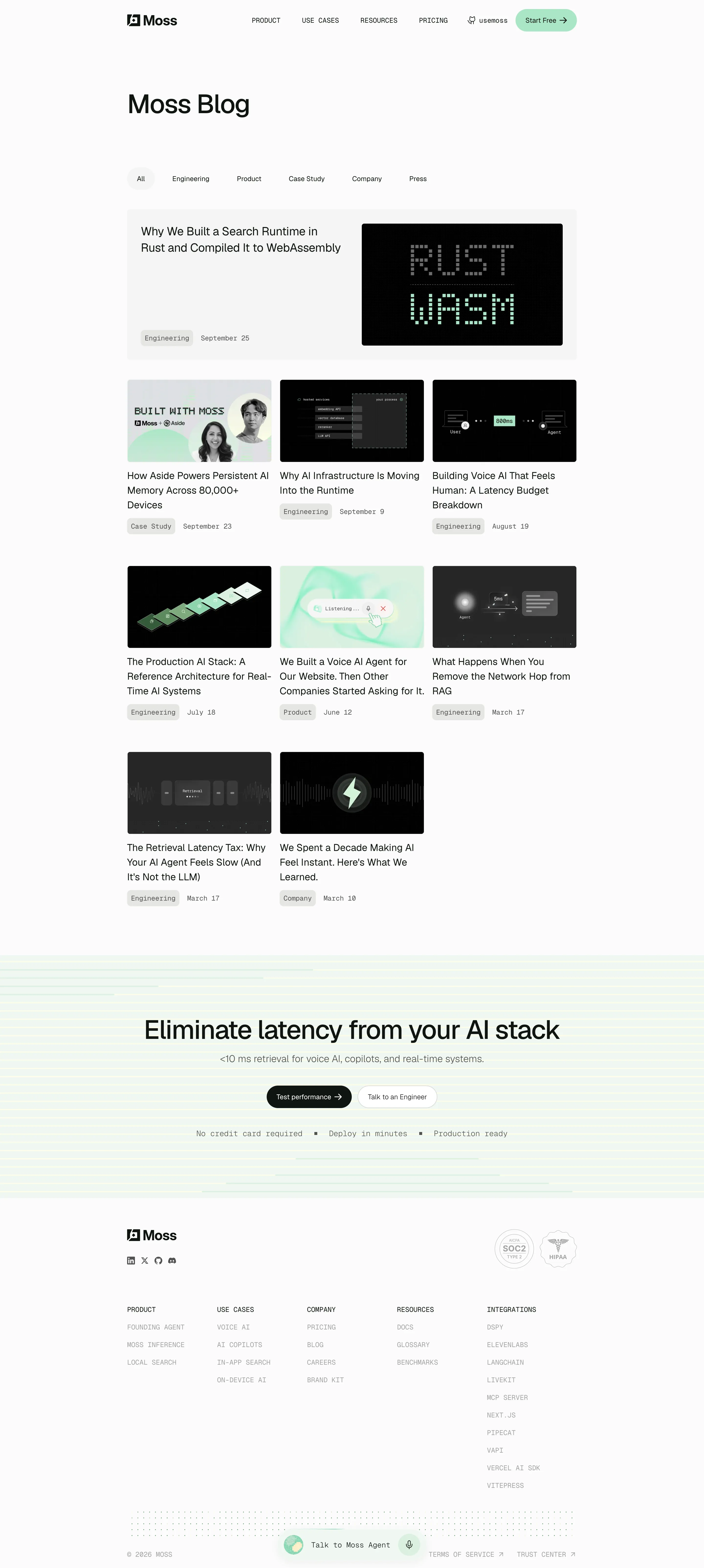

Moss Blog Feed

Moss
The retrieval layer for production AI
Designed by
No items found.

Bookmark
Bookmark

Design with AI
Thank you! Your submission has been received!
Oops! Something went wrong while submitting the form.
# Design from Reference: Moss Blog Feed
Create an original, high-fidelity visual design inspired by the reference. Prioritize composition, typography, colors, spacing, and component styling over technical implementation.
## Reference
- **Product:** Moss
- **Category:** Blog Feed
- **Screenshot:** https://cdn.prod.website-files.com/5e9dc792e1210c5325f7ebbc/6acf52732aa9d681a57b161e_KkJjpNFYGYeo-XfMLbgCs1MwSCVImlBbwZaU5paaQ2g.png
Analyze the screenshot first. If inaccessible, request it rather than guessing.
## Content
{{content.instructions}}
{{content.data}}
Preserve essential messaging and factual accuracy. Adapt structure and copy length for visual balance; never invent product claims.
## Visual Design
### Overall aesthetic
- **Style:** An editorial technical blog uses a warm near-white canvas, green-black type, restrained mint accents and dark diagram-led thumbnails.
- **Character:** Large proportional headings contrast with monospaced metadata and navigation, creating a precise developer-facing visual language.
### Page composition
- **Capture:** The original is 2880 × 6416 pixels. Estimated CSS sizes below assume an unverified 2× capture.
- **Grid:** A centered content container is about 920 CSS pixels wide with broad side margins.
- **Header:** Logo left, four uppercase navigation items, a repository-style link and mint Start Free capsule share one row.
- **Page introduction:** A large left-aligned blog title precedes a widely spaced six-category filter row.
- **Featured article:** A pale-gray rounded horizontal panel pairs a title and bottom-aligned metadata left with a large dark thumbnail right.
- **Article grid:** Eight smaller articles form three columns across three rows, with two cards in the final row. Each has an image, multiline title, category chip and date.
- **Closing CTA:** A full-width pale mint/yellow striped band contains a centered headline, subtitle, two capsule actions and a monospaced reassurance row.
- **Footer:** Brand/social icons sit left opposite two compliance marks. Five navigation columns lead to a dotted strip, copyright/legal row and floating agent control.
### Information hierarchy
- **Title:** The large blog heading introduces the page without extra explanatory copy.
- **Featured story:** A wider horizontal card establishes the primary article before the smaller grid.
- **Article roles:** Dark thumbnails lead into readable titles, while category and date remain visibly secondary.
- **Conversion:** The striped band and oversized headline create a distinct final action region.
- **Footer:** Uppercase group labels and muted monospaced links make dense navigation scannable.
### Typography
- **Families:** A neutral sans serif handles headings and article titles; a monospaced face handles navigation, dates, categories and footer links. Exact identities are unverified.
- **Page title:** Approximately 56 CSS pixels, medium weight, tight tracking.
- **Featured title:** Around 24 pixels with 33-pixel leading; card titles approximately 20 pixels with 30-pixel leading.
- **Metadata:** Around 14 pixels monospaced with relaxed horizontal spacing.
- **CTA:** Approximately 52–56-pixel heading, 20-pixel supporting line and 14-pixel button labels.
### Colors & surfaces
- **Measured canvas:** Warm off-white #FBFBFA dominates.
- **Panels:** Light neutral #F4F4F3 defines the featured surface; pale mint #F0F7F2 appears in the closing region.
- **Image darks:** Samples include #000000 and #010101 in technical thumbnails.
- **Accents:** Mint greens appear in the header CTA and diagrams; thin pale yellow and green stripes span the closing band. Exact accent stops are unverified.
- **Text treatment:** Very dark green-black headings contrast with softer gray metadata and footer links; surfaces have little visible shadow.
### Components
- **Header CTA:** A roughly 126 × 46-pixel mint capsule with a right arrow.
- **Category row:** Six plain text filters; All has a pale circular/pill background while other categories are unboxed.
- **Featured panel:** Approximately 920 × 308 pixels with small rounded corners and about 28-pixel padding. The image occupies nearly half its width.
- **Article cards:** Roughly 295 pixels wide, without enclosing borders. Thumbnails are approximately 295 × 169 pixels with small radii.
- **Metadata chips:** Pale-gray rounded category labels sit inline with dates, using compact padding and monospaced text.
- **Closing actions:** Dark filled Test performance and white outlined Talk to an Engineer capsules sit side by side.
- **Footer details:** Small social glyphs, two pale compliance seals and five link columns remain visually restrained.
- **Agent launcher:** A pale floating capsule near the bottom center includes a textured circular mark, text and microphone control.
### Visual rhythm
- **Introduction spacing:** A large gap separates title from filters; a smaller consistent gap connects filters to the featured story.
- **Grid rhythm:** Approximately 18-pixel column gaps and generous 60–70-pixel row spacing accommodate variable title heights.
- **Alignment:** Featured card, grid, header and footer share the same central container edges.
- **Closing transition:** Dense article content gives way to a spacious striped band and then an airy multi-column footer.
### Responsive
- **Evidence:** Only the desktop view is shown; filter behavior and mobile layout are unverified.
- **Recommended grid:** Reduce three columns to two, then one; stack the featured image and text while preserving reading order.
- **Recommended navigation:** Collapse the header menu and allow categories to wrap or scroll horizontally.
- **Recommended CTA:** Scale the large heading down, wrap actions and keep the reassurance row readable.
- **Footer recommendation:** Stack link groups and ensure the agent launcher does not cover legal links.
### Adaptation guidance
- **Preserve:** Keep the warm canvas, monospaced supporting type, dark technical imagery and restrained mint palette.
- **Build:** Use reusable featured and standard article components with flexible title heights and consistent thumbnail ratios.
- **Decoration:** Reuse the subtle stripe and dot motifs sparingly in the closing and footer regions.
- **Fidelity:** Treat article titles, performance copy and compliance marks as visible content rather than independently verified claims.
- **Interaction:** Define selected filter, keyboard focus and agent states explicitly; unseen behaviors should not be inferred from the screenshot.
Use this context to reproduce the reference's visual language: layout, typography, colors, spacing, borders, radii, and distinctive elements. The screenshot takes priority if descriptions conflict.
## Direction
{{preferences.fidelityInstructions}}
## Output
{{output.instructions}}
Deliver a polished, cohesive design with precise alignment, hierarchy, and spacing. Produce the requested visual artifact, not just a description. If unsupported, explain the limitation.


Category
Patterns
No items found.
Tech Stack
No items found.
Added on
October 14, 2026
Similar screens





Upgrade to SaaSFrame Pro now to see similar examples.
Monthly
$18 /month
Billed $18 monthly
Browse all screens & flows
Filter and search screens & flows
Search text in screenshots
Access Figma files
Access mobile versions
Join now
Quarterly
$16 /month
Billed $48 quarterly
Browse all screens & flows
Filter and search screens & flows
Search text in screenshots
Access Figma files
Access mobile versions
Join now
Yearly
$15 /month
Billed $180 yearly
Browse all screens & flows
Filter and search screens & flows
Search text in screenshots
Access Figma files
Access mobile versions
Join now