Design with AI
Generate a new design based on this screen using your own content.
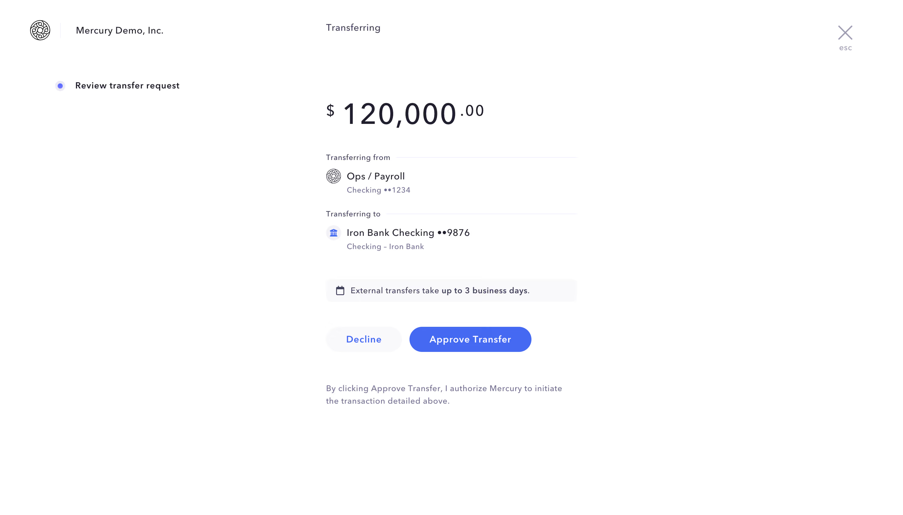
# Design from Reference: Mercury Transfert Request
Create an original, high-fidelity visual design inspired by the reference. Prioritize composition, typography, colors, spacing, and component styling over technical implementation.
## Reference
- **Product:** Mercury
- **Category:** Empty
- **Screenshot:** https://cdn.prod.website-files.com/5e9dc792e1210c5325f7ebbc/6acb722110423f7ec1f64f18_6acb6f2d1a5e5fba58c78a01_cms-65dde5eb1b570f4f113fc9a5.webp
Analyze the screenshot first. If inaccessible, request it rather than guessing.
## Content
{{content.instructions}}
{{content.data}}
Preserve essential messaging and factual accuracy. Adapt structure and copy length for visual balance; never invent product claims.
## Visual Design
### Overall aesthetic
- **Style:** Minimal transfer-approval screen with white background, navy text and a single saturated-blue approval action.
- **Scale:** Source 2880 × 1642px; dimensions estimate a 1440px-wide CSS viewport at 2× capture scale.
### Page composition
- **Header:** Company identity sits upper left, Transferring near center and a close/escape control upper right.
- **Review state:** A small left-side step marker labels Review transfer request.
- **Main column:** A narrow approximately 400px stack contains large amount, source/destination accounts, timing notice, actions and authorization copy.
### Information hierarchy
- **Amount:** The transfer amount dominates with smaller currency symbol and decimal fraction.
- **Accounts:** Transferring from and Transferring to groups show icons, account names and masked identifiers.
- **Decision:** Decline and Approve Transfer sit side by side above explicit authorization text.
### Typography
- **Family:** Sans-serif with lightly tracked small labels; exact font identity is unverified.
- **Roles:** Estimated amount 48px, account names 16px, labels/helper 12–13px and actions 14px semibold.
- **Contrast:** Navy primary text contrasts with muted violet-gray secondary details.
### Colors & surfaces
- **Sampled palette:** ICC-aware sRGB samples include white #FFFFFF, pale #F9F9FB, blue #4569F3, navy #201F30 and muted #71718F.
- **Actions:** Approval is blue with white text; Decline uses pale fill and blue text.
- **Treatment:** No enclosing card; thin rules and a pale timing strip organize the content.
### Components
- **Account groups:** Small icons precede two-line account identity; section labels connect to faint horizontal rules.
- **Timing notice:** Pale rounded strip with calendar icon and short business-day explanation.
- **Decision buttons:** Rounded pills, with the approval action wider than Decline.
- **Close:** Large thin X with a tiny esc hint beneath.
### Visual rhythm
- **Spacing:** Broad vertical gaps separate amount, account groups, notice and decision.
- **Alignment:** Review details share a left edge within a narrow centered measure.
### Responsive
- **Recommended adaptation:** Only desktop is observed. Make the review column fluid and move the step marker above it.
- **Decision clarity:** Retain both actions and authorization copy without truncating account details.
### Adaptation guidance
- **Preserve:** Keep amount, source, destination, timing and authorization explicit before approval.
- **Adapt:** Use actual transfer data and timing rules. Never initiate a transfer merely to reproduce this design.
Use this context to reproduce the reference's visual language: layout, typography, colors, spacing, borders, radii, and distinctive elements. The screenshot takes priority if descriptions conflict.
## Direction
{{preferences.fidelityInstructions}}
## Output
{{output.instructions}}
Deliver a polished, cohesive design with precise alignment, hierarchy, and spacing. Produce the requested visual artifact, not just a description. If unsupported, explain the limitation.