Design with AI
Generate a new design based on this screen using your own content.
# Design from Reference: Maze Checkout
Create an original, high-fidelity visual design inspired by the reference. Prioritize composition, typography, colors, spacing, and component styling over technical implementation.
## Reference
- **Product:** Maze
- **Category:** Checkout
- **Screenshot:** https://cdn.prod.website-files.com/5e9dc792e1210c5325f7ebbc/6acbc134b7ca13cf70095a17_6acbc027578bcc411175ffa3_cms-6f4ac4781bf8219b6f11f6e6.webp
Analyze the screenshot first. If inaccessible, request it rather than guessing.
## Content
{{content.instructions}}
{{content.data}}
Preserve essential messaging and factual accuracy. Adapt structure and copy length for visual balance; never invent product claims.
## Visual Design
### Overall aesthetic
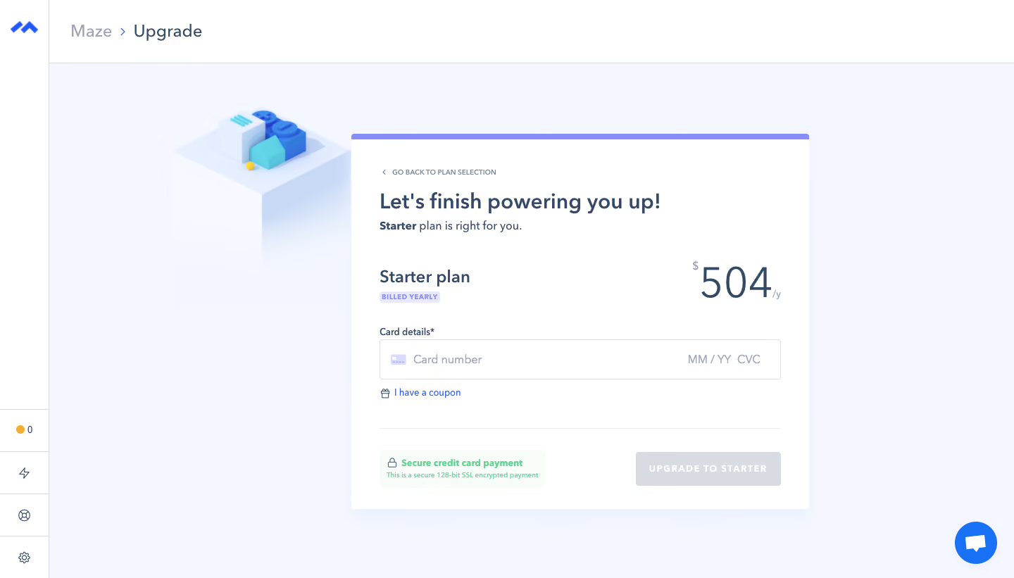
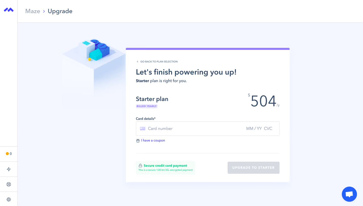
- **Character:** A softly colored checkout uses a pale lavender-blue canvas, white panel, slate text, purple top accent and a small isometric illustration.
- **Evidence:** The screenshot is 1440 × 821 pixels. Approximate CSS dimensions assume an unverified 1× capture density.
### Page composition
- **Shell:** A narrow icon rail and shallow breadcrumb header frame the checkout.
- **Panel:** A roughly 650-pixel-wide white panel sits right of a decorative block illustration, with a thin purple top strip.
- **Content sequence:** Back link, heading, selected plan/annual price, card details, coupon link, divider, security note and upgrade action.
- **Utility:** A blue circular chat launcher sits at bottom right.
### Information hierarchy
- **Task:** A large completion heading leads into the selected Starter plan.
- **Price:** A prominent 504 annual total aligns right of the plan label and yearly badge.
- **Payment:** A single combined card-details field is the primary entry area; coupon is secondary.
- **Completion state:** The final upgrade control is gray and disabled-looking because card details are empty.
### Typography
- **Heading:** Approximately 30 pixels semibold; plan title around 24 pixels.
- **Price:** Roughly 58–60 pixels lightweight, with much smaller currency and annual unit.
- **Controls/support:** Around 14–16 pixels; the small yearly badge and security detail are roughly 10–12 pixels.
- **Family:** A neutral humanist sans-serif is visible; exact identity is unverified.
### Colors & surfaces
- **Measured base:** ICC-to-sRGB sampling identifies #F4F7FF as the dominant canvas and #FFFFFF as panel/input surfaces.
- **Measured supporting tones:** #F3F6FF and #F2F6FF are nearby pale variations; #D8DBE1 is the disabled-action gray.
- **Measured security surface:** #F7FCF9 supplies a faint green note background.
- **Accents:** Purple highlights the panel edge/yearly badge, bright blue marks links and chat, and green supports the security note.
### Components
- **Checkout card:** Approximately 650 × 532 pixels, with around 40-pixel padding, small corner rounding and a subtle shadow.
- **Card field:** A roughly 570 × 56-pixel outlined input groups card number and expiry/CVC placeholders.
- **Coupon link:** A small gift icon precedes an inline blue text action.
- **Bottom row:** A pale security badge sits left, with an approximately 205 × 48-pixel uppercase upgrade action right.
- **Decoration:** A pastel isometric cube/platform illustration extends behind the panel's upper-left edge.
### Visual rhythm
- **Vertical grouping:** Generous gaps distinguish intro, plan, payment and completion sections.
- **Alignment:** Heading, labels, field and divider share a common inset; price and upgrade action align right.
- **Whitespace:** Broad pale margins isolate the purchase task from the surrounding application chrome.
### Responsive
- **Observed scope:** One desktop empty-payment state is visible; validation, coupon entry and successful payment are not shown.
- **Recommended layout:** Remove or reduce decoration, make the panel fluid and stack price/security/action regions on small screens.
- **Recommended forms:** Preserve clear payment labels and sufficient touch targets without compressing grouped card entry.
### Adaptation guidance
- **Checkout pattern:** Keep plan, billing interval, total and payment input visible together before the final action.
- **State clarity:** Define enabled, error and processing states explicitly; the screenshot only establishes the resting disabled-looking action.
- **Implementation:** Verify font/scale and live pricing, provide accessible payment-field labels and use accurate security wording.
Use this context to reproduce the reference's visual language: layout, typography, colors, spacing, borders, radii, and distinctive elements. The screenshot takes priority if descriptions conflict.
## Direction
{{preferences.fidelityInstructions}}
## Output
{{output.instructions}}
Deliver a polished, cohesive design with precise alignment, hierarchy, and spacing. Produce the requested visual artifact, not just a description. If unsupported, explain the limitation.