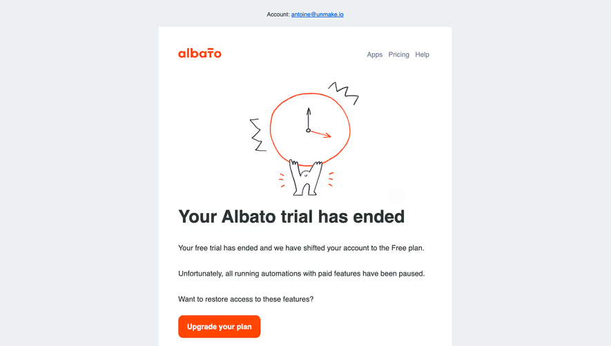
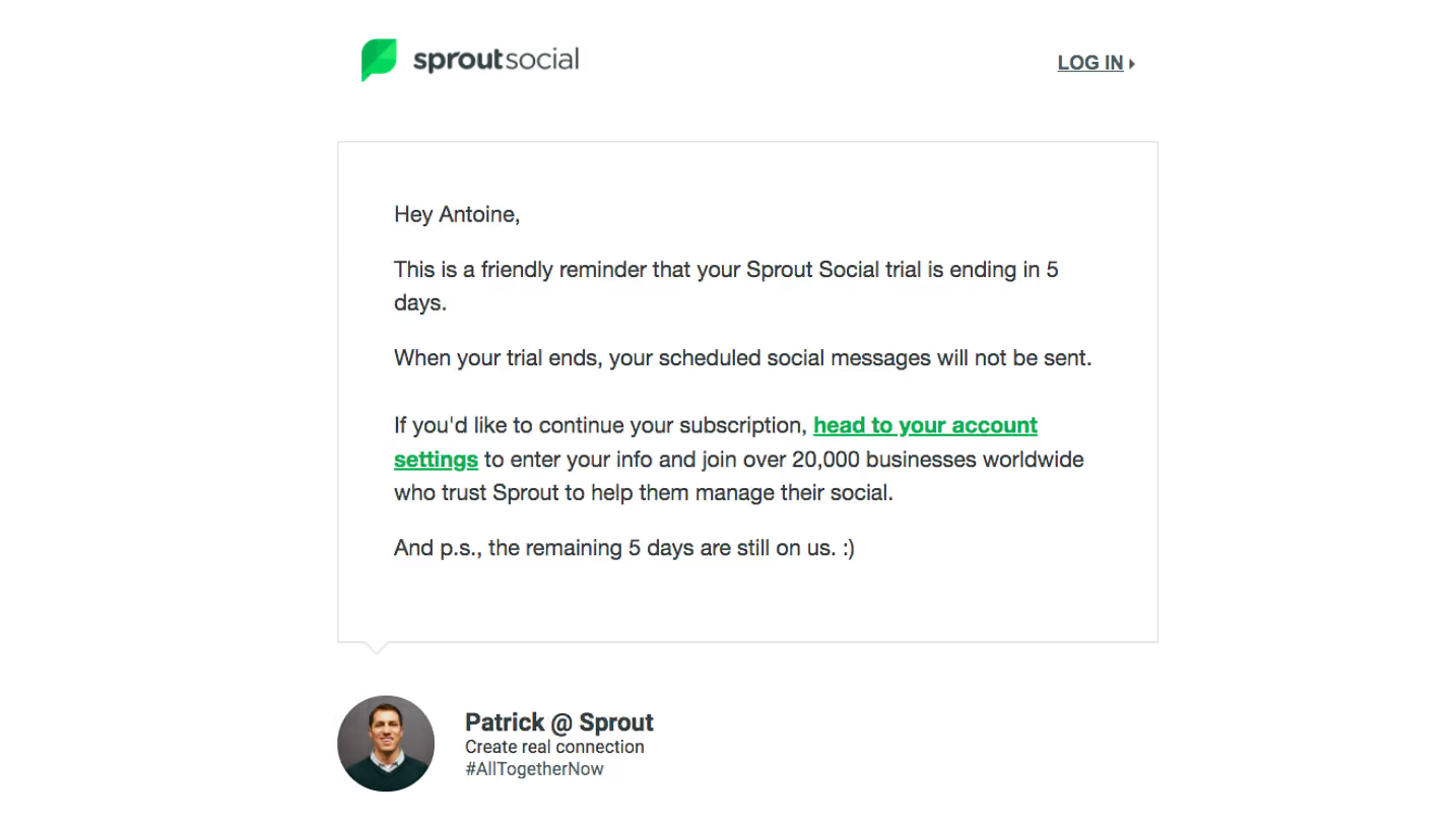
Design with AI
Generate a new design based on this screen using your own content.
# Design from Reference: Loom Free Trial Emails
Create an original, high-fidelity visual design inspired by the reference. Prioritize composition, typography, colors, spacing, and component styling over technical implementation.
## Reference
- **Product:** Loom
- **Category:** Free Trial Emails
- **Screenshot:** https://cdn.prod.website-files.com/5e9dc792e1210c5325f7ebbc/62ecad87f0eb3d490b80102e_1659676832067-5ed3cc9ca90a9c41591f16cf_screencapture-mail-google-mail-u-1-2020-05-31-17_18_54.webp
Analyze the screenshot first. If inaccessible, request it rather than guessing.
## Content
{{content.instructions}}
{{content.data}}
Preserve essential messaging and factual accuracy. Adapt structure and copy length for visual balance; never invent product claims.
## Visual Design
### Overall aesthetic
- **Character:** Branded trial-expiry email with a dark wavy header, pastel decorative shapes and a blue upgrade action.
### Page composition
- **Capture:** 1371 × 787 screenshot pixels; CSS scale unverified.
- **Structure:** Centered white email sheet, dark Loom Pro masthead, greeting, expiry explanation, two-item feature list, upgrade CTA, support and sign-off.
### Information hierarchy
- **Priority:** Account downgrade explanation leads into retained capabilities and the blue Upgrade to Loom Pro button.
### Typography
- **Family:** Sans serif; exact family unverified.
- **Screenshot sizes:** Body approximately 16px, bold list heading 18px and action 18px; CSS scale appears near 1×.
### Colors & surfaces
- **Measured palette:** White #FFFFFF, charcoal #2B2F37, blue #516BEF and near-white #FFFEFF/#FDFFFF/#FFFFFD.
- **Accents:** Pastel pink/blue shapes at the curved header boundary.
### Components
- **Elements:** Wordmark with Pro badge, wave-shaped header, bullet list, rectangular blue button and fine sheet border.
- **Screenshot geometry:** Sheet approximately 900px wide, 80px body gutters, 56px CTA height and 4px radius.
### Visual rhythm
- **Spacing:** Comfortable paragraph gaps and one short bullet list keep the message easy to scan.
### Responsive
- **Suggested adaptation:** Use fluid sheet width and 20–24px CSS gutters. Mobile rendering is not shown.
### Adaptation guidance
- **Transfer:** Preserve clear retained-versus-upgrade capability communication using actual account terms.
Use this context to reproduce the reference's visual language: layout, typography, colors, spacing, borders, radii, and distinctive elements. The screenshot takes priority if descriptions conflict.
## Direction
{{preferences.fidelityInstructions}}
## Output
{{output.instructions}}
Deliver a polished, cohesive design with precise alignment, hierarchy, and spacing. Produce the requested visual artifact, not just a description. If unsupported, explain the limitation.