
Thank you! Your submission has been received!
Oops! Something went wrong while submitting the form.
Get SaaSFrame Pro
Monthly
$18
Quarterly
$48
Yearly
$180
Upgrade to access this feature
Browse all screens & flows
Filter and search screens & flows
Access Figma files
Access mobile versions
Bookmark screens & flows
Join now
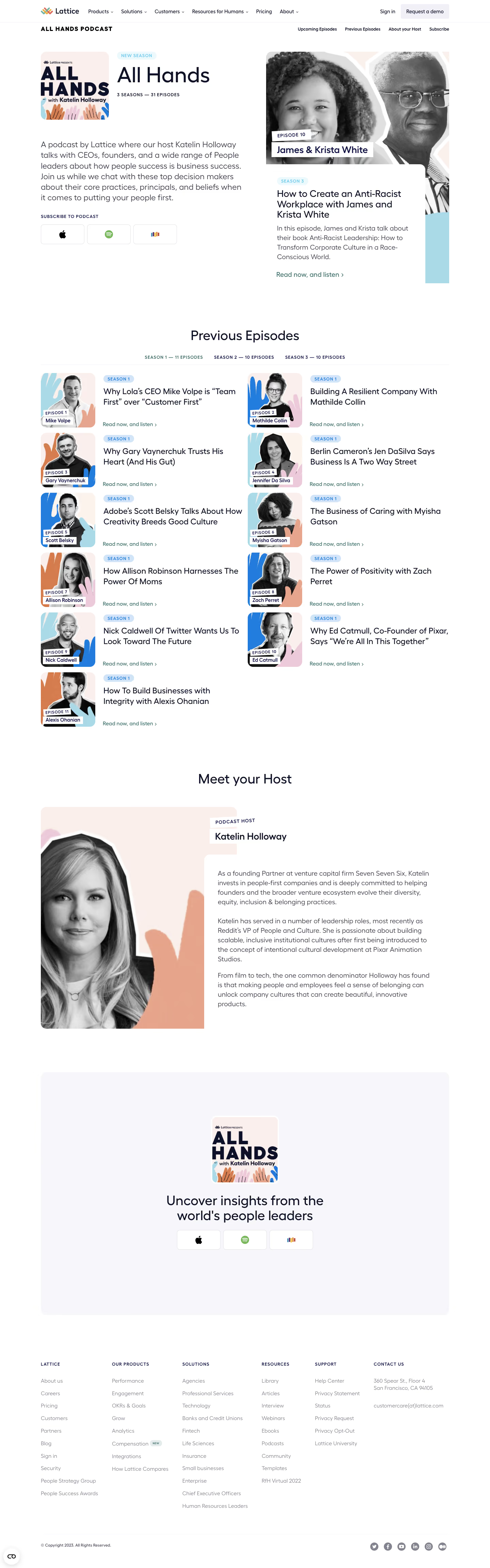

Lattice Podcast Pages

Lattice
People success platform
Designed by
No items found.

Bookmark
Bookmark

Design with AI
Thank you! Your submission has been received!
Oops! Something went wrong while submitting the form.
# Design from Reference: Lattice Podcast Pages
Create an original, high-fidelity visual design inspired by the reference. Prioritize composition, typography, colors, spacing, and component styling over technical implementation.
## Reference
- **Product:** Lattice
- **Category:** Podcast Pages
- **Screenshot:** https://cdn.prod.website-files.com/5e9dc792e1210c5325f7ebbc/6acb6d9eb206c0d3f8f3a541_6acb6aa2ddc9482c9278878e_cms-b0420bf201498631d63e59cf.webp
Analyze the screenshot first. If inaccessible, request it rather than guessing.
## Content
{{content.instructions}}
{{content.data}}
Preserve essential messaging and factual accuracy. Adapt structure and copy length for visual balance; never invent product claims.
## Visual Design
### Overall aesthetic
- **Character:** An airy editorial podcast directory combines dark navy type, generous white space and playful pastel portrait collages.
- **Imagery:** Black-and-white cutout portraits sit over peach, blue and pink hand illustrations; white caption strips provide a recurring album-art language.
### Page composition
- **Capture scale:** The original is 1440 × 4611 image pixels. Dimensions below approximate image pixels; a roughly 1:1 CSS rendering is plausible but unverified.
- **Header:** Two horizontal navigation rows span a centered approximately 1200-pixel content area: corporate navigation above a podcast-specific anchor menu.
- **Opening:** A broad two-column hero pairs cover artwork, title, description and subscription buttons on the left with a large featured episode portrait and overlapping white description panel on the right.
- **Archive:** A centered heading and three season tabs precede eleven episode entries arranged in two columns, leaving the final item in the left column.
- **Lower regions:** A host portrait and biography form another overlapping split composition, followed by a large subscription panel and six-column footer with a separate copyright/social row.
### Information hierarchy
- **Opening priority:** The large All Hands title and featured portrait establish the show before descriptive copy and platform choices.
- **Episode scanning:** Repeated season pills, two-line episode titles and teal listening links establish a consistent order beside each square portrait.
- **Closing hierarchy:** The host section adds personal context; the oversized pale subscription panel repeats the platform actions before the denser corporate footer.
### Typography
- **Family:** Rounded geometric sans-serif forms appear throughout; the exact font family is unverified.
- **Display roles:** The opening title is approximately 60–64 pixels, regular weight with tight leading. Section headings are around 38–40 pixels; the closing heading uses a centered two-line treatment.
- **Reading roles:** Hero description is approximately 24 pixels with 31–32-pixel leading; featured title about 28 pixels; archive titles around 24 pixels; biography and featured body roughly 20 pixels with 28-pixel leading.
- **Utility roles:** Navigation is approximately 14–16 pixels. Uppercase season labels and footer headings use roughly 12–13 pixels, semibold weight and visibly expanded tracking.
### Colors & surfaces
- **Measured base:** Sampled source colors include white #FFFFFF and deep navy #0C1128, used for the canvas and strongest typography respectively.
- **Measured artwork:** Pale peach #FAEFEB and nearby #FAEFEC support portrait compositions; peach #E6A58A appears in the illustrative artwork.
- **Measured closing surface:** The subscription block uses very pale gray-lavender #F7F7FA.
- **Accent relationships:** Teal listening links, pale blue season badges and colorful platform marks add restrained functional contrast; portraits retain grayscale contrast.
### Components
- **Platform controls:** Three outlined icon buttons form a row, each approximately 128 × 58 pixels with a thin light border and roughly 7-pixel radius; this group repeats near the bottom.
- **Featured card:** A white panel overlaps the large image, with about 32-pixel internal padding and a rounded upper-right corner; text and link remain left aligned.
- **Episode entries:** Approximately 160-pixel square artwork has rounded corners. A roughly 24-pixel gap separates it from title, badge and bottom-aligned listening link; entries have no enclosing card border.
- **Host treatment:** The large rounded portrait, offset white name strips and overlapping biography panel reuse the featured episode collage vocabulary.
- **Footer:** Small uppercase headings sit above widely spaced muted links; a thin rule separates copyright from round social icons.
### Visual rhythm
- **Container:** About 120-pixel outer margins create a stable desktop alignment across hero, archive, subscription panel and footer.
- **Repetition:** Archive rows use approximately 16–20 pixels of vertical separation and consistent portrait sizes; the two columns align across a wider central gutter.
- **Section pauses:** Roughly 120–170 pixels of white space separate major content groups, while the subscription panel has particularly generous vertical padding.
### Responsive
- **Observed state:** Only a wide desktop page is supplied; mobile rearrangement and navigation behavior are not verified.
- **Recommended stacking:** Collapse hero, archive and host layouts to one column; place overlapping biography and episode panels in normal flow when space is limited.
- **Recommended controls:** Keep platform buttons comfortably tappable, allow season navigation to wrap or scroll, and collapse footer columns into readable groups.
### Adaptation guidance
- **Preserve the system:** Reuse the portrait collage, small season pills and restrained teal links as the directory's recognizable visual structure.
- **Keep navigation distinct:** Maintain separate corporate and show navigation while preventing both rows from crowding smaller screens.
- **Implementation estimates:** Start with a 1200-pixel maximum container, 160-pixel archive artwork and a 24/40/64-pixel type hierarchy, then tune against the original capture.
- **Content resilience:** Allow variable episode titles without clipping and preserve reading order when overlap treatments are removed; provide accessible names for platform and social icons.
Use this context to reproduce the reference's visual language: layout, typography, colors, spacing, borders, radii, and distinctive elements. The screenshot takes priority if descriptions conflict.
## Direction
{{preferences.fidelityInstructions}}
## Output
{{output.instructions}}
Deliver a polished, cohesive design with precise alignment, hierarchy, and spacing. Produce the requested visual artifact, not just a description. If unsupported, explain the limitation.


Category
Patterns
No items found.
Tech Stack




Added on
April 4, 2023
Similar screens
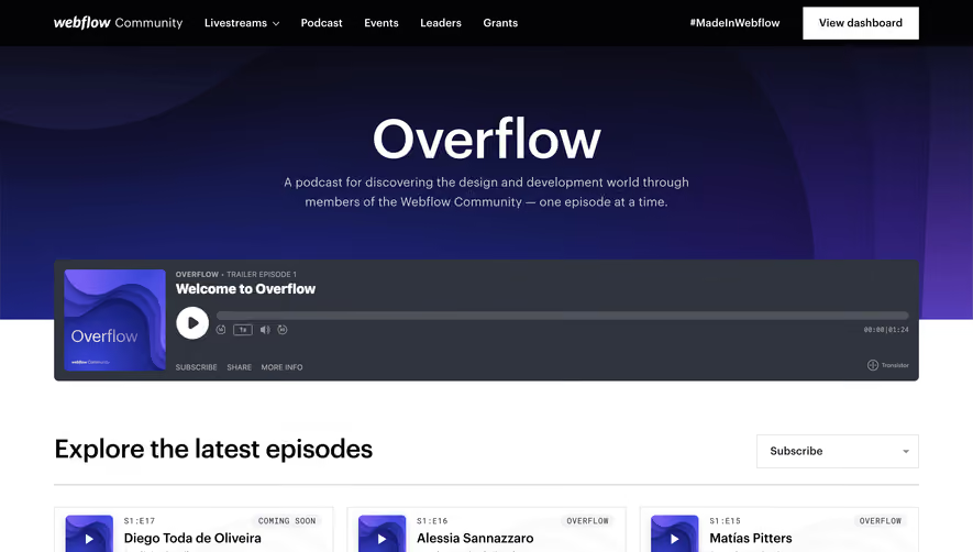


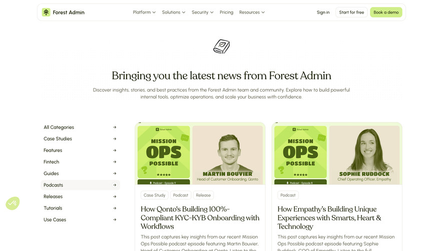

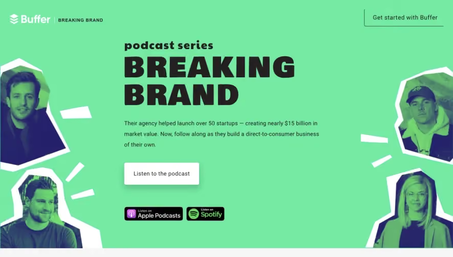

Upgrade to SaaSFrame Pro now to see similar examples.
Monthly
$18 /month
Billed $18 monthly
Browse all screens & flows
Filter and search screens & flows
Search text in screenshots
Access Figma files
Access mobile versions
Join now
Quarterly
$16 /month
Billed $48 quarterly
Browse all screens & flows
Filter and search screens & flows
Search text in screenshots
Access Figma files
Access mobile versions
Join now
Yearly
$15 /month
Billed $180 yearly
Browse all screens & flows
Filter and search screens & flows
Search text in screenshots
Access Figma files
Access mobile versions
Join now