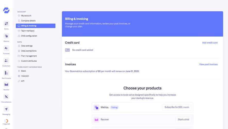
Design with AI
Generate a new design based on this screen using your own content.
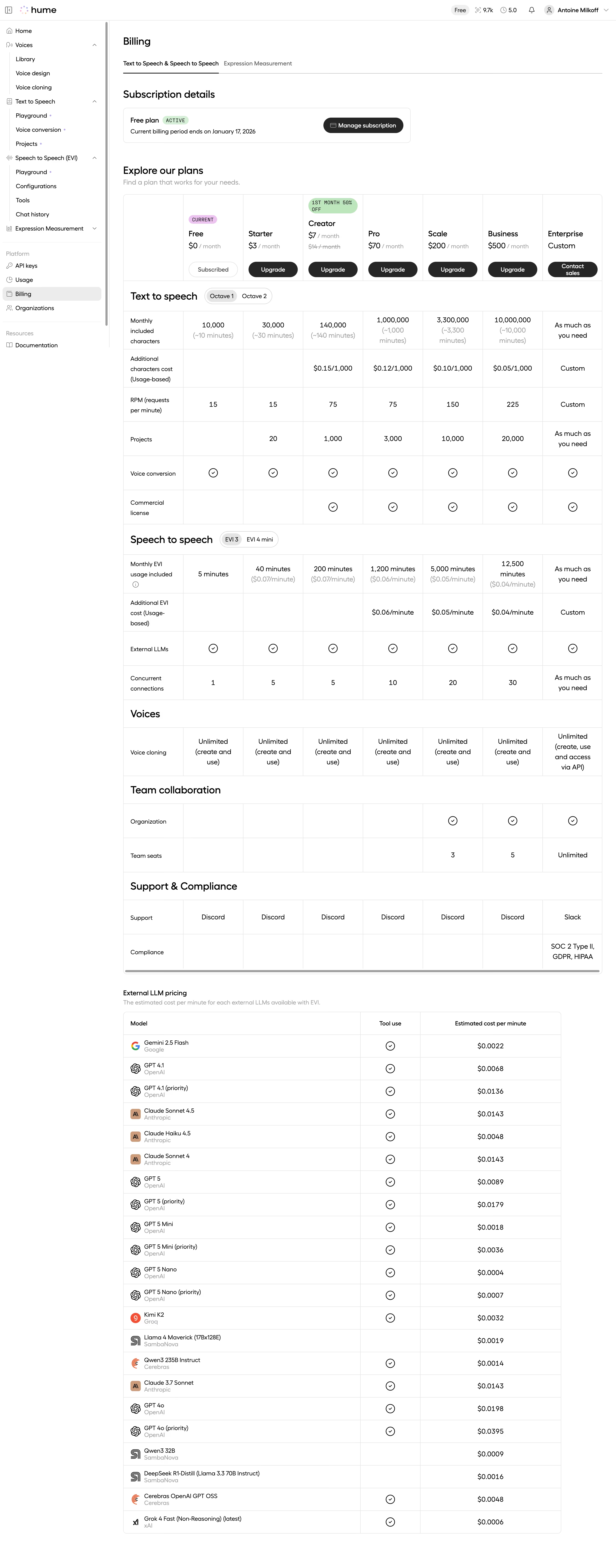
# Design from Reference: Hume AI Text to Speech Billing
Create an original, high-fidelity visual design inspired by the reference. Prioritize composition, typography, colors, spacing, and component styling over technical implementation.
## Reference
- **Product:** Hume AI
- **Category:** Billing
- **Screenshot:** https://cdn.prod.website-files.com/5e9dc792e1210c5325f7ebbc/6acad404c910b3adf9e48b6c_6acad18db129c83afa283e17_cms-12c35411e53fd7b843250150.webp
Analyze the screenshot first. If inaccessible, request it rather than guessing.
## Content
{{content.instructions}}
{{content.data}}
Preserve essential messaging and factual accuracy. Adapt structure and copy length for visual balance; never invent product claims.
## Visual Design
### Overall aesthetic
- **Character:** Dense white billing workspace with thin gray table rules, black pill actions and minimal pastel status badges.
- **Visual emphasis:** A broad multi-plan comparison dominates below a compact subscription summary.
- **Scale:** The source measures 2880 × 7332 px. Dimensions below estimate a 1440 × 3666 CSS layout at 2× scale; device ratio and zoom are unverified. Three portions were inspected.
### Page composition
- **Shell:** A narrow left navigation groups voice, speech and platform destinations. A slim top bar contains brand, usage/account indicators and utilities.
- **Header:** Billing title and two product-category tabs sit above subscription details.
- **Subscription card:** A compact white outlined block shows current free-plan status and a dark management action.
- **Plan table:** A wide eight-column grid includes a feature-label column and seven plan columns.
- **Feature groups:** Full-width group headings separate text-to-speech, speech-to-speech, voices, collaboration and support/compliance.
- **Model table:** A separate narrower external-model pricing table follows with model/provider, tool-use and estimated-cost columns.
### Information hierarchy
- **Current subscription:** A green Active badge and current-plan card establish state before upgrade options.
- **Plan comparison:** Plan names/prices and black upgrade/contact actions lead each column.
- **Feature matrix:** Numeric allowances, check circles and explanatory secondary values organize capability comparison.
- **External models:** Provider logos/names and per-minute estimates form a distinct secondary pricing section.
- **Evidence caution:** All prices, model names and allowances are captured content, not verified current offers.
### Typography
- **Family:** Rounded neutral sans-serif; exact identity is unverified.
- **Page/section headings:** Approximately 24–26 px, medium weight.
- **Plan names:** Around 18 px, with prices/body near 14–16 px.
- **Table:** Compact 13–14 px values and labels, with muted secondary calculations.
- **Badges:** Small uppercase monospace-like status/promo text.
- **Navigation:** Small compact labels support a dense shell.
### Colors & surfaces
- **Measured base:** ICC-aware sRGB sampling yields #FFFFFF.
- **Measured rules:** #E5E5E5 and #ECECEC define the comparison grids.
- **Measured foreground:** #000000, #262626 and #0D0D0D appear in headings/actions.
- **Measured muted:** #9F9F9F and #A3A3A3 appear in supporting text.
- **Measured status:** Pale green #BDE6BE supports active/promo badges; a small pink current badge adds another localized accent.
- **Depth:** Flat outlined cards and tables dominate.
### Components
- **Product tabs:** Underline marks the active text/speech category.
- **Subscription summary:** Thin bordered rectangle pairs plan/status/date with a black pill management action.
- **Plan headers:** Each column contains name, price and rounded upgrade/subscribed/contact action.
- **Feature selectors:** Small segmented pills beside group headings select model variants.
- **Capability cells:** Circular checks, numbers and muted sublines repeat across the grid.
- **External-model rows:** Provider icon, model name and lighter provider caption align left; check markers and costs align in later columns.
- **Scroll treatment:** A horizontal scrollbar is visible at the main matrix bottom.
### Visual rhythm
- **Grid discipline:** Fine rules and fixed columns create a consistent comparison rhythm.
- **Section hierarchy:** Larger full-width feature labels interrupt dense rows.
- **Spacing:** Generous gaps separate subscription, plans and external-model table.
- **Density contrast:** Narrow navigation and broad data area support scanning.
### Responsive
- **Evidence limit:** Only desktop is shown; recommendations follow.
- **Shell:** Collapse navigation.
- **Comparison:** Preserve horizontal scrolling or offer plan-focused views instead of shrinking text.
- **Headers:** Keep plan identity/actions visible when scrolling if implemented.
- **Model table:** Wrap provider/model labels while preserving cost alignment.
### Adaptation guidance
- **Reusable pattern:** Separate current subscription from upgrade matrix and external usage pricing.
- **State clarity:** Distinguish current plan, promotional price and custom enterprise options.
- **Data discipline:** Validate current commercial/model details separately before reuse.
- **Accessibility:** Use semantic table headers, readable text and labeled variant controls.
Use this context to reproduce the reference's visual language: layout, typography, colors, spacing, borders, radii, and distinctive elements. The screenshot takes priority if descriptions conflict.
## Direction
{{preferences.fidelityInstructions}}
## Output
{{output.instructions}}
Deliver a polished, cohesive design with precise alignment, hierarchy, and spacing. Produce the requested visual artifact, not just a description. If unsupported, explain the limitation.