
Thank you! Your submission has been received!
Oops! Something went wrong while submitting the form.
Get SaaSFrame Pro
Monthly
$18
Quarterly
$48
Yearly
$180
Upgrade to access this feature
Browse all screens & flows
Filter and search screens & flows
Access Figma files
Access mobile versions
Bookmark screens & flows
Join now
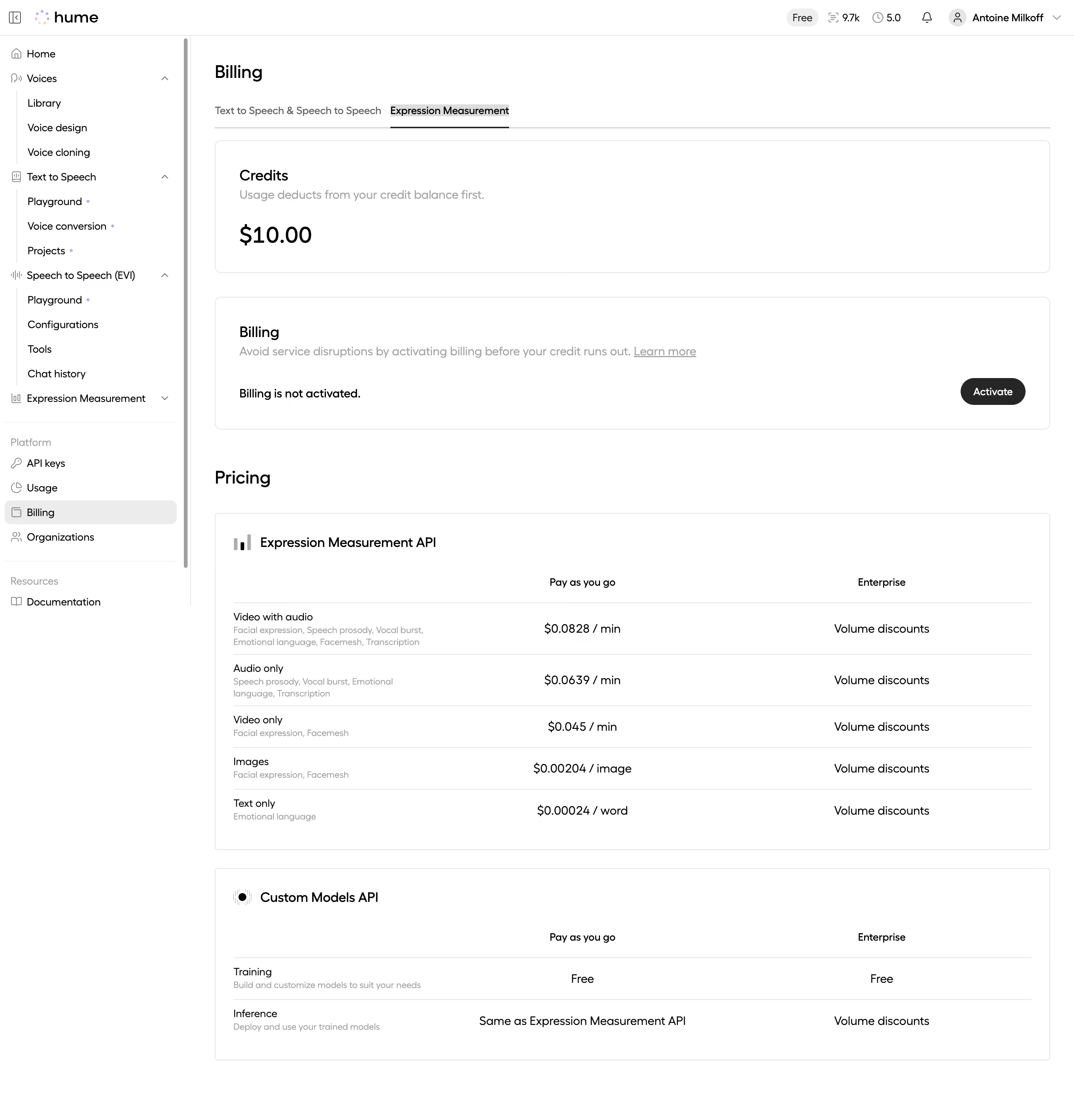
Hume AI Expression Measurement Billing

Hume AI
Voice AI with emotional intelligence
Designed by
No items found.

Bookmark
Bookmark

Design with AI
Thank you! Your submission has been received!
Oops! Something went wrong while submitting the form.
# Design from Reference: Hume AI Expression Measurement Billing
Create an original, high-fidelity visual design inspired by the reference. Prioritize composition, typography, colors, spacing, and component styling over technical implementation.
## Reference
- **Product:** Hume AI
- **Category:** Billing
- **Screenshot:** https://cdn.prod.website-files.com/5e9dc792e1210c5325f7ebbc/6acc0f7fe540d8db93de5952_6acc0e50188ab6d0a4760d30_cms-cd765008202dfd177ad5cefd-v3.webp
Analyze the screenshot first. If inaccessible, request it rather than guessing.
## Content
{{content.instructions}}
{{content.data}}
Preserve essential messaging and factual accuracy. Adapt structure and copy length for visual balance; never invent product claims.
## Visual Design
### Overall aesthetic
- **Style:** Monochrome developer billing dashboard with a structured navigation rail and broad outlined information cards.
- **Character:** White surfaces, black headings, gray explanatory text, fine rules, and one dark activation pill.
- **Density:** Spacious credit/billing summaries transition into compact pricing tables.
### Page composition
- **Capture and scale:** 2880 × 3004 image px. Estimated CSS dimensions assume a 2× capture, about 1440 × 1502 CSS px; scale is unverified.
- **Top bar:** Brand left, compact plan/usage/account indicators right, separated from content by a fine rule.
- **Sidebar:** Approximately 255px wide, with expandable product groups, indented subpages, Platform links, and Resources. Billing is highlighted.
- **Main content:** Begins around x=288 CSS px, with Billing heading and two tabs above the cards.
- **Selected tab:** Expression Measurement is underlined, beside the text/speech billing category.
- **Summary cards:** Credits card with helper copy and large currency amount; billing-state card with explanation, inactive-state label, and right-aligned Activate.
- **Pricing:** Heading above an Expression Measurement API table with five modality rows, then a Custom Models API table with training and inference rows.
- **Lower boundary:** The image ends shortly after the second table with a narrow white tail; no additional section is inferred.
### Information hierarchy
- **Location:** Billing heading, selected sidebar destination, and tab underline reinforce the active category.
- **Credit balance:** Large currency number is the strongest value within the first card.
- **Activation:** Inactive billing state and dark Activate action form the key actionable pair.
- **Pricing hierarchy:** API section title, column labels, modality name, muted capability description, then rate/enterprise terms.
- **Secondary navigation:** Product subpages and resource links remain compact and mostly monochrome.
### Typography
- **Family:** Rounded proportional sans serif; exact family is unverified.
- **Page / pricing headings:** Approximately 24px semibold with 30px line-height.
- **Card / table titles:** Approximately 20px medium or semibold.
- **Credit amount:** Approximately 32px medium.
- **Body / tabs / rows:** Approximately 14–16px with 20–24px line-height.
- **Capability descriptions:** Approximately 12px in muted gray, often wrapping over two lines.
- **Sidebar:** Approximately 14px labels with consistent compact leading.
- **Precision:** All CSS sizes and weights are visual reconstruction estimates.
### Colors & surfaces
- **Canvas:** Sampled #FFFFFF.
- **Primary black:** Sampled #000000.
- **Dark action:** Sampled #262626.
- **Card rules:** Sampled #E5E5E5 and #DCDCDC.
- **Selected navigation:** Sampled #ECECEC.
- **Muted text:** Sampled #A3A3A3 and #9F9F9F.
- **Secondary grays:** Sampled #BEBEBE and #EEEEEE in icons, fine borders, and background details.
- **Brand accents:** Tiny pastel dots in the logo and product navigation provide minor color without changing the neutral billing palette.
### Components
- **Tab strip:** Thin full-width gray baseline with a darker underline beneath the selected tab.
- **Credits card:** Broad rounded outlined rectangle, approximately 32px padding and 8px radius; helper sentence above the balance.
- **Billing card:** Similar geometry, with status/action row below the explanatory sentence.
- **Activate pill:** Approximately 88 × 36px, dark fill, white label, fully rounded ends.
- **Pricing panels:** Broad outlined rectangles with small corner radius, icon/title at top, three-column table, and thin horizontal row rules.
- **Table columns:** Left modality/description column; centered pay-as-you-go values; centered enterprise terms.
- **Navigation groups:** Thin vertical guides connect indented product subpages; chevrons indicate collapsible groups in the captured state.
- **Selected destination:** Pale rounded highlight around Billing.
- **State limits:** No payment form or activation dialog is open; no billing action was performed.
### Visual rhythm
- **Card spacing:** Approximately 32px between summary cards, with a larger gap before Pricing.
- **Alignment:** Main headings, card edges, and table panels share a consistent left boundary.
- **Table rhythm:** Repeated modality title/description pairs and aligned rates permit horizontal comparison.
- **Sidebar rhythm:** Compact repeated links contrast with the main area’s broad whitespace.
### Responsive
- **Observed state:** Desktop only; mobile and alternate billing-tab states are unverified.
- **Navigation recommendation:** Collapse the rail to a drawer.
- **Cards recommendation:** Keep summaries fluid with 20–24px padding and allow status/action rows to wrap.
- **Table recommendation:** Preserve readable modality descriptions and use controlled horizontal scrolling or stacked rate groups on narrow screens.
- **Action recommendation:** Keep activation and credit context together without covering table content.
### Adaptation guidance
- **Preserve:** Neutral billing shell, explicit credit/status summaries, tabbed product categories, and clear usage-rate tables.
- **Starting geometry:** Approximately 255px sidebar, 32px card padding, 24px page headings, and 36px activation pill under the unverified 2× assumption.
- **Data fidelity:** Use supplied live billing data and approved rates; screenshot amounts and terms are historical visual content, not verified current pricing.
- **Privacy:** Replace account identifiers with supplied example data.
- **Implementation recommendation:** Provide accessible tabs, labeled rate tables, focus states, and a deliberate payment-activation flow; none is established by the static capture.
Use this context to reproduce the reference's visual language: layout, typography, colors, spacing, borders, radii, and distinctive elements. The screenshot takes priority if descriptions conflict.
## Direction
{{preferences.fidelityInstructions}}
## Output
{{output.instructions}}
Deliver a polished, cohesive design with precise alignment, hierarchy, and spacing. Produce the requested visual artifact, not just a description. If unsupported, explain the limitation.


Category


Added on
December 17, 2025
Similar screens



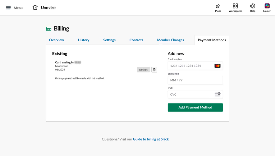



Upgrade to SaaSFrame Pro now to see similar examples.
Monthly
$18 /month
Billed $18 monthly
Browse all screens & flows
Filter and search screens & flows
Search text in screenshots
Access Figma files
Access mobile versions
Join now
Quarterly
$16 /month
Billed $48 quarterly
Browse all screens & flows
Filter and search screens & flows
Search text in screenshots
Access Figma files
Access mobile versions
Join now
Yearly
$15 /month
Billed $180 yearly
Browse all screens & flows
Filter and search screens & flows
Search text in screenshots
Access Figma files
Access mobile versions
Join now