Design with AI
Generate a new design based on this screen using your own content.
# Design from Reference: Height User Onboarding
Create an original, high-fidelity visual design inspired by the reference. Prioritize composition, typography, colors, spacing, and component styling over technical implementation.
## Reference
- **Product:** Height
- **Category:** User Onboarding
- **Screenshot:** https://cdn.prod.website-files.com/5e9dc792e1210c5325f7ebbc/6acbba89d01e36484765982c_6acb71d52d777adaad19919b_cms-9295bb7fa285471035d0384b.webp
Analyze the screenshot first. If inaccessible, request it rather than guessing.
## Content
{{content.instructions}}
{{content.data}}
Preserve essential messaging and factual accuracy. Adapt structure and copy length for visual balance; never invent product claims.
## Visual Design
### Overall aesthetic
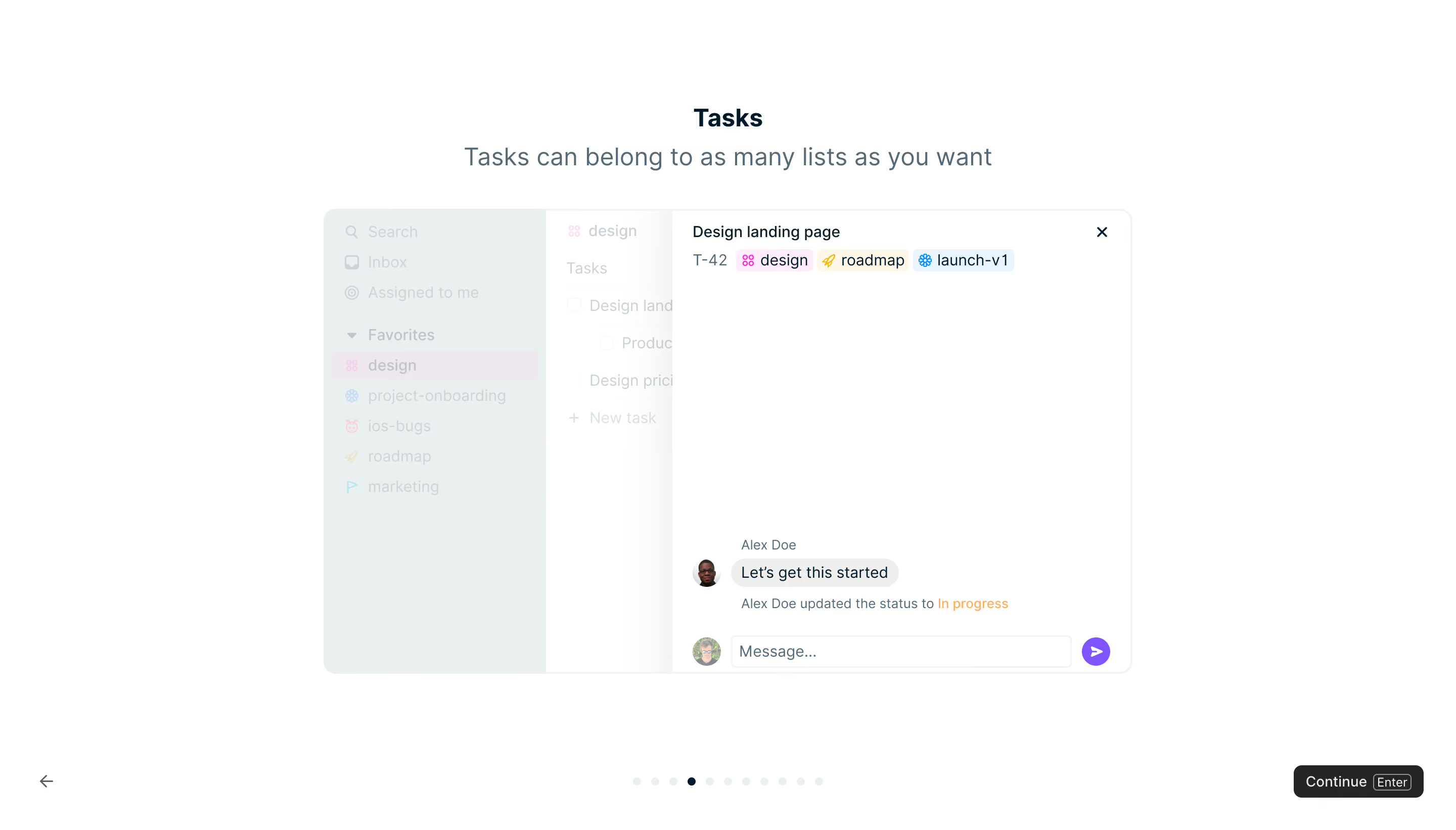
- **Character:** A minimal onboarding lesson with a white canvas, centered explanation and a simplified product demonstration.
- **Focus:** The design emphasizes one concept—tasks belonging to multiple lists—while dimming unrelated parts of the pictured interface.
### Page composition
- **Capture scale:** The source measures 2880 × 1642 pixels. A 1440 × 821 CSS-pixel viewport at 2× scale is plausible but unverified.
- **Heading:** A centered Tasks title and one-line subtitle sit near the top, with ample white space around them.
- **Demonstration:** A rounded product panel roughly 800 × 460 estimated CSS pixels occupies the center. It contains a left navigation region, a faded task list and a clear task-detail panel.
- **Lesson navigation:** A back arrow anchors the lower left, a row of progress dots centers near the bottom, and Continue with an Enter-key hint sits at lower right.
### Information hierarchy
- **Concept first:** A compact bold title leads to a larger muted explanatory sentence.
- **Highlighted detail:** The right task panel shows a task title, identifier and three colored list tags. The rest of the interface is washed out.
- **Conversation:** A small avatar, message bubble, status update and message composer appear near the detail panel's bottom.
- **Progress:** One dark dot among pale dots marks the current onboarding step; the black Continue action is the strongest navigation control.
### Typography
- **Family:** A clean sans serif is visible; exact font identity is unverified.
- **Heading roles:** Tasks is approximately 24 estimated CSS pixels and bold; the subtitle is around 24 pixels, regular, with 30-pixel line height.
- **Product UI:** Task title, tags and message text are about 14–16 pixels; small attribution/status lines are around 12–13 pixels.
- **Controls:** Continue uses approximately 14-pixel text and a compact outlined keyboard-key treatment.
### Colors & surfaces
- **Measured samples:** ICC-aware sRGB sampling yields white #FFFFFF, pale blue-gray #EAEFF0, faint pink #EEE8EE, light gray #F2F3F5 and dark #242424.
- **Accent roles:** Pastel pink, cream and pale blue distinguish list tags; purple marks the circular send affordance, and orange marks the status phrase.
- **Panel treatment:** A thin pale border and roughly 12-pixel estimated CSS corners contain the demonstration; there is no heavy shadow.
### Components
- **Task detail:** A close icon sits at top right, with the title and tag row aligned near the top left; most of the panel remains intentionally empty.
- **Tags:** Three small rounded chips combine colored symbols and list names, showing multiple memberships on one task.
- **Composer:** A compact avatar precedes a bordered message field and purple circular arrow button.
- **Lesson controls:** The back arrow is unboxed; progress dots are evenly spaced; the black Continue button has small rounded corners.
### Visual rhythm
- **Spacing:** The heading group is separated from the demo by roughly 36–40 estimated CSS pixels. The demo has generous white margins on every side.
- **Contrast rhythm:** Faded navigation gives way to the clear detail pane, directing attention without additional callout arrows.
- **Bottom anchoring:** Navigation controls spread across the viewport rather than sitting immediately beneath the demo.
### Responsive
- **Recommendation:** Reduce the demonstration proportionally or use a focused detail-only version on phones instead of shrinking essential labels excessively.
- **Recommendation:** Keep back/continue controls reachable and allow the explanatory sentence to wrap. A mobile arrangement is not shown.
### Adaptation guidance
- **Preserve:** Retain one lesson per screen, a single highlighted product area and an obvious progression action.
- **Implement:** Use accessible progress labels and keyboard navigation; the pictured Enter hint is visual evidence, while behavior remains unverified.
- **Demonstration:** Keep the faded regions subordinate and preserve the three membership chips as the central teaching device.
Use this context to reproduce the reference's visual language: layout, typography, colors, spacing, borders, radii, and distinctive elements. The screenshot takes priority if descriptions conflict.
## Direction
{{preferences.fidelityInstructions}}
## Output
{{output.instructions}}
Deliver a polished, cohesive design with precise alignment, hierarchy, and spacing. Produce the requested visual artifact, not just a description. If unsupported, explain the limitation.