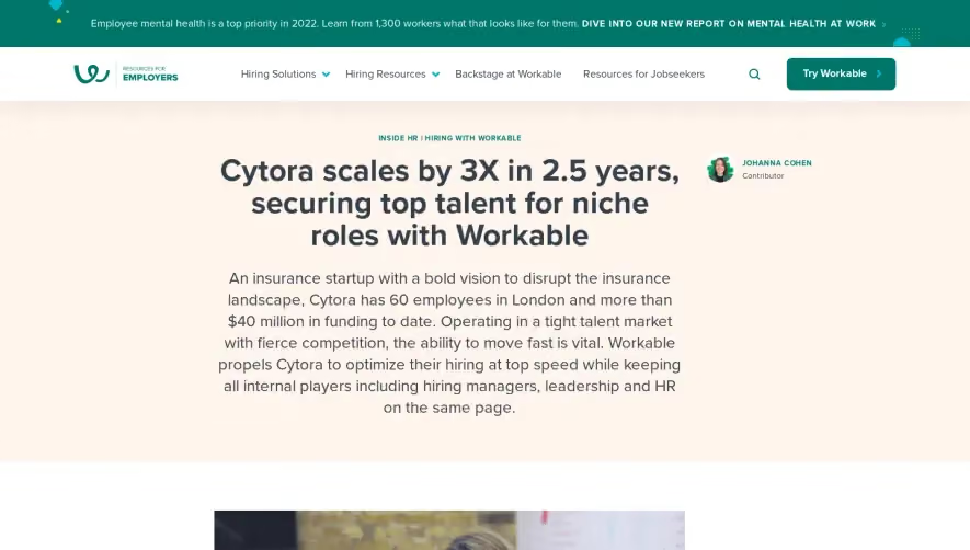
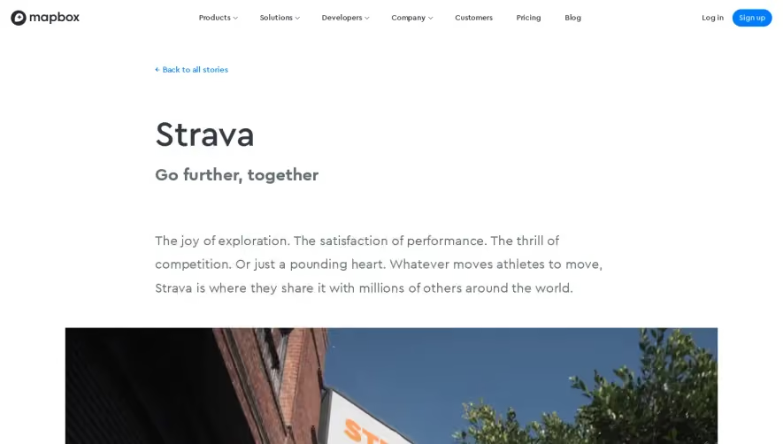
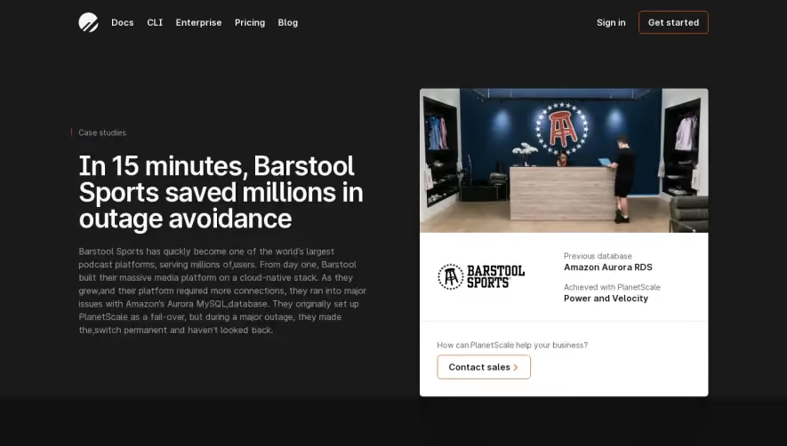
Generate a new design based on this screen using your own content.
Thank you! Your submission has been received!
Oops! Something went wrong while submitting the form.
# Design from Reference: GraphCMS Customer Stories
Create an original, high-fidelity visual design inspired by the reference. Prioritize composition, typography, colors, spacing, and component styling over technical implementation.
## Reference
- **Product:** GraphCMS
- **Category:** Customer Stories
- **Screenshot:** https://cdn.prod.website-files.com/5e9dc792e1210c5325f7ebbc/62ecada072e5af3be7207f8d_1659676671202-5edbfdbfbca2fa3bd9915f95_screencapture-graphcms-case-studies-tropo-case-study-2020-06-06-22_33_24.webp
Analyze the screenshot first. If inaccessible, request it rather than guessing.
## Content
{{content.instructions}}
{{content.data}}
Preserve essential messaging and factual accuracy. Adapt structure and copy length for visual balance; never invent product claims.
## Visual Design
Use this context to reproduce the reference's visual language: layout, typography, colors, spacing, borders, radii, and distinctive elements. The screenshot takes priority if descriptions conflict.
## Direction
{{preferences.fidelityInstructions}}
## Output
{{output.instructions}}
Deliver a polished, cohesive design with precise alignment, hierarchy, and spacing. Produce the requested visual artifact, not just a description. If unsupported, explain the limitation.
The Tropo case study page on GraphCMS radiates a modern, minimalist aesthetic that feels both highly professional and approachable. Ample white space sets a clean stage, allowing content and brand color pops—primarily vibrant teals and blues—to guide attention. The design is understated yet confident, establishing credibility while maintaining visual freshness.
Layout and Structure
A classic, above-the-fold hero section introduces the case study with a concise summary and graphic logo, immediately followed by an organized, stepwise narrative. The flow is linear yet dynamic: alternating background colors and clear content cards guide readers through challenges, solutions, and outcomes. There’s a deliberate absence of clutter; each section is bite-sized, focused, and digestible.
Visual Elements
Minimalist vector icons and subtle illustrations enhance the page without overwhelming. Occasional screenshots and banners add context and visual breaks. Instead of stock imagery, brand-aligned graphics and product visuals create authenticity. Micro-interactions—such as hover effects on links and CTA buttons—add polish and interactivity.
Color Palette and Typography
The color scheme is anchored in a crisp white with strategic use of teal (#05BDBA), steel blue, and slate gray for hierarchy. Bold headings in a modern sans-serif font stand out, while supportive body text remains highly legible. Hierarchy is established with font weight, size, and confident use of headings/subheadings.
User Experience Patterns
Navigation is frictionless, with sticky and visible site-wide navigation and a persistent, high-contrast primary CTA. The page employs progressive disclosure—revealing more content as the user scrolls, keeping engagement high. Scroll-based transitions and highlighted stats direct focus and break up text.
Unique or Notable Design Choices
A standout feature is the seamless blend between Tropo's and GraphCMS's branding, maintained through consistent colors and accent elements. The case study reads like a visual story, making complex outcomes digestible via infographics and modular content blocks. The tone throughout is trustworthy and innovative—an aspirational benchmark for SaaS storytelling design.