Generate a new design based on this screen using your own content.
Thank you! Your submission has been received!
Oops! Something went wrong while submitting the form.
# Design from Reference: GoFundMe Foundraiser Setup
Create an original, high-fidelity visual design inspired by the reference. Prioritize composition, typography, colors, spacing, and component styling over technical implementation.
## Reference
- **Product:** GoFundMe
- **Category:** Account Setup
- **Screenshot:** https://cdn.prod.website-files.com/5e9dc792e1210c5325f7ebbc/6acad5255a5fdf4c30310f30_6acad44b5af75170c4bd08e3_cms-7cfd55628be960c7d0731f5b.webp
Analyze the screenshot first. If inaccessible, request it rather than guessing.
## Content
{{content.instructions}}
{{content.data}}
Preserve essential messaging and factual accuracy. Adapt structure and copy length for visual balance; never invent product claims.
## Visual Design
Use this context to reproduce the reference's visual language: layout, typography, colors, spacing, borders, radii, and distinctive elements. The screenshot takes priority if descriptions conflict.
## Direction
{{preferences.fidelityInstructions}}
## Output
{{output.instructions}}
Deliver a polished, cohesive design with precise alignment, hierarchy, and spacing. Produce the requested visual artifact, not just a description. If unsupported, explain the limitation.
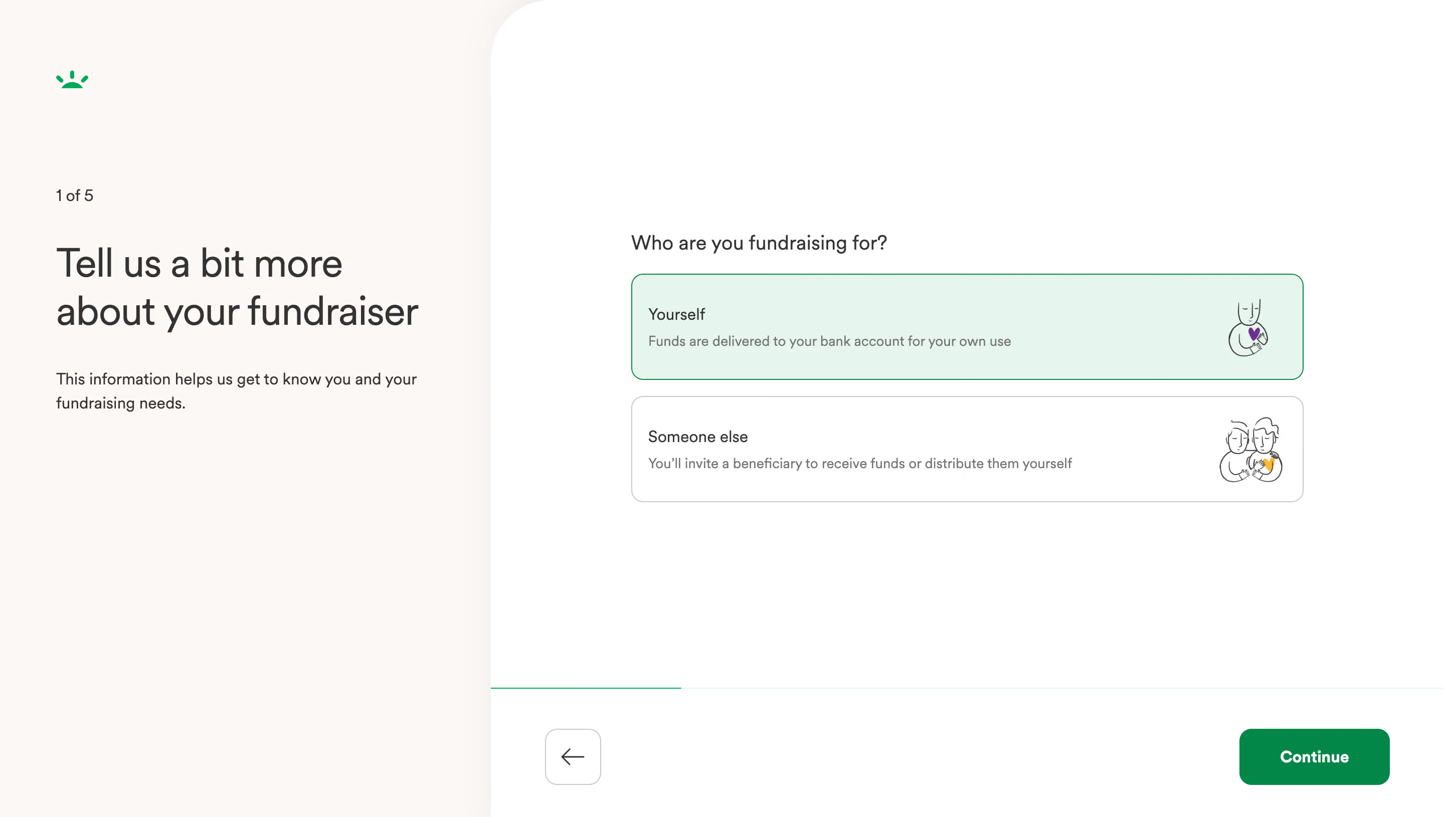
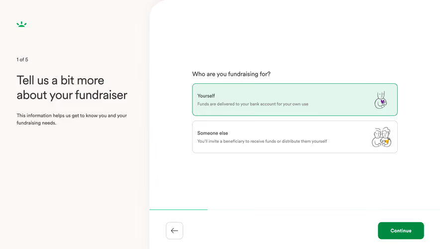
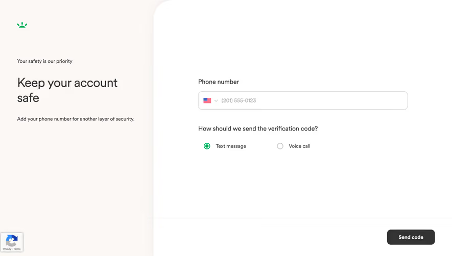
This is GoFundMe's fundraiser setup flow and it's a masterclass in reducing friction. Step 1 of 5. Two options. No clutter. The split layout gives your eye a natural resting point on the left with context, then pulls you right to take action.
Smart Use of Space and Color
The selected "Yourself" card has that soft mint green fill with a green border. It's subtle but immediately communicates state without screaming at you. The unselected "Someone else" card stays neutral with a light gray outline. Dead simple visual hierarchy. The illustrations on each card add personality without feeling childish. They've got this hand-drawn quality with little purple and yellow accents that keep things warm.
Typography That Stays Out of the Way
Big bold heading on the left, smaller helper text underneath. The right side keeps labels tight and descriptions in gray. Nothing fights for attention. That green "Continue" button anchors the bottom right exactly where you expect it. The progress bar is barely visible but it's there. The back arrow sits quietly opposite. Every element knows its job and does it without overdesigning anything.