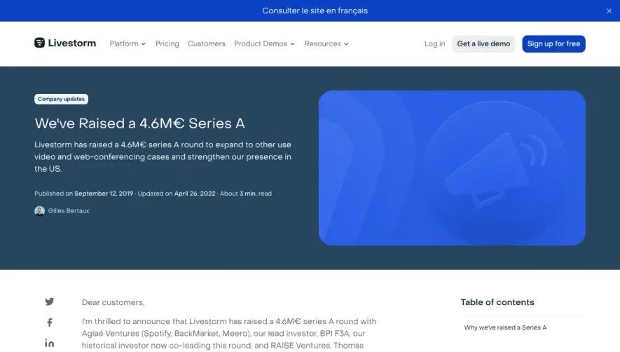
Overall Style and Aesthetic
Front’s Series C announcement page embodies a crisp, modern, and highly professional vibe. The design leverages ample whitespace, allowing content to breathe and guiding the user’s focus to key messages. This minimalist approach is complemented by pops of cheerful, brand-appropriate color, projecting a sense of optimism and innovation without veering into playfulness. Layout and Structure
The layout is thoughtfully linear, leading with a bold hero section that makes a compelling first impression. Headline and subheadline are center-stage, supported by succinct copy and a prominent CTA button. Scrolling downward, readers encounter a flowing narrative segmented by visual breaks—there’s no rigid "features/testimonials/pricing" structure, but instead a storytelling approach that suits a company update. The footer maintains brand alignment and provides essential links without clutter. Visual Elements
Distinctive illustrations—flat, vector-based, and gently animated—reinforce key messages. Custom icons inject subtle personality, while professional photography of team members hints at authenticity and warmth. Occasional animated accents and smooth transitions elevate interactivity, enhancing engagement without distraction. Color Palette and Typography
A fresh palette of white and light grays forms the foundation, enlivened by energetic accents of blue and coral. Headings are set in a bold, geometric sans-serif, establishing a clear hierarchy and ensuring readability, while body text opts for a lighter, softer sans-serif, aligning with the friendly aesthetic. User Experience Patterns
Navigation is streamlined with a sticky header for easy access across the site. CTAs are clear and spaced generously, ensuring they're impossible to miss. Subtle scroll animations guide the user journey, maintaining momentum and attention without overwhelming. Unique or Notable Design Choices
What stands out most is the confident restraint: the page balances storytelling with conversion, using brand visuals and concise copy to build trust. The integration of authentic team imagery, smooth animations, and playful yet refined illustrations cultivates a narrative that’s both approachable and authoritative. The tone feels optimistic and forward-looking, perfectly aligning with the page’s announcement of new growth and possibilities.