
Thank you! Your submission has been received!
Oops! Something went wrong while submitting the form.
Get SaaSFrame Pro
Monthly
$18
Quarterly
$48
Yearly
$180
Upgrade to access this feature
Browse all screens & flows
Filter and search screens & flows
Access Figma files
Access mobile versions
Bookmark screens & flows
Join now
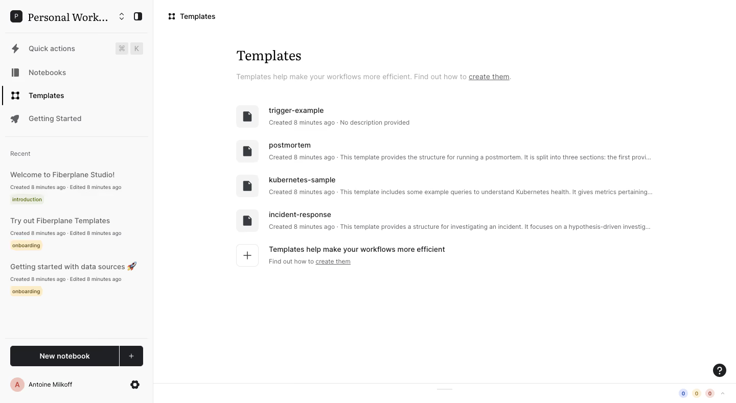
Fiberplane Dashboard

Fiberplane
Collaborative Notebooks for debugging your infrastructure
Designed by
No items found.

Bookmark
Bookmark

Design with AI
Thank you! Your submission has been received!
Oops! Something went wrong while submitting the form.
# Design from Reference: Fiberplane Dashboard
Create an original, high-fidelity visual design inspired by the reference. Prioritize composition, typography, colors, spacing, and component styling over technical implementation.
## Reference
- **Product:** Fiberplane
- **Category:** Dashboard
- **Screenshot:** https://cdn.prod.website-files.com/5e9dc792e1210c5325f7ebbc/6acbca358313d4c6c0cc4050_6acbc82ead8ac5752786b320_cms-14a74efd1ba95af82ba1b1a4.webp
Analyze the screenshot first. If inaccessible, request it rather than guessing.
## Content
{{content.instructions}}
{{content.data}}
Preserve essential messaging and factual accuracy. Adapt structure and copy length for visual balance; never invent product claims.
## Visual Design
### Overall aesthetic
- **Style:** Sparse notebook-workspace interface with a pale-gray sidebar, white canvas and an editorial serif page heading.
- **Character:** Small monochrome icons, compact metadata and muted pastel tags create a quiet productivity-tool presentation.
- **Capture:** The image measures 1440 × 789 image pixels. CSS estimates assume approximately 1:1 capture scale; browser scale and font identities are unverified. The visible view is Templates.
### Page composition
- **Sidebar:** An approximately 300-pixel rail contains workspace identity, primary navigation, recent documents, a lower notebook-creation action and account controls.
- **Main breadcrumb:** A small template icon and page label sit near the top-left of the white content region.
- **Content column:** The main heading begins around x462, y95, followed by a muted explanatory sentence.
- **Template list:** Four document rows show an icon tile, name and metadata/description line.
- **Creation guidance:** A fifth row uses an outlined plus tile and short guidance with an underlined documentation link.
- **Lower utilities:** A help circle sits near the lower right; a thin bottom strip contains small counters and an upward chevron.
### Information hierarchy
- **Current view:** Templates is selected in the sidebar with a black left marker and darker text.
- **Page title:** A large serif heading establishes the main view, while the introduction remains small and muted.
- **Template identity:** Names are darker and larger than creation-time and description metadata.
- **Long descriptions:** Several secondary lines truncate with ellipses rather than increasing row height.
- **Recent documents:** Sidebar entries pair titles, timestamps and small category tags.
- **Primary creation:** The dark New notebook button is the strongest sidebar action, separate from template-creation guidance.
### Typography
- **Heading family:** A serif treatment appears in the main heading and workspace name; exact identity is unverified.
- **UI family:** Navigation, list content and metadata use sans-serif; exact identity is unverified.
- **Main heading:** Approximately 30-pixel CSS size, regular weight, with around 38-pixel line height.
- **Template names:** Approximately 14–15 pixels, regular-to-medium weight.
- **Descriptions:** Approximately 12 pixels with 18-pixel line height, muted gray.
- **Sidebar:** Main links around 14 pixels; recent titles around 14 pixels; timestamps and tags around 10–11 pixels.
- **Button:** New notebook uses approximately 14-pixel semibold white text.
### Colors & surfaces
- **Measured base:** White #FFFFFF fills the main canvas; pale gray #F9F9F9 fills the sidebar.
- **Measured dark:** #1F2023 supports the primary creation control and darker icon/text regions.
- **Measured neutrals:** #F3F3F3 supports icon tiles; #E7E7E7 appears in fine separators.
- **Measured text tones:** #383B40 and #606266 occur in dark and muted interface pixels.
- **Measured tags:** Pale yellow #FCEDCA and subdued green-gray #EDEFE6 distinguish recent-document categories.
- **Depth:** The screen is flat, using rules, fills and selection indicators rather than shadows.
### Components
- **Workspace selector:** A dark initial tile, truncated serif workspace name and small controls share the sidebar header.
- **Quick actions:** A lightning icon and two keyboard-key badges indicate a command shortcut.
- **Selected navigation:** Templates has a thin vertical black marker at the rail's left edge.
- **Recent entries:** Three unboxed document groups each include title, creation/edit metadata and a small rounded tag.
- **Template rows:** Approximately 68-pixel vertical cadence, with 44 × 44-pixel pale icon tiles and two-line text groups.
- **Document icons:** Dark file silhouettes sit centrally in the neutral tiles.
- **Guidance row:** A white outlined 44-pixel square contains a plus, beside explanatory text and a create-them link.
- **Notebook action:** A roughly 260 × 40-pixel dark split control combines a wide label area and a narrow plus segment.
- **Account row:** A small circular initial avatar, account name and settings gear sit at the sidebar bottom.
- **Help and counters:** A dark circular question mark and tiny colored numbered badges remain peripheral.
- **State scope:** No template is open, and no creation dialog or command menu is shown.
### Visual rhythm
- **Sidebar divisions:** Horizontal rules separate navigation, recent content and bottom actions.
- **Main inset:** A broad approximately 162-pixel gap separates the rail edge from the content column.
- **List cadence:** Equal icon sizes and consistent row spacing keep template names aligned.
- **Whitespace:** The short list occupies the upper half, leaving a large empty lower canvas.
- **Text density:** Compact metadata lines contrast with the larger serif title and broad margins.
### Responsive
- **Recommendation — sidebar:** Collapse the rail when space is limited while retaining current-view context.
- **Recommendation — content:** Reduce the large left inset and use fluid gutters.
- **Recommendation — rows:** Preserve template names and allow descriptions to wrap or truncate deliberately.
- **Recommendation — creation:** Keep notebook and template creation routes distinguishable and reachable.
- **Recommendation — utilities:** Prevent bottom counters and help controls from overlapping content. No mobile view is evidenced.
### Adaptation guidance
- **Preserve the visible view:** Reuse the template-list structure rather than inferring charts or dashboard metrics from the record title.
- **Keep hierarchy light:** Use name, metadata and icon consistently without enclosing every row in a card.
- **Reuse editorial contrast:** Pair a serif page heading with compact sans-serif controls if matching this identity.
- **Maintain contextual recents:** Keep category tags and timestamps subordinate to document titles.
- **Define interactions separately:** Template opening, creation and command-menu behavior are not shown.
- **Keep empty space intentional:** Avoid adding unsupported widgets to fill the blank lower area.
Use this context to reproduce the reference's visual language: layout, typography, colors, spacing, borders, radii, and distinctive elements. The screenshot takes priority if descriptions conflict.
## Direction
{{preferences.fidelityInstructions}}
## Output
{{output.instructions}}
Deliver a polished, cohesive design with precise alignment, hierarchy, and spacing. Produce the requested visual artifact, not just a description. If unsupported, explain the limitation.


Category
Patterns
Tech Stack


Added on
February 4, 2023
Similar screens
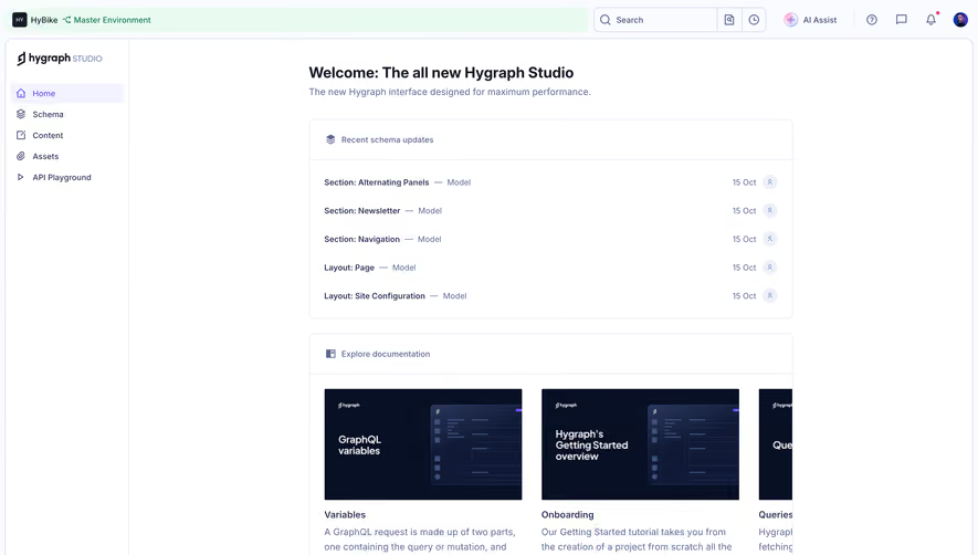




Upgrade to SaaSFrame Pro now to see similar examples.
Monthly
$18 /month
Billed $18 monthly
Browse all screens & flows
Filter and search screens & flows
Search text in screenshots
Access Figma files
Access mobile versions
Join now
Quarterly
$16 /month
Billed $48 quarterly
Browse all screens & flows
Filter and search screens & flows
Search text in screenshots
Access Figma files
Access mobile versions
Join now
Yearly
$15 /month
Billed $180 yearly
Browse all screens & flows
Filter and search screens & flows
Search text in screenshots
Access Figma files
Access mobile versions
Join now