Design with AI
Generate a new design based on this screen using your own content.
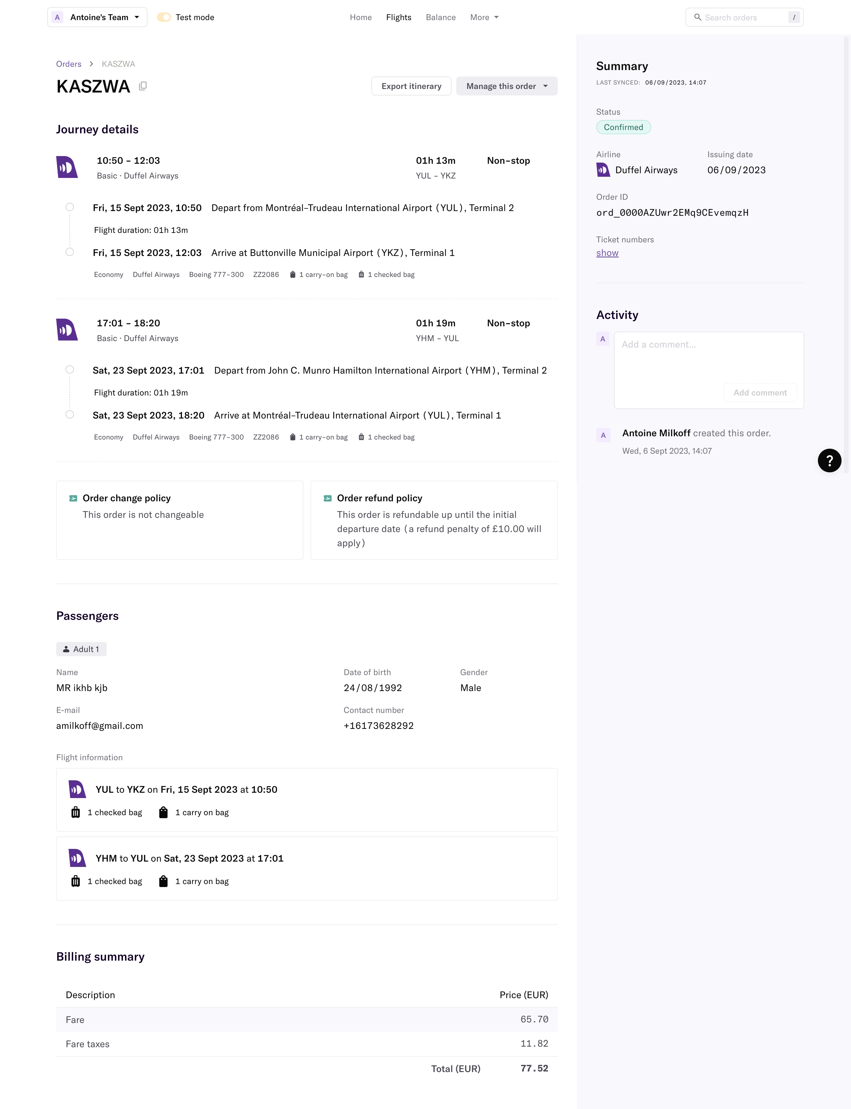
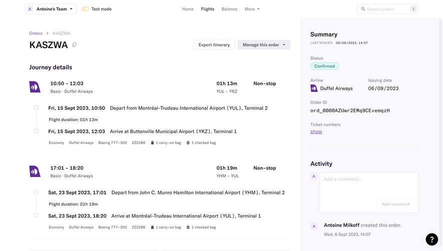
# Design from Reference: Duffel Order Confirmation
Create an original, high-fidelity visual design inspired by the reference. Prioritize composition, typography, colors, spacing, and component styling over technical implementation.
## Reference
- **Product:** Duffel
- **Category:** Add & Edit
- **Screenshot:** https://cdn.prod.website-files.com/5e9dc792e1210c5325f7ebbc/6acadb79494a081980ea090b_6acada973ce5f4104ebff8dc_cms-15ce71b38bfdf6df11ca9310.webp
Analyze the screenshot first. If inaccessible, request it rather than guessing.
## Content
{{content.instructions}}
{{content.data}}
Preserve essential messaging and factual accuracy. Adapt structure and copy length for visual balance; never invent product claims.
## Visual Design
### Overall aesthetic
- **Character:** Precise travel-order detail interface with generous white space, pale lavender summary rail and purple airline accents.
### Page composition
- **Canvas:** 2880 × 3752 screenshot pixels; CSS estimates assume approximately 2× capture scale.
- **Structure:** Thin global header; broad left order-detail column and right summary/activity rail occupying about one-third of the width.
- **Sequence:** Order heading/actions, two journey segments, policy cards, passenger details, baggage/flight cards and billing table.
### Information hierarchy
- **Priority:** Order reference and confirmed status establish context. Flight times/routes are emphasized above supporting airport and baggage data.
- **Support:** Summary metadata and comment/activity controls remain grouped in the right rail.
### Typography
- **Family:** Neutral sans-serif with tabular/monospace treatment for identifiers; exact font is unverified.
- **Scale:** Estimated CSS order title 28–30px, section headings 18–20px, body 15–16px and metadata 12–13px.
### Colors & surfaces
- **Sampled palette:** White #FFFFFF; pale rail #F9F8FC; subtle fills #EDEDF2; near-black #09090A; muted copy #4B4B56; purple #612B96; borders #E2E2E7.
- **Status:** Confirmed appears in a small pale-teal outlined pill.
### Components
- **Journey blocks:** Airline icon, aligned time/duration/stops row and vertical dotted departure/arrival timeline.
- **Details:** Two outlined policy cards, structured passenger label/value grid, baggage cards and a right-aligned total in the billing table.
- **Geometry:** Estimated 4px radii, 1px borders and 24–32px section gaps; action buttons are compact outlined/soft-filled rectangles.
### Visual rhythm
- **Spacing:** Broad horizontal rules and consistent left edges divide a long information-rich page.
- **Density:** Large journey blocks contrast with compact summary metadata.
### Responsive
- **Guidance:** Mobile is not shown. Stack summary above or below journey details, wrap airport lines and retain aligned amounts in billing.
### Adaptation guidance
- **Transfer:** Preserve the itinerary timeline, status rail and structured booking metadata. Use target order fields and policies; avoid carrying over personal passenger data.
Use this context to reproduce the reference's visual language: layout, typography, colors, spacing, borders, radii, and distinctive elements. The screenshot takes priority if descriptions conflict.
## Direction
{{preferences.fidelityInstructions}}
## Output
{{output.instructions}}
Deliver a polished, cohesive design with precise alignment, hierarchy, and spacing. Produce the requested visual artifact, not just a description. If unsupported, explain the limitation.