Design with AI
Generate a new design based on this screen using your own content.
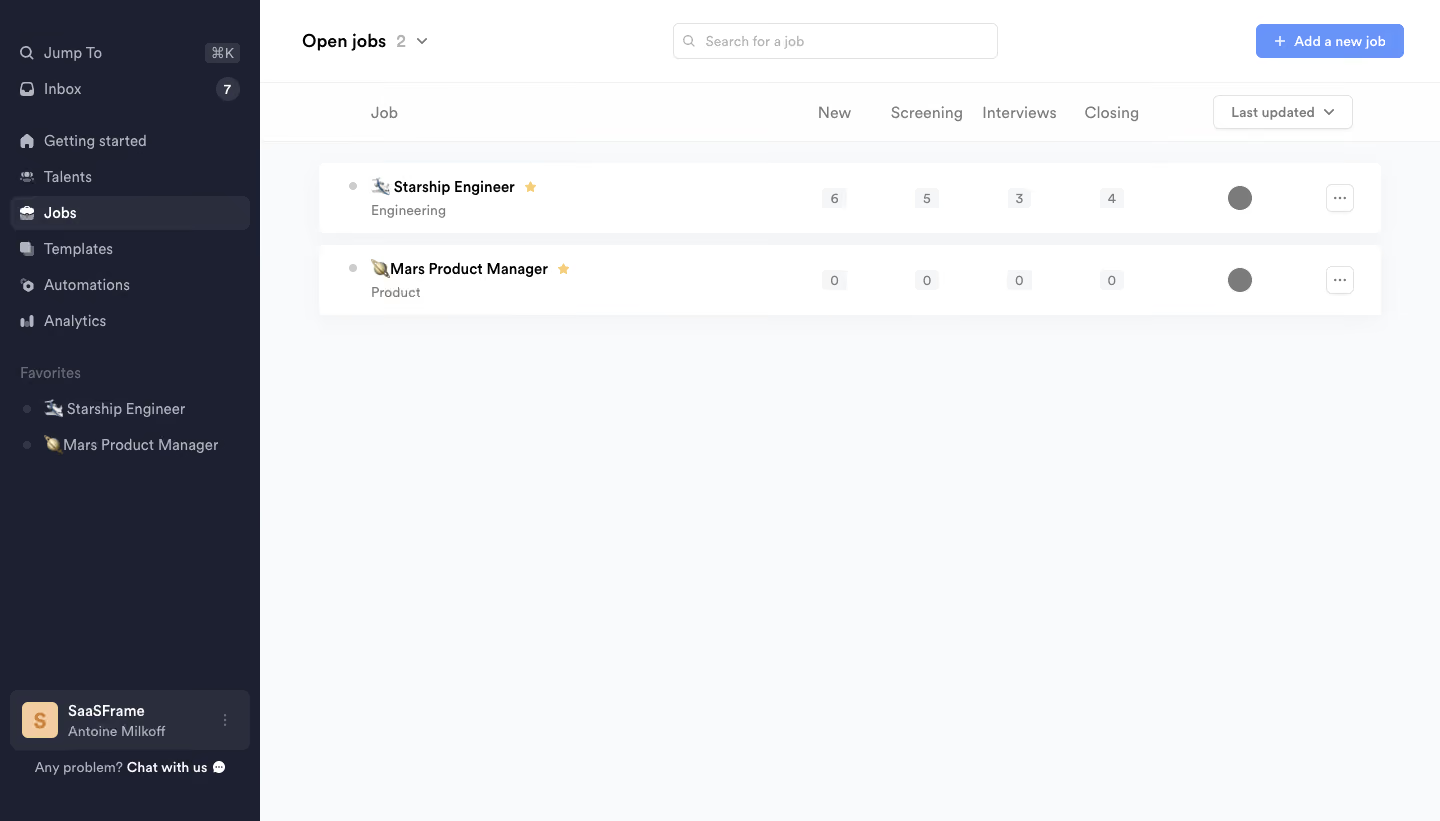
# Design from Reference: Crew Open jobs
Create an original, high-fidelity visual design inspired by the reference. Prioritize composition, typography, colors, spacing, and component styling over technical implementation.
## Reference
- **Product:** Crew
- **Category:** Dashboard
- **Screenshot:** https://cdn.prod.website-files.com/5e9dc792e1210c5325f7ebbc/6acbbda8d6be908889c4e6f3_6acbbcdc2f4f4a795437ed95_cms-57b3f4b91c35d9c033308850.webp
Analyze the screenshot first. If inaccessible, request it rather than guessing.
## Content
{{content.instructions}}
{{content.data}}
Preserve essential messaging and factual accuracy. Adapt structure and copy length for visual balance; never invent product claims.
## Visual Design
### Overall aesthetic
- **Character:** Compact recruiting workspace with a dark sidebar and pale, low-density job list.
### Page composition
- **Canvas:** 1440 × 821 screenshot pixels. Approximately 260 px sidebar contains navigation, favorites, and bottom workspace identity. Main header holds job count, search, and Add a new job; two job rows sit below stage headings.
### Information hierarchy
- **Priority:** Active Jobs navigation and the top-right blue creation action orient the screen. Bold job names lead each row, followed by department, stage counts, assignee avatar, and overflow action.
### Typography
- **Scale:** Approximate screenshot sizes: title 18 px, job names 14 px semibold, navigation/body 14 px, metadata 12 px. Sans serif family and CSS scale are unverified.
### Colors & surfaces
- **Palette:** Sampled sRGB sidebar #1D2030, selected surface #2A2D3C, main canvas #F9FAFB, and white #FFFFFF rows. Periwinkle-blue creation action supplies the main accent.
### Components
- **Details:** White job cards about 70 screenshot px high have subtle shadow and 5–6 px corners. Small gray count chips align under New, Screening, Interviews, and Closing. Emoji, star favorites, circular avatars, and outlined ellipsis buttons personalize rows.
### Visual rhythm
- **Spacing:** Main list uses approximately 60 px horizontal inset, 12 px row gaps, and abundant empty space below the two entries.
### Responsive
- **Adaptation:** Mobile is not shown. Collapse the sidebar and scroll pipeline columns horizontally or reveal stage totals within each job card.
### Adaptation guidance
- **Transfer:** Keep job identity visually dominant and stage counts strictly aligned. Replace sample roles, departments, favorites, and candidate totals with real data.
Use this context to reproduce the reference's visual language: layout, typography, colors, spacing, borders, radii, and distinctive elements. The screenshot takes priority if descriptions conflict.
## Direction
{{preferences.fidelityInstructions}}
## Output
{{output.instructions}}
Deliver a polished, cohesive design with precise alignment, hierarchy, and spacing. Produce the requested visual artifact, not just a description. If unsupported, explain the limitation.