Design with AI
Generate a new design based on this screen using your own content.
# Design from Reference: Coherence Account Setup
Create an original, high-fidelity visual design inspired by the reference. Prioritize composition, typography, colors, spacing, and component styling over technical implementation.
## Reference
- **Product:** Coherence
- **Category:** Account Setup
- **Screenshot:** https://cdn.prod.website-files.com/5e9dc792e1210c5325f7ebbc/6acb72b9018523cfee2da197_6acb703bf56587432a47b015_cms-a98f5268d3670364c012e5e5.webp
Analyze the screenshot first. If inaccessible, request it rather than guessing.
## Content
{{content.instructions}}
{{content.data}}
Preserve essential messaging and factual accuracy. Adapt structure and copy length for visual balance; never invent product claims.
## Visual Design
### Overall aesthetic
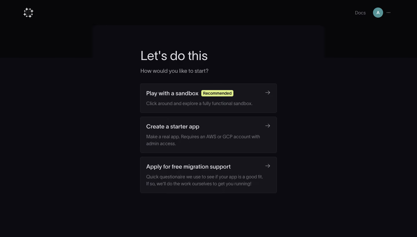
- **Character:** A dark onboarding choice screen uses nearly black layered surfaces, soft gray typography and three outlined option cards.
- **Accent restraint:** A pale yellow-green recommendation badge and teal avatar provide the only notable color accents.
### Page composition
- **Capture:** The source measures 1440 × 821 image pixels. Observed dimensions below approximate CSS only under an unverified 1× capture assumption.
- **Header:** A small geometric white brand mark sits at the upper left; Docs, a circular avatar and an overflow icon align at the upper right.
- **Main surface:** A broad rounded-top central surface rises into the darker header region. A roughly 470 px wide content column sits around x=485.
- **Choice stack:** A large introductory heading and short question precede three vertically stacked option cards: sandbox exploration, starter-app creation and migration support.
### Information hierarchy
- **Opening:** A large regular-weight heading leads into a smaller muted question.
- **Options:** Each card contains a semibold title, muted explanation and right arrow. The first option carries a Recommended badge.
- **Supporting differences:** The second and third descriptions wrap to two lines, making their cards taller than the first.
- **Navigation:** Header utilities remain subdued and peripheral to the central choice task.
### Typography
- **Family:** A neutral sans serif is visible throughout; exact font identity is unverified.
- **Main heading:** Approximately 44 px, regular, with around 52 px line height.
- **Question and card titles:** Approximately 20 px; titles use medium/semibold weight while the question is muted.
- **Descriptions:** Approximately 16 px with 24 px leading. The recommendation badge uses smaller bold dark text.
### Colors & surfaces
- **Measured layers:** ICC-aware sRGB sampling yields #070609 for the upper background, #0B0B10 for the main surface and #15151A for option cards.
- **Measured borders/text:** #24232B defines subtle card edges; light text includes #DEDDE3 and muted text #73707B.
- **Measured accents:** The recommendation badge uses #DFEC8B; the avatar uses teal #5A9397.
- **Depth:** Surface differences and thin borders establish layering without prominent shadows.
### Components
- **Option cards:** Approximately 470 px wide, with 20 px padding, 5–6 px corners and thin dark-gray borders. Heights range from roughly 100 to 125 px depending on copy.
- **Directional affordance:** A small gray right arrow sits near each card's upper-right corner, aligned with the title.
- **Recommendation badge:** A compact light yellow-green rectangle with subtly rounded corners appears inline after the first title.
- **Header utilities:** A text documentation link, circular initial avatar and three-dot menu form a compact right-side group.
### Visual rhythm
- **Stack cadence:** Approximately 14 px gaps separate the cards, while larger spacing distinguishes the opening copy from the choices.
- **Alignment:** Heading, question and cards share the same left edge. Card descriptions align below their titles with consistent inset.
- **Whitespace:** Broad dark margins frame the narrow central column, keeping attention on the three paths.
### Responsive
- **Evidence boundary:** Only a desktop state is shown; responsive behaviors are recommendations.
- **Fluid column:** Let the content column fill mobile width within safe gutters, keeping cards stacked.
- **Title wrapping:** Allow long option titles and the recommendation badge to wrap without colliding with the right arrow.
- **Header simplification:** Preserve documentation and account access through compact accessible controls.
### Adaptation guidance
- **Choice architecture:** Use a short set of clearly differentiated starting paths, with one visibly recommended option.
- **Flexible cards:** Let content determine card height rather than truncating explanations.
- **Dark-theme accessibility:** Validate muted-text and border contrast on real displays and add a clear keyboard-focus state.
- **State boundaries:** No selected, hover or destination state is visible; define those separately without inferring behavior from the screenshot.
- **Scale calibration:** Confirm the assumed 1× capture scale before assigning CSS dimensions.
Use this context to reproduce the reference's visual language: layout, typography, colors, spacing, borders, radii, and distinctive elements. The screenshot takes priority if descriptions conflict.
## Direction
{{preferences.fidelityInstructions}}
## Output
{{output.instructions}}
Deliver a polished, cohesive design with precise alignment, hierarchy, and spacing. Produce the requested visual artifact, not just a description. If unsupported, explain the limitation.