
Thank you! Your submission has been received!
Oops! Something went wrong while submitting the form.
Get SaaSFrame Pro
Monthly
$18
Quarterly
$48
Yearly
$180
Upgrade to access this feature
Browse all screens & flows
Filter and search screens & flows
Access Figma files
Access mobile versions
Bookmark screens & flows
Join now

Shortcut lubhouse Welcome Email

Shortcut
Project Management for Software Teams
Designed by
No items found.

Bookmark
Bookmark

Design with AI
Thank you! Your submission has been received!
Oops! Something went wrong while submitting the form.
# Design from Reference: Shortcut lubhouse Welcome Email
Create an original, high-fidelity visual design inspired by the reference. Prioritize composition, typography, colors, spacing, and component styling over technical implementation.
## Reference
- **Product:** Shortcut
- **Category:** Welcome Email
- **Screenshot:** https://cdn.prod.website-files.com/5e9dc792e1210c5325f7ebbc/62ecad9608e2d80d602a7277_1659676540331-5ef879268e35e49f3fd3c75b_screencapture-mail-google-mail-u-3-2020-06-28-13_03_04.webp
Analyze the screenshot first. If inaccessible, request it rather than guessing.
## Content
{{content.instructions}}
{{content.data}}
Preserve essential messaging and factual accuracy. Adapt structure and copy length for visual balance; never invent product claims.
## Visual Design
### Overall aesthetic
- **Character:** A structured welcome email uses a pale gray surround, white content panels and a purple brand/action system.
- **Illustration style:** Fine gray line drawings with purple and small multicolor accents make the onboarding steps friendly and approachable.
### Page composition
- **Capture:** The source measures 1312 × 1790 image pixels. Email CSS scale and device-pixel ratio are unverified; dimensions below describe source pixels.
- **Frame:** A centered roughly 750 px wide column begins with a large purple Clubhouse wordmark.
- **Main panel:** A white rounded rectangle contains centered welcome copy, a wide desk/computer illustration, three icon-led onboarding rows and a centered Get Started button.
- **Lower panels:** Two equal white cards sit side by side beneath the main panel, promoting referral and community participation.
- **Content identity:** The visible branding is Clubhouse; the description follows that captured state rather than assuming a newer product identity.
### Information hierarchy
- **Welcome:** A bold centered headline introduces a three-step setup sequence, followed by two short supporting lines.
- **Steps:** Each row pairs a small illustration with a bold title, short explanation and purple Learn more link.
- **Primary action:** A broad purple Get Started button closes the main panel.
- **Secondary routes:** Referral and Slack cards use centered icons/headings and quieter explanatory copy.
### Typography
- **Family:** A conventional sans serif is visible; exact identity is unverified.
- **Headline:** Approximately 30 px in the source, bold, with compact leading.
- **Step titles:** Approximately 21–22 px and bold.
- **Body:** Approximately 18 px with 30 px line height, using medium gray.
- **Links/actions:** Purple links are bold; the primary button label is white and centered.
### Colors & surfaces
- **Measured foundation:** ICC-aware sRGB sampling yields #F6F6F6, near-white #FEFEFE and white #FFFFFF.
- **Measured accent:** Purple #6A46DD appears in the brand and primary action.
- **Dividers:** Pale gray #EFEFEF separates onboarding rows.
- **Illustration palette:** Gray outlines combine with purple fills, green checkmarks and small red/yellow/blue details.
- **Contrast:** Dark headings and medium-gray body copy sit on white panels without heavy shadows.
### Components
- **Main email panel:** A broad white rectangle with subtly rounded corners uses generous inner padding.
- **Hero illustration:** A desktop scene contains a monitor, three task cards, desk accessories and faint background objects.
- **Step rows:** Three horizontal icon/text units have consistent left icon columns and thin separators.
- **Primary button:** A roughly 280 × 62 source px purple rectangle has small corners and substantial white space around it.
- **Secondary cards:** Two equal panels contain a gift icon or Slack mark, centered heading, paragraph and inline purple link.
### Visual rhythm
- **Top centering:** Wordmark, welcome copy and hero illustration establish a symmetrical opening.
- **Step cadence:** Repeated icon/title/body/link rows create a clear three-part rhythm.
- **Section separation:** Fine rules and generous vertical padding distinguish steps without separate card backgrounds.
- **Closing shift:** The layout changes from one broad panel to two smaller cards, marking secondary content.
### Responsive
- **Evidence boundary:** Only one email capture is shown; responsive behaviors are recommendations.
- **Fluid column:** Reduce side gutters on mobile while retaining readable body text.
- **Step layout:** Keep icons beside text where space permits, otherwise stack them with clear association.
- **Secondary panels:** Stack referral/community cards on narrow clients and preserve comfortable link/button targets.
### Adaptation guidance
- **Activation sequence:** Reuse three concrete setup tasks with concise explanations and optional deeper links.
- **Email resilience:** Keep text live, provide illustration alternatives and test panel/row layouts across common email clients.
- **Action hierarchy:** Preserve one prominent continuation button and quieter secondary routes.
- **Content separation:** Treat brand identity, feature names and community links as captured content rather than current product facts.
- **Measurement boundary:** Validate image scale before mapping source pixels to email CSS.
Use this context to reproduce the reference's visual language: layout, typography, colors, spacing, borders, radii, and distinctive elements. The screenshot takes priority if descriptions conflict.
## Direction
{{preferences.fidelityInstructions}}
## Output
{{output.instructions}}
Deliver a polished, cohesive design with precise alignment, hierarchy, and spacing. Produce the requested visual artifact, not just a description. If unsupported, explain the limitation.


Category
Patterns
No items found.
Tech Stack

Added on
June 28, 2020
Similar screens



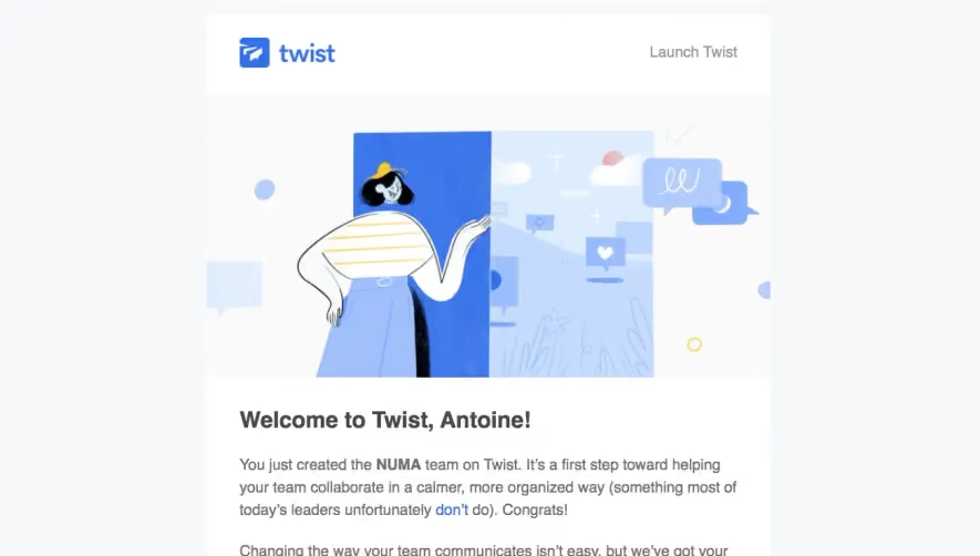


Upgrade to SaaSFrame Pro now to see similar examples.
Monthly
$18 /month
Billed $18 monthly
Browse all screens & flows
Filter and search screens & flows
Search text in screenshots
Access Figma files
Access mobile versions
Join now
Quarterly
$16 /month
Billed $48 quarterly
Browse all screens & flows
Filter and search screens & flows
Search text in screenshots
Access Figma files
Access mobile versions
Join now
Yearly
$15 /month
Billed $180 yearly
Browse all screens & flows
Filter and search screens & flows
Search text in screenshots
Access Figma files
Access mobile versions
Join now