Minimalist, Trustworthy Aesthetic
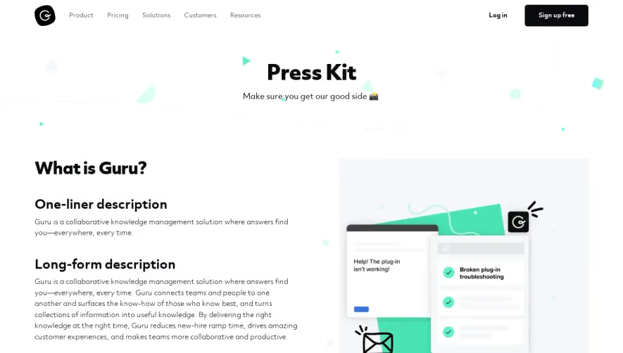
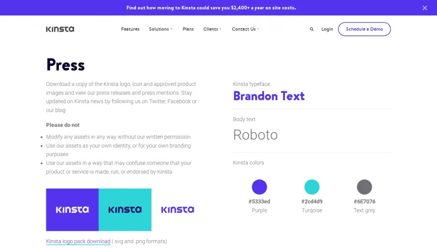
Clearbit’s Press page exemplifies a clean, modern SaaS aesthetic. It’s driven by a minimalist ethos—ample white space, crisp alignment, and restrained visual accents make the content approachable and professional. The overall look feels both friendly and credible, perfect for press and media visitors seeking clear, reliable information. Simple, Logical Layout
This page forgoes flashy hero banners or feature showcases in favor of directness. The structure starts with a clear headline, concise explanatory text, and immediately accessible downloadable assets—logos, company descriptions, and founder bios. Content is vertically stacked, segmenting information with clear headings and dividing lines, encouraging fast scanning and comprehension. Visual Elements and Branding
Logo downloads are presented as prominent visual blocks, using both light and dark versions to communicate brand versatility. There are no distracting animations or excessive imagery—iconography is purposeful and scaled perfectly for sharpness and quick recognition. The visual approach is about utility, clarity, and seamless asset delivery. Color Palette & Typography
Clearbit’s signature blue—a fresh, calming hue—anchors the page, contrasted with dark gray and strategic splashes of accent color in call-to-action buttons. Typography is sans-serif, with bold headers and legible body text creating a strong hierarchy and effortless readability. User Experience Patterns & Unique Touches
Navigation remains consistent with the broader site, and sticky menus allow easy return to the homepage. Download buttons are visually distinct, inviting confident interaction. The elegant absence of forms or unnecessary steps means visitors can instantly grab assets—one-click simplicity that aligns with media needs. The tone stays factual, approachable, and innovative, balancing accessibility and authority for an enjoyable press resource experience.