Design with AI
Generate a new design based on this screen using your own content.
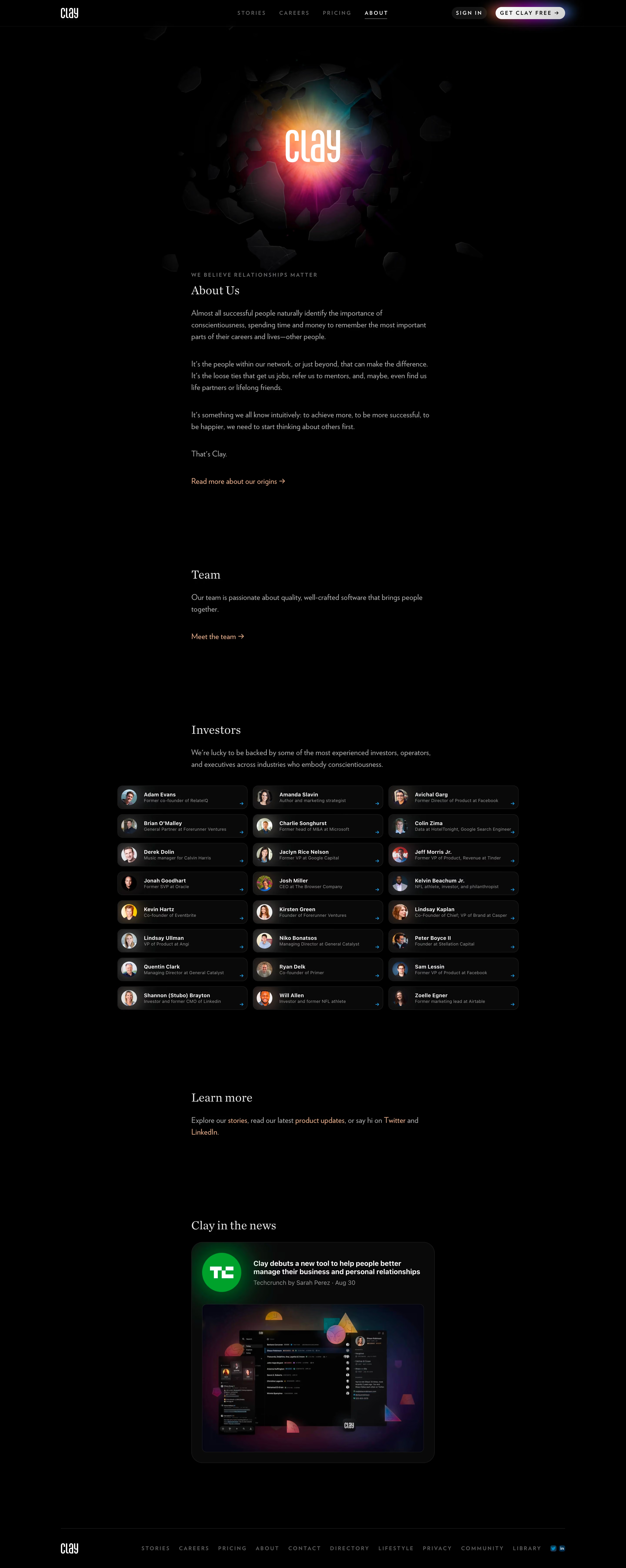
# Design from Reference: Clay About Page
Create an original, high-fidelity visual design inspired by the reference. Prioritize composition, typography, colors, spacing, and component styling over technical implementation.
## Reference
- **Product:** Clay
- **Category:** About Page
- **Screenshot:** https://cdn.prod.website-files.com/5e9dc792e1210c5325f7ebbc/6acb698e5e515b69c7964d70_6acb672cb79140e81e497e74_cms-0ca2c6e8f2634b04ba8bdaf5.webp
Analyze the screenshot first. If inaccessible, request it rather than guessing.
## Content
{{content.instructions}}
{{content.data}}
Preserve essential messaging and factual accuracy. Adapt structure and copy length for visual balance; never invent product claims.
## Visual Design
### Overall aesthetic
- **Character:** Cinematic black company page, mixing a luminous 3D brand hero with restrained serif editorial headings.
### Page composition
- **Canvas:** 2880 × 7214 screenshot px; CSS estimates assume 2× capture.
- **Sequence:** Sparse tracked navigation; glowing Clay wordmark among dark fractured shapes; narrow About prose; Team link; investor grid; Learn more; large news card; compact footer.
### Information hierarchy
- **Priority:** Luminous hero leads; understated serif section titles and warm text links guide the rest. Investor cards expand beyond the narrow prose width.
### Typography
- **Family:** Elegant serif headings paired with humanist sans serif body and widely tracked uppercase navigation; exact families unverified.
- **Scale:** Estimated CSS section headings 28 px, body 16–18 px and nav 11–12 px; hero wordmark is graphic typography.
### Colors & surfaces
- **Sampled palette:** Black #000000, card #090A0A and subtle border/surface #1B1C1C; white #FFFFFF highlights.
- **Accents:** Hero glow blends amber, magenta, cyan and violet; warm amber inline links and small cyan investor arrows.
### Components
- **Investor grid:** Three columns of compact dark rounded capsules, circular portraits, bold names, muted roles and trailing arrows.
- **News:** Large rounded near-black card with publication logo/glow, headline/metadata and inset product artwork.
- **Geometry:** Estimated CSS prose width 560 px, investor grid approximately 920 px, card radii 12–24 px; navigation CTA is a glowing white pill.
### Visual rhythm
- **Spacing:** Approximately 140–200 CSS px between editorial sections; narrow text blocks and large black margins create a deliberate slow pace.
### Responsive
- **Observed:** Desktop only.
- **Adaptation:** Reduce black gaps, stack investor cards and scale the hero without losing brand focus; retain sufficient muted-text contrast.
### Adaptation guidance
- **Preserve:** Black editorial canvas, serif/sans contrast and selective luminous accents.
- **Replace:** Use original brand artwork, authorized portraits and actual company/news information.
Use this context to reproduce the reference's visual language: layout, typography, colors, spacing, borders, radii, and distinctive elements. The screenshot takes priority if descriptions conflict.
## Direction
{{preferences.fidelityInstructions}}
## Output
{{output.instructions}}
Deliver a polished, cohesive design with precise alignment, hierarchy, and spacing. Produce the requested visual artifact, not just a description. If unsupported, explain the limitation.