
Thank you! Your submission has been received!
Oops! Something went wrong while submitting the form.
Get SaaSFrame Pro
Monthly
$18
Quarterly
$48
Yearly
$180
Upgrade to access this feature
Browse all screens & flows
Filter and search screens & flows
Access Figma files
Access mobile versions
Bookmark screens & flows
Join now
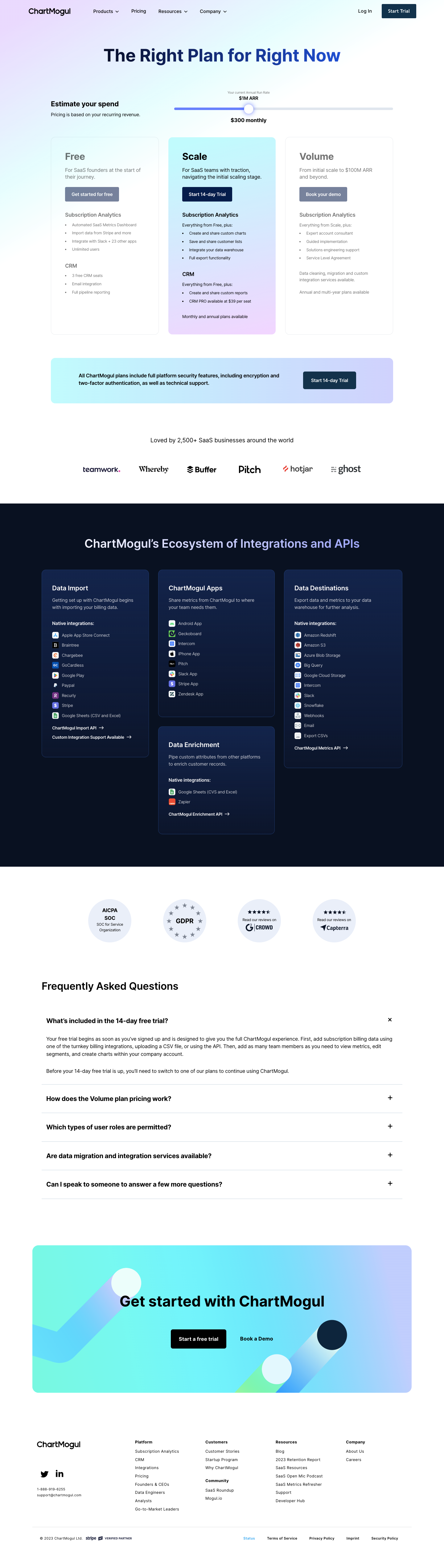

ChartMogul Pricing Page

ChartMogul
Subscription Analytics Platform for growing SaaS businesses
Designed by
No items found.

Bookmark
Bookmark

Design with AI
Thank you! Your submission has been received!
Oops! Something went wrong while submitting the form.
# Design from Reference: ChartMogul Pricing Page
Create an original, high-fidelity visual design inspired by the reference. Prioritize composition, typography, colors, spacing, and component styling over technical implementation.
## Reference
- **Product:** ChartMogul
- **Category:** Pricing Page
- **Screenshot:** https://cdn.prod.website-files.com/5e9dc792e1210c5325f7ebbc/6acb6c115391d62536b671a5_6acb6a9b2837b9f3168ecdba_cms-78e77dae4a149240e7cbc3eb.webp
Analyze the screenshot first. If inaccessible, request it rather than guessing.
## Content
{{content.instructions}}
{{content.data}}
Preserve essential messaging and factual accuracy. Adapt structure and copy length for visual balance; never invent product claims.
## Visual Design
### Overall aesthetic
- **Character:** A pricing page blends cool pastel gradients, dark navy actions and a sharply contrasting integrations section.
- **Capture evidence:** The image measures 1440 × 5073 pixels and was inspected in four portions through the footer. Approximate dimensions are image pixels; near-1× CSS scale is estimated.
- **Tone:** Clear plan cards and an interactive-looking revenue estimator create a measured business-product presentation.
### Page composition
- **Navigation:** Brand and menu links align left; login and a dark trial action align right.
- **Hero:** A large centered gradient-colored headline sits above an estimator with explanatory text left and a long slider right.
- **Plans:** Three equal-width cards present Free, Scale and Volume; Scale has a pastel gradient fill while neighboring cards appear muted.
- **Supporting proof:** A broad security/trial banner and customer-logo row follow the plan cards.
- **Integrations:** A full-width near-black region contains a heading and three columns of outlined dark cards, with the middle column split into two stacked groups.
- **Lower content:** Four circular trust/review badges precede a five-item FAQ; the first answer is expanded.
- **Closing:** A large gradient conversion panel sits above a white multi-column footer and legal row.
### Information hierarchy
- **Estimator:** A current revenue value appears above the slider thumb and a monthly price below; values are captured content, not current verified pricing.
- **Plan emphasis:** Scale has dark text and a dark action on a colored background, contrasting with muted neighboring cards.
- **Feature grouping:** Subscription Analytics and CRM headings divide plan details.
- **Integration taxonomy:** Data Import, Apps, Data Enrichment and Data Destinations are separate titled groups with icons and short link lists.
- **FAQ state:** The first question shows visible paragraphs and a close-style icon; later questions show plus icons and no visible answer.
- **Final conversion:** A centered headline and trial/demo pair repeat the two commercial paths.
### Typography
- **Family:** A clean sans-serif is visible; exact identity is unverified.
- **Hero heading:** Approximately 56px bold with 64px line-height and slightly tight tracking.
- **Plan names:** Approximately 32px bold; plan summaries around 16px with 23px line-height.
- **Feature lists:** Approximately 13–14px with 26px row cadence.
- **Section headings:** Integrations and conversion headings are around 40–48px; FAQ heading around 34px.
- **FAQ text:** Questions are approximately 21px bold, answers around 16px with 24px line-height.
- **Footer:** Small 12–14px links use compact line-height and slightly open tracking.
### Colors & surfaces
- **Base:** Sampled #FFFFFF supplies the pricing and FAQ regions.
- **Dark region:** Sampled #0A1220 supplies the integrations-section background.
- **Card gradients:** Sampled #101F3B, #10203C and #11213D contribute to dark blue integration panels.
- **Pale badges:** Sampled #EBEFF9 supplies circular trust/review backings.
- **Pastel palette:** Cyan, pale mint, blue and lavender blend in the hero, highlighted plan and conversion panels.
- **Text contrast:** Black/navy dominates light surfaces; white headings and blue-gray descriptions sit on the dark integration cards.
### Components
- **Revenue slider:** A long thin pale track has a blue filled portion and large white circular thumb with a soft blue glow.
- **Plan cards:** Approximately 350px wide and 640px tall, with around 14px radii, generous 44px padding and thin pale borders on unhighlighted cards.
- **Plan actions:** Compact dark or muted rectangular buttons use small radii and white semibold text.
- **Security banner:** A wide rounded pastel strip pairs bold explanatory copy with a dark trial button.
- **Integration cards:** Rounded dark-gradient panels use thin blue borders, roughly 34px padding and small service icons before labels.
- **FAQ rows:** Full-width questions are separated by thin cool-gray rules, with right-aligned expand/collapse marks.
- **Conversion panel:** A broad rounded rectangle contains abstract diagonal bars/circles, a centered headline and two actions.
- **Footer:** Brand/social/contact information precedes four navigation columns; a fine divider separates legal utilities.
### Visual rhythm
- **Content width:** Main pricing content uses about 1110px centered width.
- **Card gutters:** Approximately 32px separates the three plans.
- **Vertical spacing:** Large 80–120px gaps distinguish major modules, while internal feature rows remain compact.
- **Dark-section balance:** Three columns and a stacked center panel create varied heights without losing alignment.
- **FAQ cadence:** Generous question padding and thin rules support scanning the expanded and collapsed states.
### Responsive
- **Evidence limit:** Only the desktop slider/FAQ state is visible; interactions and breakpoints are unverified.
- **Pricing recommendation:** Stack cards or use a clear plan selector, maintaining highlighted-plan context.
- **Estimator recommendation:** Keep the slider keyboard operable and provide an explicit value input or equivalent accessible control.
- **Integration recommendation:** Collapse the three-column card arrangement to a single-column sequence.
- **FAQ/footer recommendation:** Preserve readable widths, clear disclosure controls and stacked link groups on small screens.
### Adaptation guidance
- **Pricing data:** Generate slider values and plan content from one consistent data model.
- **Visual states:** Define active/inactive plan styling explicitly; the muted neighboring cards are observed but their underlying interaction is unverified.
- **Components:** Reuse gradient panels, dark actions and integration-list rows with consistent radii and padding.
- **Accessibility:** Expose slider values, FAQ expanded states and meaningful service-link names.
- **Evidence discipline:** Treat displayed rates, trial terms and trust badges as historical screenshot content unless independently verified.
Use this context to reproduce the reference's visual language: layout, typography, colors, spacing, borders, radii, and distinctive elements. The screenshot takes priority if descriptions conflict.
## Direction
{{preferences.fidelityInstructions}}
## Output
{{output.instructions}}
Deliver a polished, cohesive design with precise alignment, hierarchy, and spacing. Produce the requested visual artifact, not just a description. If unsupported, explain the limitation.


Category
Patterns
No items found.
Tech Stack

Added on
April 5, 2023
Similar screens



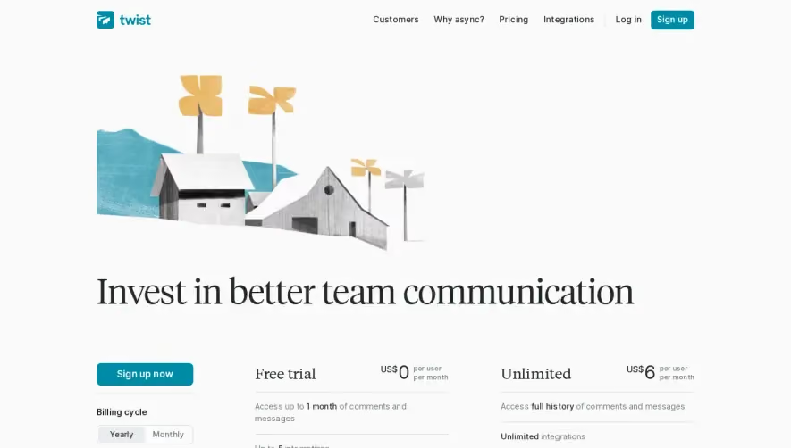



Upgrade to SaaSFrame Pro now to see similar examples.
Monthly
$18 /month
Billed $18 monthly
Browse all screens & flows
Filter and search screens & flows
Search text in screenshots
Access Figma files
Access mobile versions
Join now
Quarterly
$16 /month
Billed $48 quarterly
Browse all screens & flows
Filter and search screens & flows
Search text in screenshots
Access Figma files
Access mobile versions
Join now
Yearly
$15 /month
Billed $180 yearly
Browse all screens & flows
Filter and search screens & flows
Search text in screenshots
Access Figma files
Access mobile versions
Join now