Overall Style and Aesthetic
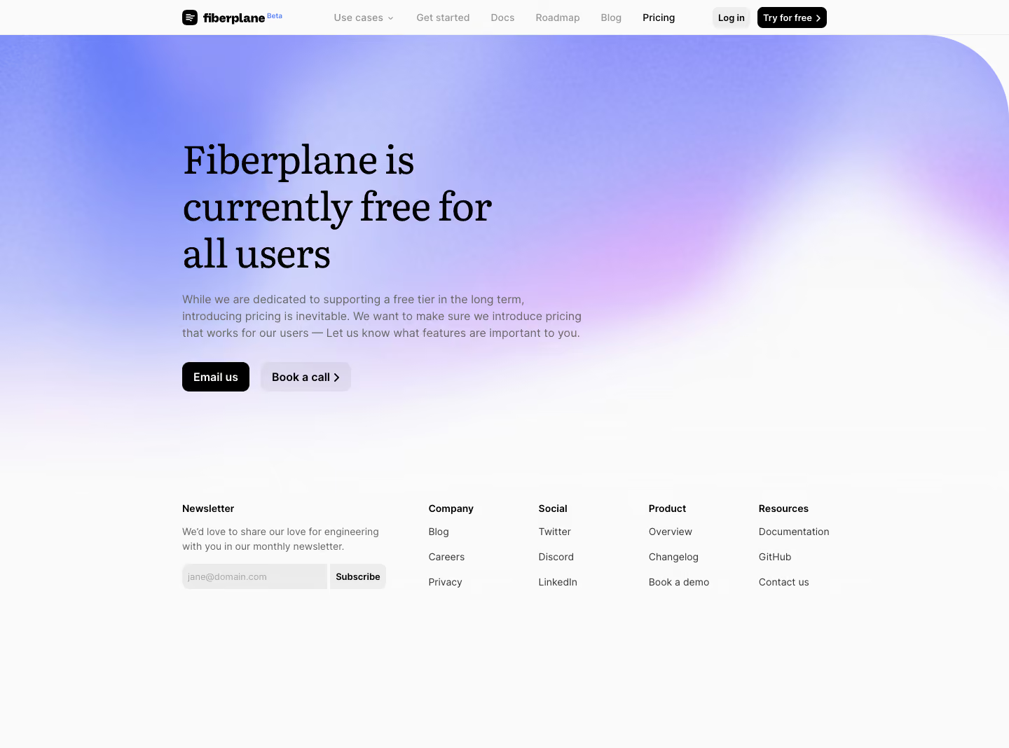
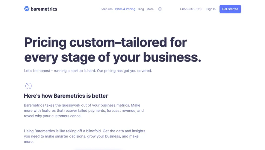
Fiberplane’s pricing page epitomizes modern minimalism, blending a crisp, professional feel with subtle pops of color for a tech-forward atmosphere. The design favors whitespace, resulting in a clean canvas that draws attention to core content. This uncluttered approach makes the page approachable and trustworthy, ideal for B2B SaaS audiences. Layout and Structure
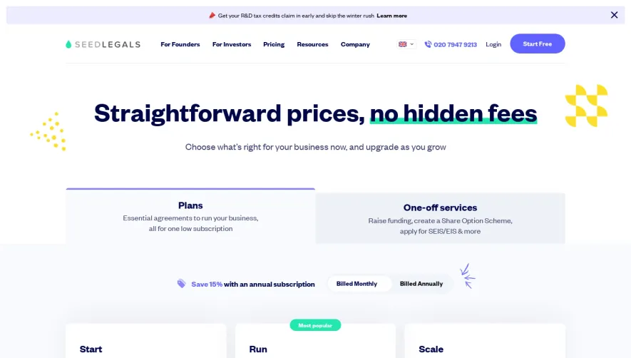
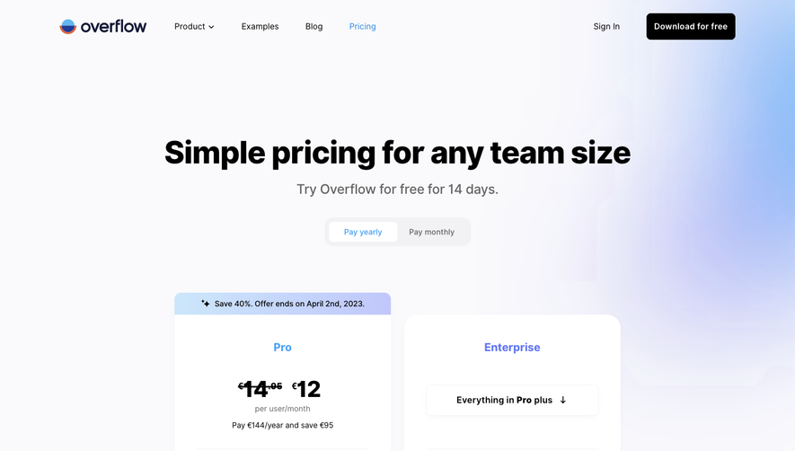
The page opens with a concise hero section, immediately setting context and guiding users to the pricing details. Pricing plans are presented side by side in clearly demarcated “cards,” making it easy to compare options at a glance. Sticky headers, discrete CTAs ("Start for free"), and collapsible sections enhance navigation without distracting from the primary content. Visual Elements
Custom illustrations, gentle gradients, and polished icons accent key sections, providing visual cues without overwhelming the eye. Graphical separators and subtle motion effects (such as hover states) enliven interactions. There’s a lack of stock photography, keeping focus on the product and information, while clean iconography aids scannability. Color Palette and Typography
The palette revolves around cool blues and soft muted tones contrasted with warm CTA highlights, balancing authority with engagement. Typography is precise and modern: bold sans-serif headings establish hierarchy, while slightly lighter body text keeps content approachable and digestible. User Experience Patterns
Navigation is frictionless, with sticky elements and succinct copy aiding decision-making. Prominent, well-labeled CTAs bolster conversion, while tooltips and microcopy clarify pricing details. The form elements are minimal, maintaining momentum toward signup. Unique or Notable Design Choices
Fiberplane’s careful use of white space, collapsible FAQ, and interactive plan selectors stand out. The tone is purposeful yet welcoming, amplifying credibility and innovation while inviting users to take action confidently.