Design with AI
Generate a new design based on this screen using your own content.
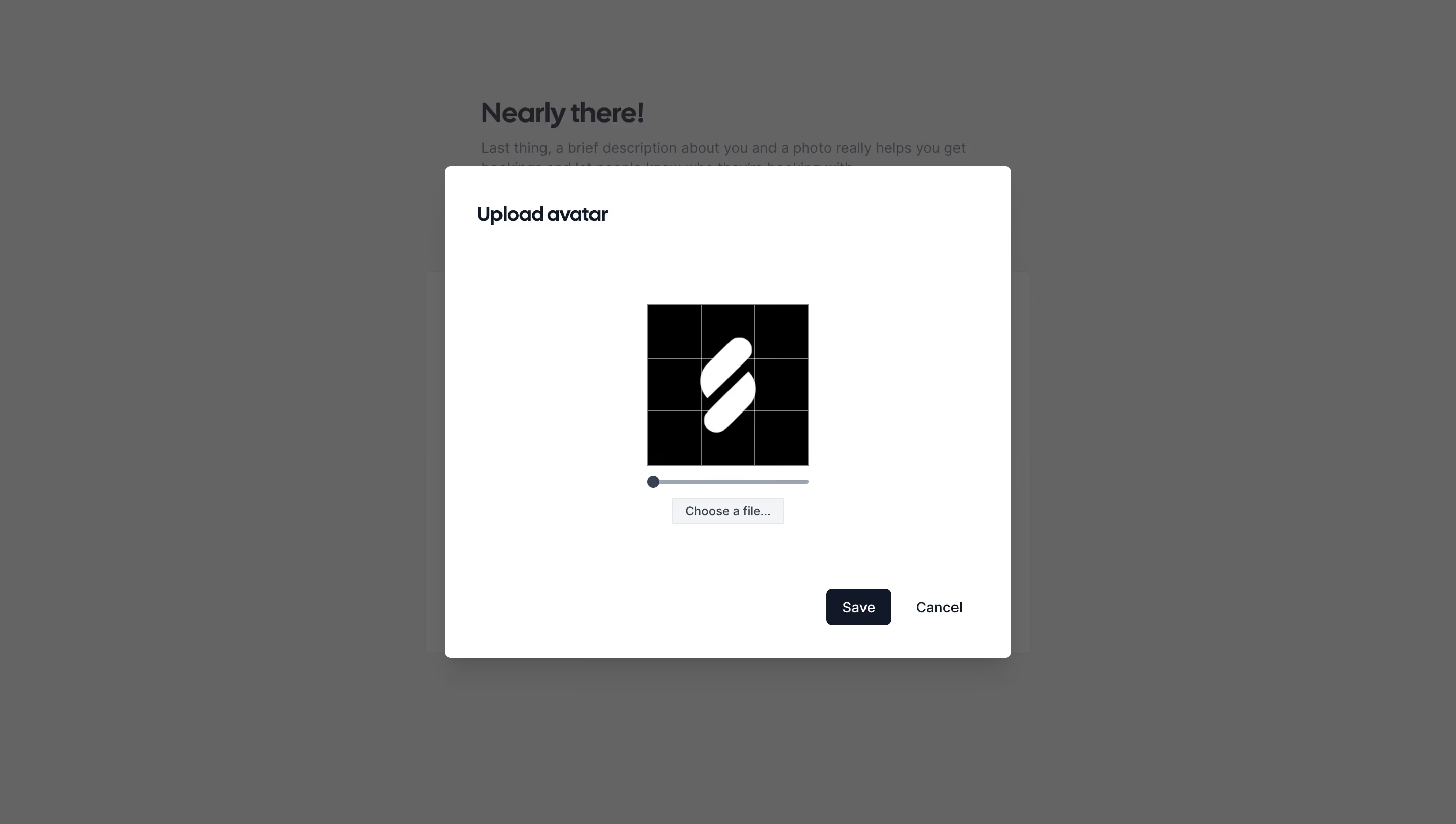
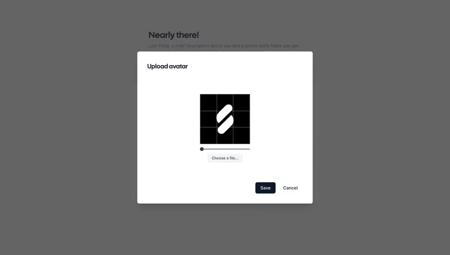
# Design from Reference: Cal.com Upload Avatar
Create an original, high-fidelity visual design inspired by the reference. Prioritize composition, typography, colors, spacing, and component styling over technical implementation.
## Reference
- **Product:** Cal.com
- **Category:** Account Setup
- **Screenshot:** https://cdn.prod.website-files.com/5e9dc792e1210c5325f7ebbc/6acad8aad05a3f53c0a74d9a_6acad827782887bd39751bd3_cms-3c2c1794d4c2b0dc45a9adfe.webp
Analyze the screenshot first. If inaccessible, request it rather than guessing.
## Content
{{content.instructions}}
{{content.data}}
Preserve essential messaging and factual accuracy. Adapt structure and copy length for visual balance; never invent product claims.
## Visual Design
### Overall aesthetic
- **Character:** A minimal monochrome avatar-editing dialog over a dimmed onboarding screen.
- **Focus:** A small square crop preview, a simple scale slider and a restrained action row keep the task narrow and practical.
### Page composition
- **Capture scale:** The source is 2880 × 1630 pixels. A 1440 × 815 CSS-pixel viewport at 2× scale is plausible, but unverified.
- **Overlay:** A centered white panel is approximately 560 × 486 estimated CSS pixels, with about 32-pixel internal padding and gently rounded corners.
- **Internal layout:** The title sits at top left, the preview and controls share the central axis, and Save/Cancel align toward the bottom right.
- **Background:** The partially visible “Nearly there!” onboarding heading and form are darkened by a uniform scrim.
### Information hierarchy
- **Task label:** “Upload avatar” is the only prominent dialog heading.
- **Editing sequence:** A square image with a three-by-three crop grid leads into a horizontal slider and “Choose a file…” control.
- **Completion:** The dark Save button has greater visual priority than the text-style Cancel action. No close icon is visible.
### Typography
- **Family:** A modern rounded sans serif is visible; the exact font is unverified.
- **Title:** Approximately 20 estimated CSS pixels, semibold to bold, with compact line height.
- **Controls:** Save and Cancel are around 14 pixels; the native-looking file control uses smaller text around 12 pixels.
### Colors & surfaces
- **Measured samples:** ICC-aware sRGB sampling yields #FFFFFF for the panel, #000000 for the preview field and #636464 for the dominant dimmed background.
- **Control palette:** The slider uses a muted slate track/thumb and the primary button is near-black navy. The file control has a light gray surface and thin border.
- **Elevation:** A broad soft shadow under the panel separates it from the darkened page; corners are modest, around 6 estimated CSS pixels.
### Components
- **Crop preview:** An approximately 160 × 160 estimated CSS-pixel square shows a white abstract mark on black with fine gray horizontal and vertical guide lines.
- **Slider:** A narrow track matches the preview width, with a circular thumb positioned near the left end in the captured state.
- **File picker:** A compact light button is centered below the slider, approximately 110 × 26 estimated CSS pixels.
- **Actions:** Save is approximately 64 × 36 pixels with a 6-pixel radius; Cancel is plain dark text with no enclosing filled surface.
### Visual rhythm
- **Whitespace:** Large gaps around the small editing area make the dialog substantially larger than its preview.
- **Alignment:** The preview, slider and file picker form a centered vertical stack; title and action row use the panel's outer padding.
- **Bottom spacing:** The action row sits roughly 32 pixels above the panel edge, leaving a clear completion zone.
### Responsive
- **Recommendation:** Keep the panel within viewport width minus 32 CSS pixels and preserve a usable crop preview size on phones.
- **Recommendation:** Reduce excess vertical whitespace before shrinking controls; allow scrolling if the viewport is short. No mobile state is shown.
### Adaptation guidance
- **Preserve:** Retain the simple title, square guided preview, scale adjustment and clear Save/Cancel hierarchy.
- **Implement:** Provide accessible file-input labeling, keyboard slider control and dialog focus handling; these behaviors cannot be verified from the image.
- **State clarity:** Keep the selected image and crop guides visually distinct, and avoid adding unsupported editing tools to this compact task.
Use this context to reproduce the reference's visual language: layout, typography, colors, spacing, borders, radii, and distinctive elements. The screenshot takes priority if descriptions conflict.
## Direction
{{preferences.fidelityInstructions}}
## Output
{{output.instructions}}
Deliver a polished, cohesive design with precise alignment, hierarchy, and spacing. Produce the requested visual artifact, not just a description. If unsupported, explain the limitation.