
Thank you! Your submission has been received!
Oops! Something went wrong while submitting the form.
Get SaaSFrame Pro
Monthly
$18
Quarterly
$48
Yearly
$180
Upgrade to access this feature
Browse all screens & flows
Filter and search screens & flows
Access Figma files
Access mobile versions
Bookmark screens & flows
Join now
Café Activation Emails

Café
The Social Hub for Hybrid Teams
Designed by
No items found.

Bookmark
Bookmark

Design with AI
Thank you! Your submission has been received!
Oops! Something went wrong while submitting the form.
# Design from Reference: Café Activation Emails
Create an original, high-fidelity visual design inspired by the reference. Prioritize composition, typography, colors, spacing, and component styling over technical implementation.
## Reference
- **Product:** Café
- **Category:** Activation Emails
- **Screenshot:** https://cdn.prod.website-files.com/5e9dc792e1210c5325f7ebbc/6acb6da2b206c0d3f8f3a671_6acb6b8e955d9ae8dea65ec4_cms-16376938e7cafe5af592996e.webp
Analyze the screenshot first. If inaccessible, request it rather than guessing.
## Content
{{content.instructions}}
{{content.data}}
Preserve essential messaging and factual accuracy. Adapt structure and copy length for visual balance; never invent product claims.
## Visual Design
### Overall aesthetic
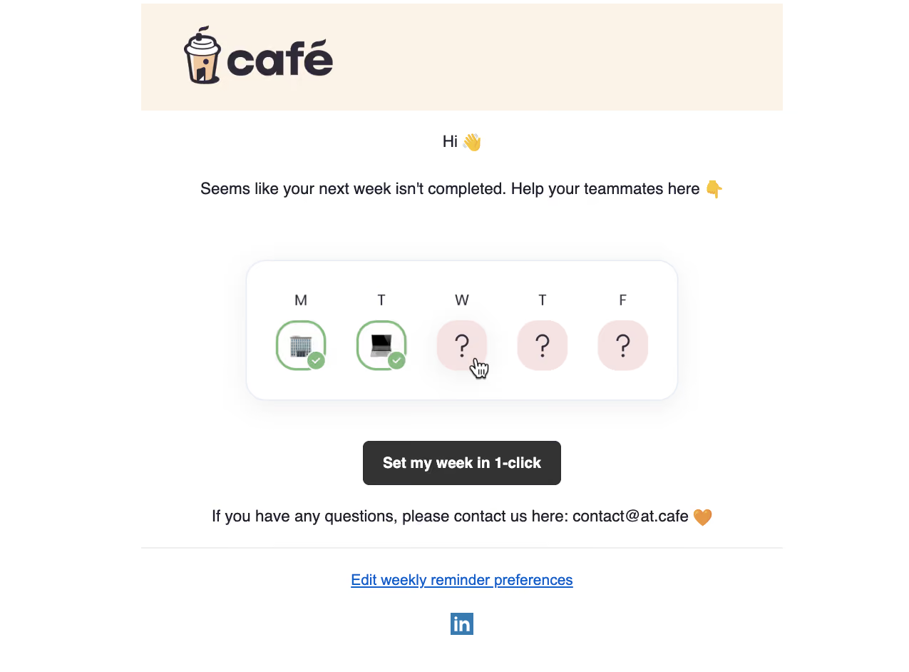
- **Character:** A friendly activation/reminder email using a centered white layout, a warm cream brand banner and a simple weekly-status illustration. A dark rectangular CTA supplies the main action.
- **Image basis:** Observed on a 1275 × 942 screenshot without enlargement. Dimensions below are approximate image pixels; email CSS scale and device pixel ratio are unverified.
### Page composition
- **Brand banner:** A roughly 900 × 150 px cream rectangle starts around x198, y5. The large café logo is left inset within it.
- **Message:** A short centered greeting sits below the banner, followed by a longer centered reminder line with emoji accents.
- **Illustration:** A roughly 606 × 197 px rounded weekly-status panel is centered in the middle, with five weekday columns and completion/unknown symbols.
- **Action and footer:** A dark CTA appears beneath the illustration, followed by a support sentence. A thin horizontal rule separates the main message from a preference link and centered social icon.
### Information hierarchy
- **Brand:** The large illustrated cup and bold wordmark establish identity before the email message.
- **Task:** The reminder sentence explains the missing weekly setup. The weekday illustration visually contrasts two completed entries with three unknown entries.
- **Primary action:** A single bold button offers one-click completion. Its centered placement and dark fill make it the strongest interactive element.
- **Secondary help:** The support sentence, blue preference link and social icon follow below. Their visual roles are distinct from the main CTA.
### Typography
- **Message:** Greeting and body lines are approximately 23–24 px in a regular dark sans-serif with comfortable line-height.
- **Button:** The CTA uses approximately 22 px bold white text, centered vertically in a roughly 62 px high button.
- **Illustration:** Weekday letters are around 22 px; unknown-state question marks are larger, around 42 px.
- **Font certainty:** The logo is custom artwork, and the text family is unverified. The preference link retains conventional blue underlined styling at approximately 22 px.
### Colors & surfaces
- **Measured base:** White #FFFFFF dominates the message area. Cream #FCF3E8 fills the brand banner.
- **Measured dark:** Charcoal #333333 appears in the CTA and dark illustration details.
- **Measured pale accent:** Soft pink #F5E3E3 fills the unknown weekday circles.
- **Status accents:** Green outlines and check badges identify completed days. The preference link and social icon use blue; these colors are visually observed but not established as global brand tokens.
### Components
- **Weekly panel:** Approximately 606 × 197 px with roughly 28 px corners, a thin pale blue-gray outline and a diffuse shadow.
- **Day markers:** Five evenly spaced columns use letters above approximately 70 px markers. Completed markers have green rounded outlines, location/device artwork and small overlapping check circles; unknown markers are pink circles with question marks.
- **Pointer artwork:** A hand cursor overlaps the first unknown marker. It is part of the screenshot's illustration and does not prove a live hover state.
- **CTA:** Approximately 278 × 62 px with roughly 9 px corners, charcoal fill and bold white text.
- **Footer:** A roughly 900 px horizontal rule precedes one centered underlined preference link and a small square LinkedIn-style icon. No form, error or loading state is visible.
### Visual rhythm
- **Centering:** Greeting, message, illustration, button and footer controls share the same central axis.
- **Vertical spacing:** The reminder has a broad gap before the weekly panel; approximately 56 px separates the panel from the CTA. Smaller gaps connect the CTA to support copy and footer.
- **Status repetition:** Five evenly spaced weekday columns make completion gaps immediately legible.
- **Surface hierarchy:** A cream banner, outlined illustration and dark button provide three distinct visual anchors against the white background.
### Responsive
- **Evidence limit:** Only this captured email composition is observed.
- **Recommended email width:** Use a fluid container with a sensible maximum, retain side padding and scale the weekly illustration proportionally.
- **Recommended text:** Allow the reminder and support sentence to wrap into readable short lines without shrinking text excessively.
- **Recommended action:** Keep the CTA touch-friendly and ensure preference and support links remain usable when lines wrap.
### Adaptation guidance
- **Preserve:** Retain the warm illustrated identity, single-action hierarchy and simple completed-versus-unknown weekly metaphor.
- **Build:** Use robust email layout primitives, a responsive image with meaningful alternative text and a real text CTA.
- **Content:** Keep the preference destination clearly identifiable and substitute appropriate support details when adapting.
- **Validate:** Test email-client rendering, narrow-screen wrapping, image-disabled readability and link contrast. The screenshot does not establish actual one-click behavior.
Use this context to reproduce the reference's visual language: layout, typography, colors, spacing, borders, radii, and distinctive elements. The screenshot takes priority if descriptions conflict.
## Direction
{{preferences.fidelityInstructions}}
## Output
{{output.instructions}}
Deliver a polished, cohesive design with precise alignment, hierarchy, and spacing. Produce the requested visual artifact, not just a description. If unsupported, explain the limitation.


Category
Patterns
No items found.
Tech Stack


Added on
March 17, 2023
Similar screens




Upgrade to SaaSFrame Pro now to see similar examples.
Monthly
$18 /month
Billed $18 monthly
Browse all screens & flows
Filter and search screens & flows
Search text in screenshots
Access Figma files
Access mobile versions
Join now
Quarterly
$16 /month
Billed $48 quarterly
Browse all screens & flows
Filter and search screens & flows
Search text in screenshots
Access Figma files
Access mobile versions
Join now
Yearly
$15 /month
Billed $180 yearly
Browse all screens & flows
Filter and search screens & flows
Search text in screenshots
Access Figma files
Access mobile versions
Join now