
Thank you! Your submission has been received!
Oops! Something went wrong while submitting the form.
Get SaaSFrame Pro
Monthly
$18
Quarterly
$48
Yearly
$180
Upgrade to access this feature
Browse all screens & flows
Filter and search screens & flows
Access Figma files
Access mobile versions
Bookmark screens & flows
Join now
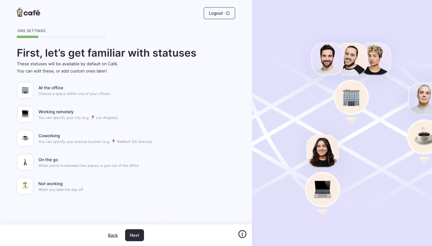
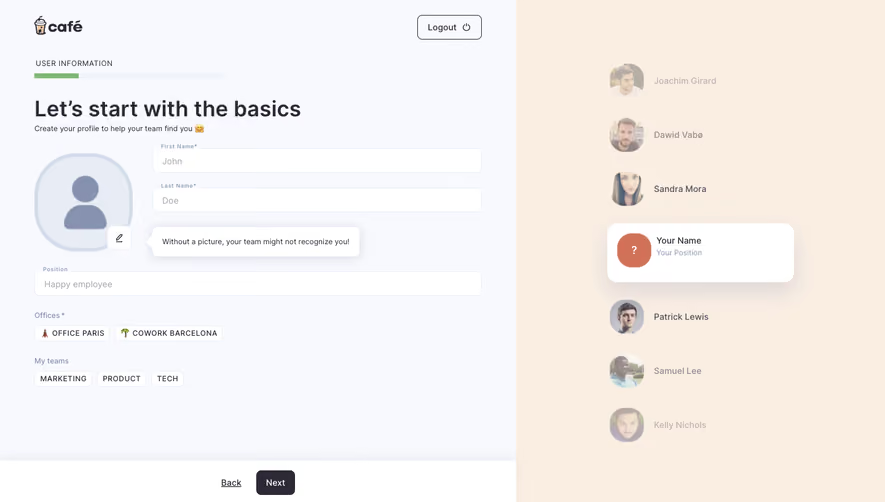
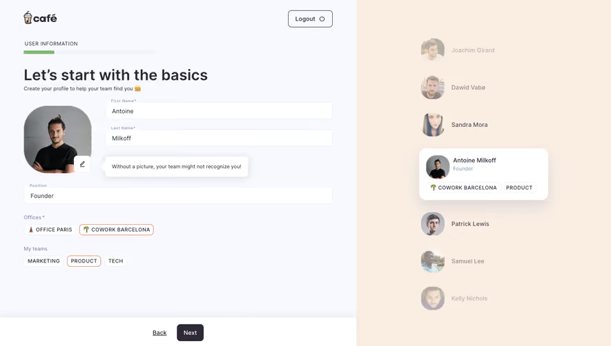
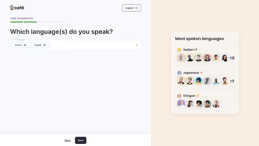
Café Account Setup

Café
The Social Hub for Hybrid Teams
Designed by
No items found.

Bookmark
Bookmark

Design with AI
Thank you! Your submission has been received!
Oops! Something went wrong while submitting the form.
# Design from Reference: Café Account Setup
Create an original, high-fidelity visual design inspired by the reference. Prioritize composition, typography, colors, spacing, and component styling over technical implementation.
## Reference
- **Product:** Café
- **Category:** Account Setup
- **Screenshot:** https://cdn.prod.website-files.com/5e9dc792e1210c5325f7ebbc/6acbb9bdd1be8ecd2912de36_6acb702b3993bb63a94bcf04_cms-c71afa1eeb57ccdc582714f1.webp
Analyze the screenshot first. If inaccessible, request it rather than guessing.
## Content
{{content.instructions}}
{{content.data}}
Preserve essential messaging and factual accuracy. Adapt structure and copy length for visual balance; never invent product claims.
## Visual Design
### Overall aesthetic
- **Character:** A calm onboarding explainer pairs a pale functional workspace with playful people-and-location artwork. The five status examples form a readable list rather than a form.
- **Evidence and scale:** The observed screenshot is 1440 × 821 image pixels. Dimensions below are approximate source-image measurements; a similar CSS scale is plausible but device pixel ratio is unverified.
### Page composition
- **Split:** The left workspace occupies approximately 840 px, with a full-height lavender illustration filling the remaining 600 px. The join is a clean vertical edge without a divider.
- **Header:** A small café logo sits about 56 px from the left and 28 px from the top. A compact outlined Logout control aligns near the upper-right corner of the workspace.
- **Content:** Organization setup progress, a single-line introductory heading, two lines of explanation, and five vertically stacked status rows share the same left alignment.
- **Bottom band:** A white band approximately 72 px high spans the left panel. Back and Next are centered as a pair; a circular information icon sits near its right edge. Fixed positioning cannot be established from this image.
### Information hierarchy
- **Primary:** The large bold heading introduces statuses; supporting copy directly below explains that defaults can later be edited.
- **Examples:** Each status combines an emoji tile, a short dark label, and a smaller muted explanation. Office, remote, coworking, travel, and time-off examples share equal emphasis.
- **Wayfinding:** A small uppercase organization-settings label and four narrow progress segments precede the heading. Only the first segment is green.
### Typography
- **Family:** UI text uses a clean sans serif with conventional double-storey letterforms. Exact font identity is unverified; retain a neutral sans fallback.
- **Heading:** Approximately 36 px, semibold to bold, with a roughly 43 px line-height and tight neutral tracking.
- **Copy and rows:** Introductory copy and status labels are approximately 14–16 px; muted descriptions are approximately 12–13 px with 18–20 px line-height.
- **Utility text:** Progress labeling is approximately 12 px with modest uppercase tracking; button labels are approximately 14 px, medium weight.
### Colors & surfaces
- **Measured foundations:** Dominant sampled source pixels include near-white #F8F9FE, white #FFFFFF, and closely related lavender artwork tones #E2E0FC, #E1E0FB, #E1E0FA, and #E0E0FA.
- **Text:** Headings and controls appear dark charcoal with a slight purple cast; supporting descriptions use desaturated blue-gray. These semantic descriptions are visual estimates rather than exact sampled tokens.
- **Accents:** A muted green marks completed progress. Cream circles, pale white map lines, and photographic portraits soften the lavender illustration.
### Components
- **Progress:** Four shallow rectangular segments span roughly 300 px with narrow gaps. The active segment occupies about one quarter of the track.
- **Status tiles:** Approximately 54 × 54 px white squares with 15–17 px corner radii, a faint cool border, and a very soft shadow. Centered emoji occupy about 24 px.
- **Actions:** Next is a dark filled rectangle around 64 × 41 px with an 8 px radius; Back is an underlined text link. Logout is about 105 × 40 px with a thin dark outline and trailing power icon.
- **Illustration:** Overlapping rounded portrait tiles and cream circular emoji markers float over diagonal map lines. Small triangular pointers reinforce location semantics without adding a real map interface.
### Visual rhythm
- **Horizontal spacing:** Main content begins near 56 px; row text begins near 128 px, leaving about 18 px between icon tiles and text.
- **Vertical spacing:** Status rows repeat at roughly 80 px intervals, with about 26 px between each tile. Heading and explanation are tightly grouped, followed by a larger break before the list.
- **Balance:** Generous empty space beside the list contrasts with the denser decorative right panel. The white action band provides a clear stopping point.
### Responsive
- **Observed limit:** Only a desktop composition is provided; actual breakpoints and mobile behavior are unverified.
- **Recommended stacking:** At narrow widths, prioritize the status list and move or hide the decorative panel. Reduce side gutters to 20–24 CSS px and allow the heading to wrap.
- **Recommended actions:** Keep navigation reachable without covering the last row, preserve readable helper text, and provide touch targets of at least 44 CSS px.
### Adaptation guidance
- **Preserve:** Keep the four-step progress cue, consistent emoji tiles, paired label/helper hierarchy, and a clearly grouped navigation area.
- **Implement:** Build the list with a shared two-column row component. Keep tile size stable while text wraps; use explicit spacing tokens instead of positioning rows independently.
- **Artwork:** Treat portraits and map graphics as decorative support with appropriate alternative-text handling. Do not infer interactivity from illustrated markers.
- **Validation:** Confirm fonts, CSS dimensions, keyboard focus, and responsive treatment in implementation; hover, disabled, and validation states are absent from the screenshot.
Use this context to reproduce the reference's visual language: layout, typography, colors, spacing, borders, radii, and distinctive elements. The screenshot takes priority if descriptions conflict.
## Direction
{{preferences.fidelityInstructions}}
## Output
{{output.instructions}}
Deliver a polished, cohesive design with precise alignment, hierarchy, and spacing. Produce the requested visual artifact, not just a description. If unsupported, explain the limitation.


Category
Patterns
Tech Stack


Added on
March 9, 2023
Found in 1 flow
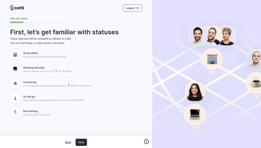

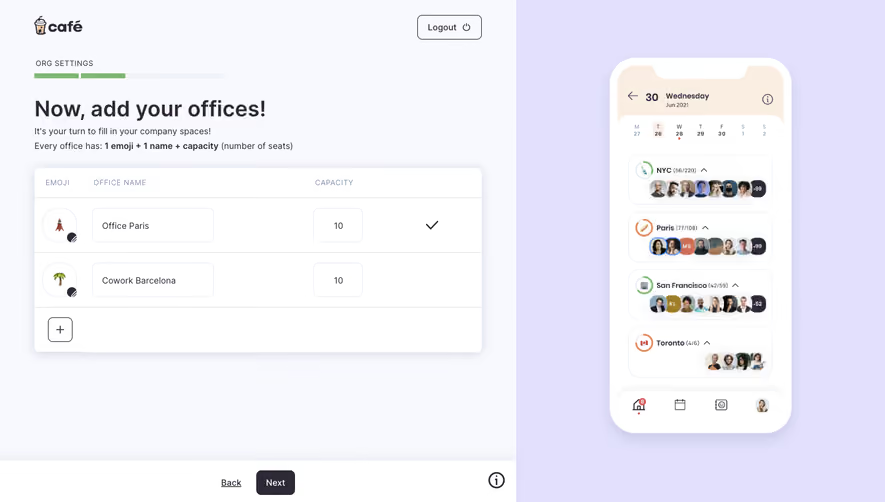


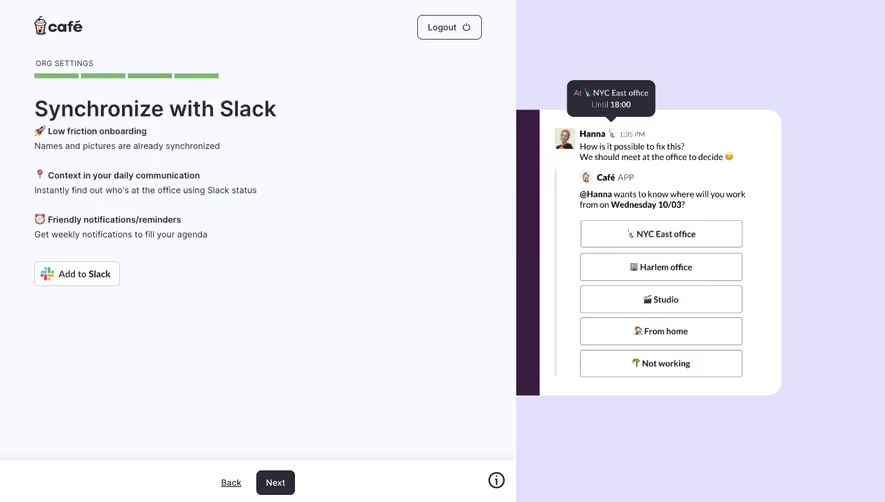

Similar screens



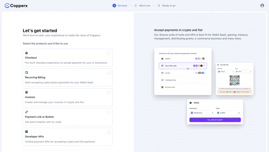



Upgrade to SaaSFrame Pro now to see similar examples.
Monthly
$18 /month
Billed $18 monthly
Browse all screens & flows
Filter and search screens & flows
Search text in screenshots
Access Figma files
Access mobile versions
Join now
Quarterly
$16 /month
Billed $48 quarterly
Browse all screens & flows
Filter and search screens & flows
Search text in screenshots
Access Figma files
Access mobile versions
Join now
Yearly
$15 /month
Billed $180 yearly
Browse all screens & flows
Filter and search screens & flows
Search text in screenshots
Access Figma files
Access mobile versions
Join now