Design with AI
Generate a new design based on this screen using your own content.
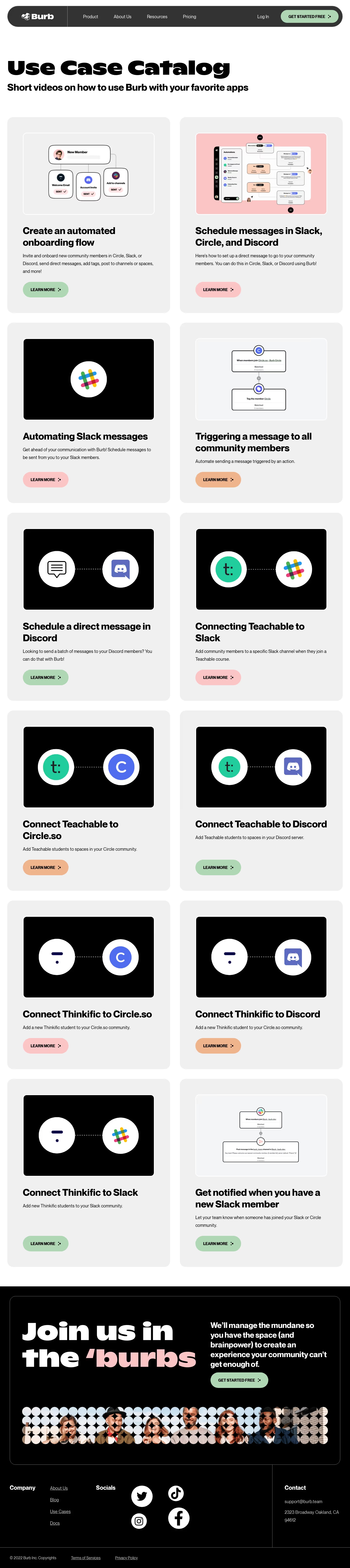
# Design from Reference: Burb Use Cases
Create an original, high-fidelity visual design inspired by the reference. Prioritize composition, typography, colors, spacing, and component styling over technical implementation.
## Reference
- **Product:** Burb
- **Category:** Use Cases
- **Screenshot:** https://cdn.prod.website-files.com/5e9dc792e1210c5325f7ebbc/62ecbb61f6c55f55cf59277b_1659680895260-screenshot-device-e82b63a3c43b4fca48ad59690541ac75-1659680751679.webp
Analyze the screenshot first. If inaccessible, request it rather than guessing.
## Content
{{content.instructions}}
{{content.data}}
Preserve essential messaging and factual accuracy. Adapt structure and copy length for visual balance; never invent product claims.
## Visual Design
### Overall aesthetic
- **Character:** Bold, friendly use-case catalog with heavy black typography and pastel conversion accents.
### Page composition
- **Canvas:** 1440 × 6453 screenshot px. Dark pill navigation, large catalog introduction, twelve use-case cards in two columns, black closing CTA with patterned photo strip, and black footer.
### Information hierarchy
- **Priority:** Oversized title introduces the catalog; each card follows image, bold use-case title, short description, and Learn more pill. Final CTA uses very large white/pink text.
### Typography
- **Scale:** Approximately 80 screenshot px display heading, 40 px card titles, 18 px body, and 16 px uppercase actions. Heavy rounded display sans and regular body sans; families/CSS scale unverified.
### Colors & surfaces
- **Palette:** Sampled sRGB #F0F0F0 cards, #000000, #FFFFFF, #F3F5F7 image surface, pink #FBC5C5, and nav #333333. Mint and peach buttons alternate.
### Components
- **Details:** Approximately 24 px card corners, 64 px inner padding, 16:10 framed images, pill actions, workflow diagrams, and paired integration-logo illustrations. Footer includes large circular social icons.
### Visual rhythm
- **Spacing:** Roughly 40 px column/row gaps and 30 px page margins. Repetition creates a steady catalog rhythm before a strong inverted closing section.
### Responsive
- **Adaptation:** Mobile is not shown. Use a single card column, reduce display text, and preserve image/title/action order.
### Adaptation guidance
- **Transfer:** Retain consistent card anatomy and pastel action variation. Replace use cases, integration marks, and contact details with authentic target content.
Use this context to reproduce the reference's visual language: layout, typography, colors, spacing, borders, radii, and distinctive elements. The screenshot takes priority if descriptions conflict.
## Direction
{{preferences.fidelityInstructions}}
## Output
{{output.instructions}}
Deliver a polished, cohesive design with precise alignment, hierarchy, and spacing. Produce the requested visual artifact, not just a description. If unsupported, explain the limitation.