Design with AI
Generate a new design based on this screen using your own content.
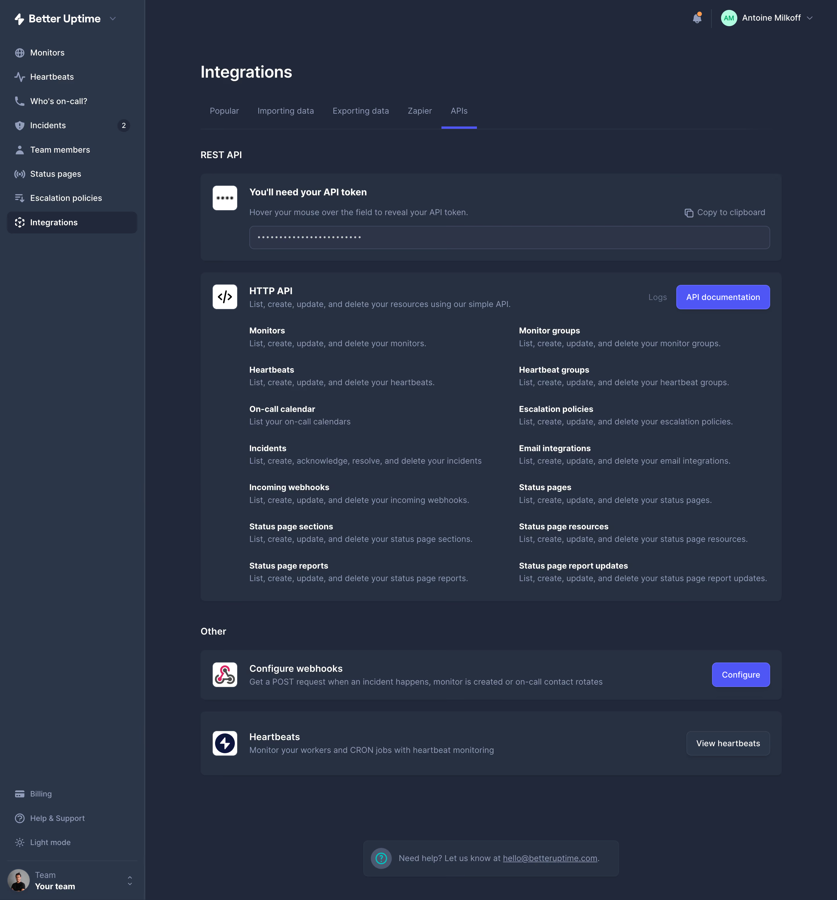
# Design from Reference: Better Stack etter Uptime API Settings
Create an original, high-fidelity visual design inspired by the reference. Prioritize composition, typography, colors, spacing, and component styling over technical implementation.
## Reference
- **Product:** Better Stack
- **Category:** Settings
- **Screenshot:** https://cdn.prod.website-files.com/5e9dc792e1210c5325f7ebbc/6acb6a5a03442b22fb62ad7e_6acb6960c8e486b21178e7e9_cms-35ad8be8ed3cf43d849abb84.webp
Analyze the screenshot first. If inaccessible, request it rather than guessing.
## Content
{{content.instructions}}
{{content.data}}
Preserve essential messaging and factual accuracy. Adapt structure and copy length for visual balance; never invent product claims.
## Visual Design
### Overall aesthetic
- **Character:** A dark infrastructure settings screen uses layered blue-gray surfaces, white headings and violet actions.
- **Density:** Compact explanatory lists remain readable through broad card padding and a stable two-column structure.
### Page composition
- **Capture scale:** The original is 2880 × 3096 pixels. A 2× capture is plausible but unverified; dimensions below estimate CSS pixels at half source resolution.
- **Sidebar:** An approximately 250-pixel column contains brand, monitoring navigation, selected Integrations and lower billing/support/team controls.
- **Header:** Main title and five tabs precede REST API content; APIs is selected.
- **Cards:** A token card sits above a large HTTP API card with fourteen resource descriptions in two columns.
- **Lower region:** Two shorter cards cover webhooks and heartbeats, followed by a compact help strip.
### Information hierarchy
- **Location:** The selected sidebar item and underlined APIs tab establish context.
- **Credential section:** A bold token instruction and masked field precede API capability details.
- **Resources:** Bold names sit above muted descriptions, allowing quick scanning.
- **Actions:** Violet documentation/configuration buttons contrast with quieter text links and a neutral heartbeat action.
### Typography
- **Family:** A clean sans serif is used; exact identity is unverified.
- **Main title:** Approximately 28 pixels, semibold.
- **Card headings:** Around 16 pixels and bold; resource names around 14 pixels and bold.
- **Descriptions:** Approximately 14 pixels with 21-pixel leading, in muted blue-gray.
- **Navigation:** Around 14 pixels, with brighter selected text.
### Colors & surfaces
- **Measured foundation:** #212839 forms the main dark canvas.
- **Measured raised surfaces:** #263041 and #2C3649 distinguish cards/sidebar; #2D3447 contributes field details.
- **Measured text:** White #FFFFFF provides primary contrast; muted #919DBB supports descriptions.
- **Accent relationship:** Violet marks selected tabs and filled actions, with small mint/orange account-status details.
### Components
- **Token card:** Rounded dark panel includes a white icon tile, explanation, copy affordance and a full-width masked field.
- **HTTP card:** A code icon and heading lead to two columns of resource names/descriptions; documentation action aligns upper right.
- **Secondary cards:** Horizontal icon/text/action layouts reuse rounded dark surfaces.
- **Tabs:** Muted labels share a thin bottom rule; APIs has a violet underline.
- **Sidebar state:** Integrations sits in a darker rounded row with white icon/text.
- **Help strip:** A small rounded panel centers a question icon and underlined contact link.
### Visual rhythm
- **Insets:** Main cards align around a roughly 1000-pixel content width with broad sidebar separation.
- **Card gaps:** Approximately 20 pixels separates stacked cards.
- **Resources:** Repeated title/description pairs use roughly 68-pixel vertical intervals.
- **Whitespace:** Large card padding keeps the dark interface from feeling crowded.
### Responsive
- **Observed state:** Only desktop is shown; compact behavior is unverified.
- **Recommended layout:** Collapse sidebar and stack API-resource columns.
- **Recommended controls:** Wrap card actions below explanations and keep token field/copy affordance usable.
### Adaptation guidance
- **Preserve layering:** Maintain distinct canvas, sidebar, card and field shades.
- **Credential fidelity:** Keep the token masked; do not reveal or infer its value.
- **Content scope:** Treat resource descriptions as captured interface copy rather than verified API documentation.
- **Accessibility:** Label icon actions, expose selected tabs and maintain readable muted-text contrast.
Use this context to reproduce the reference's visual language: layout, typography, colors, spacing, borders, radii, and distinctive elements. The screenshot takes priority if descriptions conflict.
## Direction
{{preferences.fidelityInstructions}}
## Output
{{output.instructions}}
Deliver a polished, cohesive design with precise alignment, hierarchy, and spacing. Produce the requested visual artifact, not just a description. If unsupported, explain the limitation.