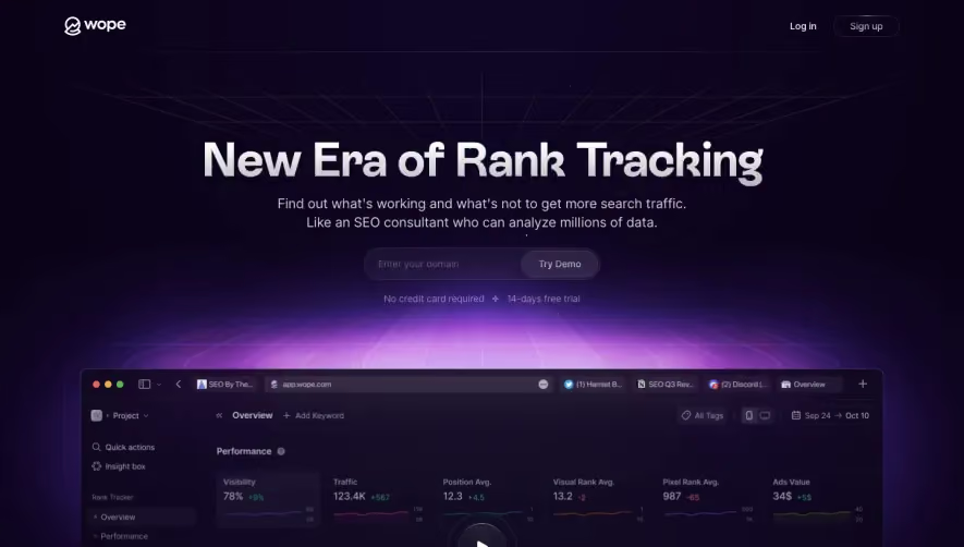
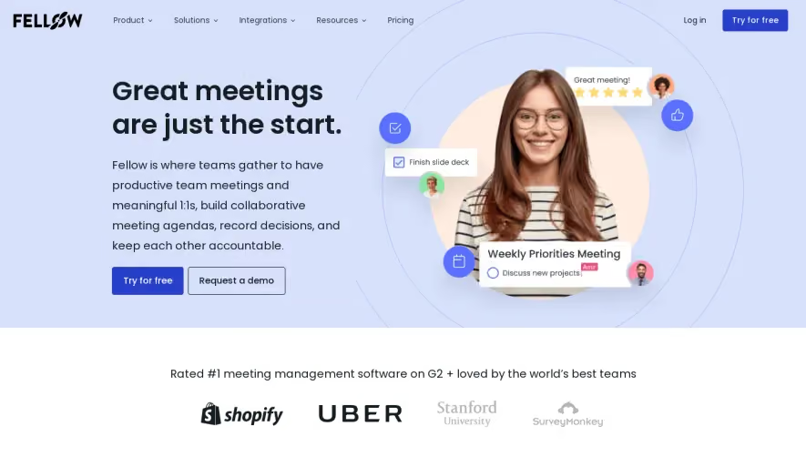
Generate a new design based on this screen using your own content.
Thank you! Your submission has been received!
Oops! Something went wrong while submitting the form.
# Design from Reference: Better Stack Landing Page
Create an original, high-fidelity visual design inspired by the reference. Prioritize composition, typography, colors, spacing, and component styling over technical implementation.
## Reference
- **Product:** Better Stack
- **Category:** Landing Page
- **Screenshot:** https://cdn.prod.website-files.com/5e9dc792e1210c5325f7ebbc/6436ac6787ee9c6364641879_tc7_KU1Lx2C2CUHDdnbLydrVY2sIeEPGRdKYgBTOEy8.webp
Analyze the screenshot first. If inaccessible, request it rather than guessing.
## Content
{{content.instructions}}
{{content.data}}
Preserve essential messaging and factual accuracy. Adapt structure and copy length for visual balance; never invent product claims.
## Visual Design
Use this context to reproduce the reference's visual language: layout, typography, colors, spacing, borders, radii, and distinctive elements. The screenshot takes priority if descriptions conflict.
## Direction
{{preferences.fidelityInstructions}}
## Output
{{output.instructions}}
Deliver a polished, cohesive design with precise alignment, hierarchy, and spacing. Produce the requested visual artifact, not just a description. If unsupported, explain the limitation.
BetterStack’s homepage champions a modern and minimalist aesthetic, characterized by generous white space, crisp alignment, and a focus on clarity. The visual tone is sleek and professional with subtle undertones of approachability, ensuring that the platform feels both reliable and forward-thinking without being overly dense or intimidating.
Layout and Structure
The site opens with a visually prominent hero section featuring bold headlines, concise copy, and an inviting primary call-to-action. Scrolling reveals an intuitive progression: feature highlights with succinct copy and visual cues, customer logos for credibility, testimonials to build trust, and an easily navigable pricing section. The sticky header ensures constant access to navigation, while the footer consolidates resources and legal links in a tidy format.
Visual Elements
The site relies on elegant vector illustrations and simple, purposeful icons that clearly explain concepts without clutter. Smooth micro-animations enliven interactions—such as hover states and menu transitions—while diagrams and product screenshots showcase functionality. The visuals support user understanding rather than distracting from the message.
Color Palette and Typography
A restrained monochrome palette dominates, punctuated by vibrant blue and green accent colors that direct attention to CTAs and key information. Typography is clean and sans-serif, with sharp hierarchy: large, impactful headings; medium-weight subheads; and easy-to-read body text. The design leverages bold and regular weights to guide the reader naturally through each section.
User Experience Patterns and Unique Features
User flows are frictionless, with prominent CTAs, minimal form fields, and clear navigation. Floating feedback and support buttons affirm commitment to customer success. Unique touches include dynamic testimonial carousels and interactive product previews. The tone is confident and innovative, offering reassurance and clarity—even for first-time visitors.