Design with AI
Generate a new design based on this screen using your own content.
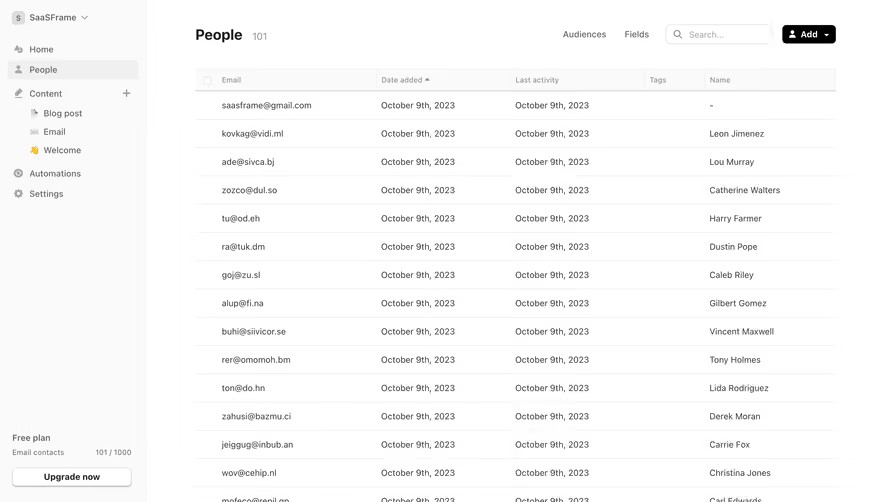
# Design from Reference: Audienceful People Table
Create an original, high-fidelity visual design inspired by the reference. Prioritize composition, typography, colors, spacing, and component styling over technical implementation.
## Reference
- **Product:** Audienceful
- **Category:** Table
- **Screenshot:** https://cdn.prod.website-files.com/5e9dc792e1210c5325f7ebbc/6acad970bd9ce0e960551f40_6acad8f06cd44b3ad4d85a2c_cms-aaf98dade7f5515093c8adac.webp
Analyze the screenshot first. If inaccessible, request it rather than guessing.
## Content
{{content.instructions}}
{{content.data}}
Preserve essential messaging and factual accuracy. Adapt structure and copy length for visual balance; never invent product claims.
## Visual Design
### Overall aesthetic
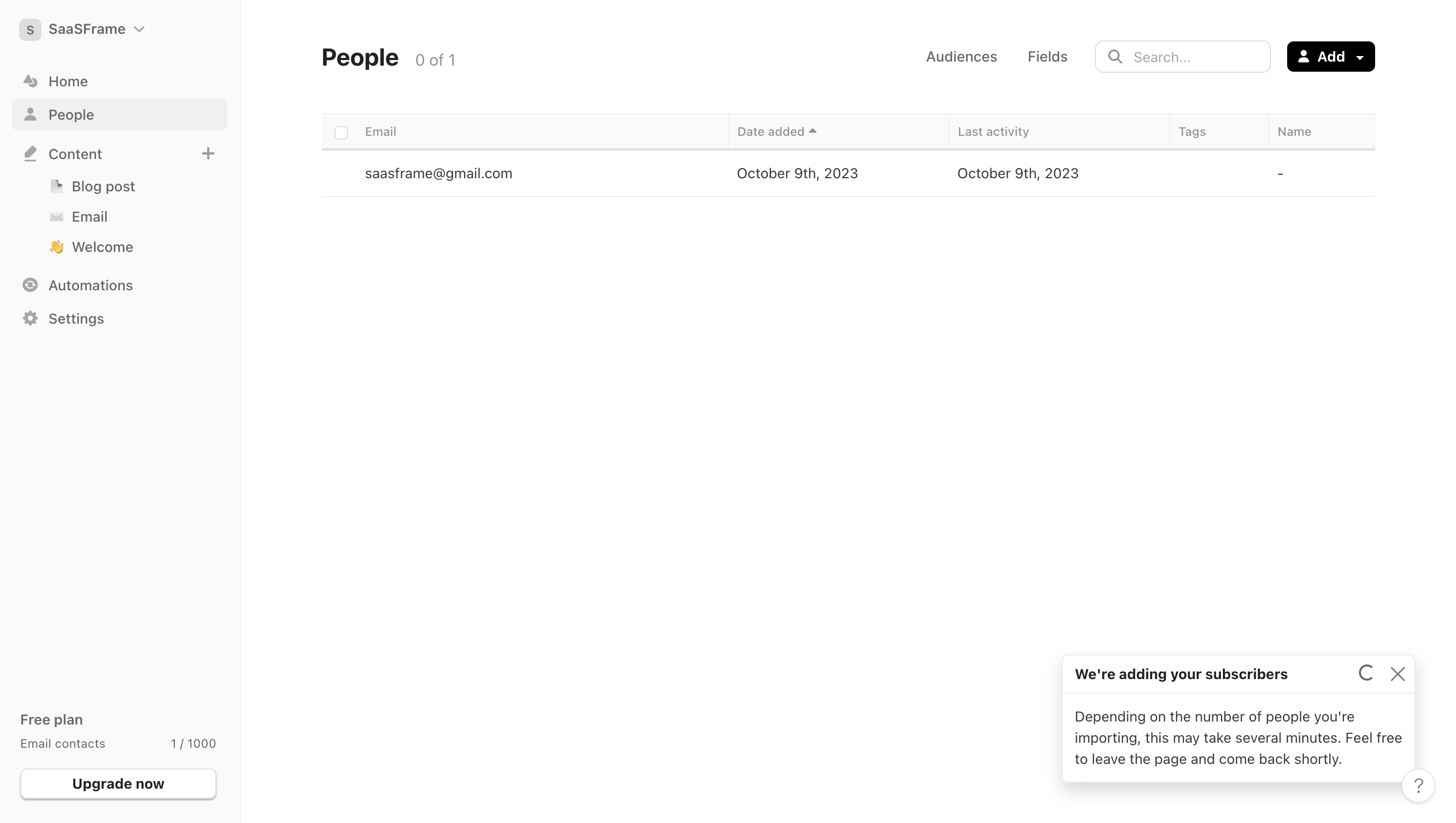
- **Character:** Minimal contact-management interface with subdued navigation, a compact data table and extensive white space.
### Page composition
- **Capture:** 2880 × 1630 screenshot pixels; estimated 2× CSS scale.
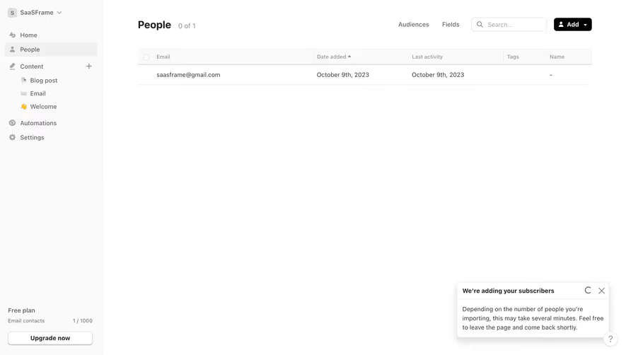
- **Structure:** Pale sidebar occupies approximately 16% of the width. Main toolbar contains People title/count, Audiences and Fields links, search and Add menu above one contact row.
### Information hierarchy
- **Priority:** People heading and Add action establish purpose; column labels and contact data follow. An import-status popover at bottom right provides background-task feedback.
### Typography
- **Family:** Neutral sans serif; exact font unverified.
- **Estimated CSS sizes:** Heading 24px, interface/body 14px, column labels 12px; restrained medium weights.
### Colors & surfaces
- **Measured palette:** White #FFFFFF, sidebar gray #FAFAFA, subtle gray #F0F0F0, rules #DDDDDF and secondary surface #ECEBEE.
- **Contrast:** Black #000000 marks primary text and filled Add button.
### Components
- **Table:** Selection checkbox, Email, Date added with sort indicator, Last activity, Tags and Name; thin rules and low row density.
- **Other elements:** Nested Content navigation, plan-usage area, outlined Upgrade button, import popover with spinner/close and floating help circle. Estimated controls 32px high and radii 4–6px.
### Visual rhythm
- **Spacing:** Tight toolbar and table header contrast with a very large empty canvas below. Sidebar groups use small consistent vertical gaps.
### Responsive
- **Suggested adaptation:** Hide sidebar behind a drawer, wrap toolbar actions, and scroll the contact table horizontally while keeping selection and email accessible. Mobile behavior is unverified.
### Adaptation guidance
- **Transfer:** Retain the quiet data-first composition, short toolbar and lightweight table dividers. Show real import state without filling empty space with decorative content.
Use this context to reproduce the reference's visual language: layout, typography, colors, spacing, borders, radii, and distinctive elements. The screenshot takes priority if descriptions conflict.
## Direction
{{preferences.fidelityInstructions}}
## Output
{{output.instructions}}
Deliver a polished, cohesive design with precise alignment, hierarchy, and spacing. Produce the requested visual artifact, not just a description. If unsupported, explain the limitation.