Design with AI
Generate a new design based on this screen using your own content.
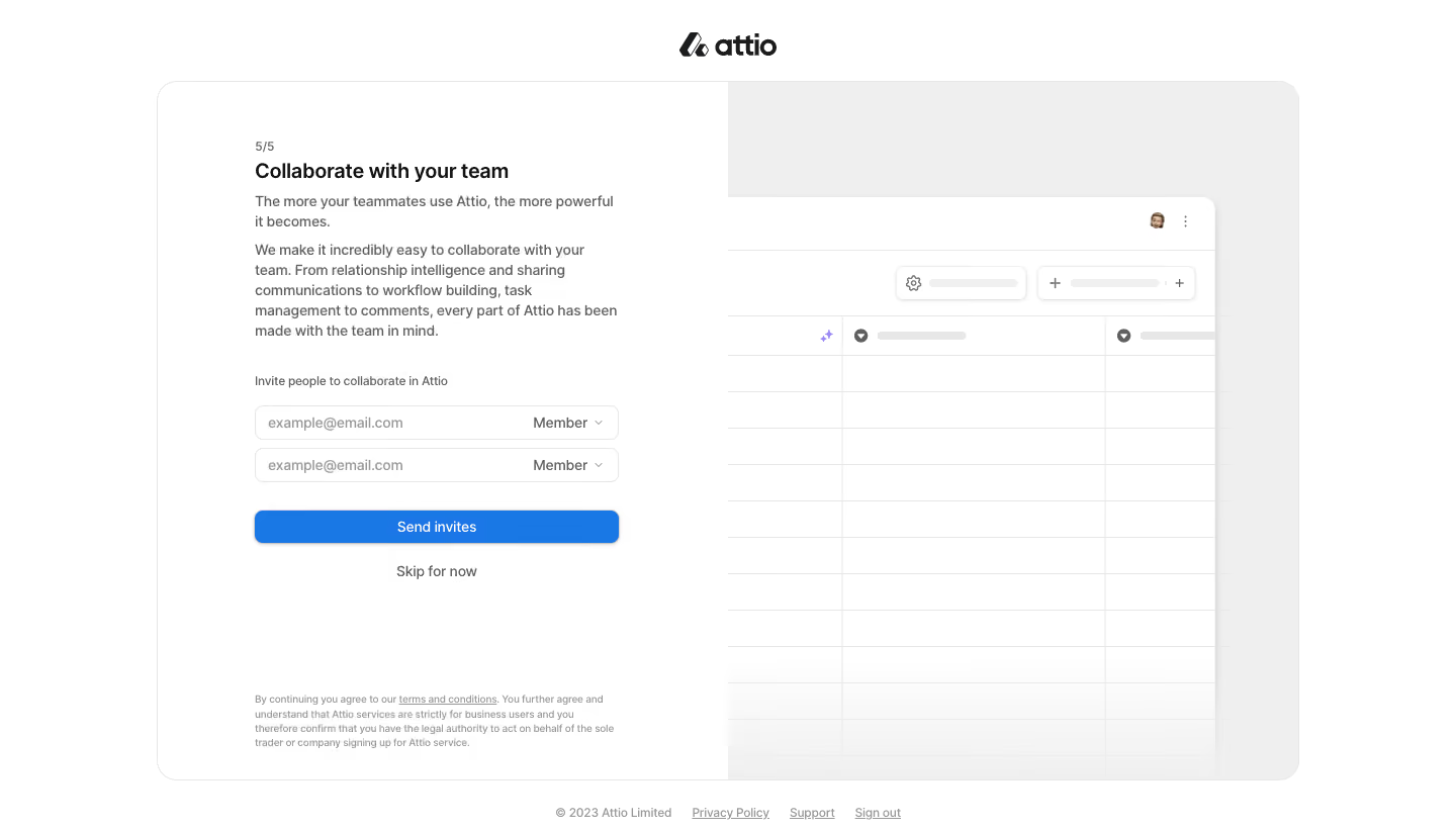
# Design from Reference: Attio Invite Team Members
Create an original, high-fidelity visual design inspired by the reference. Prioritize composition, typography, colors, spacing, and component styling over technical implementation.
## Reference
- **Product:** Attio
- **Category:** Account Setup
- **Screenshot:** https://cdn.prod.website-files.com/5e9dc792e1210c5325f7ebbc/6acbb9f8d37e66e942ffbb2e_6acb70a6b679c88211a4914a_cms-213067577513add58ddf148e.webp
Analyze the screenshot first. If inaccessible, request it rather than guessing.
## Content
{{content.instructions}}
{{content.data}}
Preserve essential messaging and factual accuracy. Adapt structure and copy length for visual balance; never invent product claims.
## Visual Design
### Overall aesthetic
- **Character:** A calm onboarding screen uses a large rounded split panel, compact invitation form and pale product-interface illustration.
- **Accent:** A single blue Send invites button provides the strongest color, while the surrounding page stays white and light gray.
### Page composition
- **Capture:** The source measures 1440 × 821 image pixels. Observed dimensions below approximate CSS only under an unverified 1× capture assumption.
- **Frame:** A centered Attio wordmark sits above a roughly 1130 × 690 px rounded container, beginning around x=155, y=80.
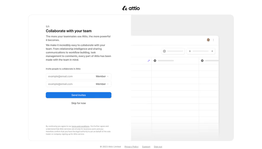
- **Left half:** A roughly 360 px form column contains a 5/5 step label, collaboration heading, explanatory paragraphs, two invitation rows, primary action and skip link.
- **Right half:** A pale gray surface holds a large cropped spreadsheet-style product illustration extending to the panel's lower edge.
- **Legal regions:** Small consent text sits near the bottom of the left half; copyright and privacy/support/sign-out links sit below the panel.
### Information hierarchy
- **Step and title:** A small step count precedes the bold collaboration heading.
- **Explanation:** Two compact paragraphs establish the team benefit before the invitation fields.
- **Invitation controls:** Two email/role rows sit beneath a short label, followed by the full-width blue action.
- **Alternative:** Skip for now is centered below the button, visibly quieter.
- **Supporting illustration:** The simplified product grid remains low contrast and secondary to the form.
### Typography
- **Family:** A neutral sans serif is visible throughout; exact font identity is unverified.
- **Title:** Approximately 21–22 px, semibold, with around 26 px line height.
- **Body and fields:** Approximately 14 px with 20 px leading; placeholder and secondary copy use gray.
- **Small text:** Step count, field-group label and footer links are around 12–13 px. Consent copy is smaller, around 10–11 px.
### Colors & surfaces
- **Measured foundation:** ICC-aware sRGB sampling yields white #FFFFFF and light gray #EFEFEF.
- **Measured borders:** #E7E7E7 and related pale grays define the outer panel, inputs and illustration grid.
- **Measured action:** Blue #1977E6 fills the invitation button.
- **Neutral hierarchy:** Dark headings contrast with medium-gray body copy and lighter legal text; the illustration uses mostly white/gray placeholders.
### Components
- **Outer panel:** A fine gray border and approximately 20 px corners enclose the split layout, with clipping at the rounded edges.
- **Invitation rows:** Two approximately 360 × 34 px observed fields combine an email placeholder at the left and Member role selector/caret at the right.
- **Primary action:** A full-width blue button has approximately 8 px corners, centered white text and a subtle shadow.
- **Product mockup:** A white rounded window with soft shadow contains a top utility strip, small avatar, placeholder controls and a ruled multi-column grid.
- **Footer links:** Small underlined text links remain separate from the main setup panel.
### Visual rhythm
- **Form alignment:** Step count, heading, paragraphs, group label and controls share one left edge.
- **Control cadence:** Invitation rows have a narrow gap; a larger pause separates them from the primary button.
- **Vertical breathing room:** A broad blank interval separates the skip link from consent copy at the bottom.
- **Split balance:** Dense form content is counterbalanced by a large, quiet illustration area.
### Responsive
- **Evidence boundary:** Only a desktop state is shown; responsive behaviors are recommendations.
- **Single-column flow:** Prioritize the invitation form and move or hide the decorative product illustration on narrow screens.
- **Field flexibility:** Allow email and role controls to stack if necessary while retaining clear associations.
- **Legal readability:** Avoid reducing consent text further; allow the panel and footer to grow vertically.
### Adaptation guidance
- **Invitation pattern:** Reuse email/role rows, one primary invite action and an explicit skip route during onboarding.
- **Dynamic rows:** Support adding/removing invitees and validating addresses without breaking the compact alignment.
- **State boundaries:** No invitations are entered or sent in the capture; success and error states must be designed separately.
- **Accessible controls:** Provide labels, keyboard-operable role selectors and clear focus states.
- **Scale calibration:** Validate observed image dimensions against the intended CSS viewport before implementation.
Use this context to reproduce the reference's visual language: layout, typography, colors, spacing, borders, radii, and distinctive elements. The screenshot takes priority if descriptions conflict.
## Direction
{{preferences.fidelityInstructions}}
## Output
{{output.instructions}}
Deliver a polished, cohesive design with precise alignment, hierarchy, and spacing. Produce the requested visual artifact, not just a description. If unsupported, explain the limitation.