Design with AI
Generate a new design based on this screen using your own content.
# Design from Reference: Asana Onboarding Email Flow
Create an original, high-fidelity visual design inspired by the reference. Prioritize composition, typography, colors, spacing, and component styling over technical implementation.
## Reference
- **Product:** Asana
- **Category:** Onboarding Email
- **Screenshot:** https://cdn.prod.website-files.com/5e9dc792e1210c5325f7ebbc/6acbc9361790037d3e058f65_6acbc6493b6b24eada55d80b_cms-585ccc6eb74c06b1ec69f17e.webp
Analyze the screenshot first. If inaccessible, request it rather than guessing.
## Content
{{content.instructions}}
{{content.data}}
Preserve essential messaging and factual accuracy. Adapt structure and copy length for visual balance; never invent product claims.
## Visual Design
### Overall aesthetic
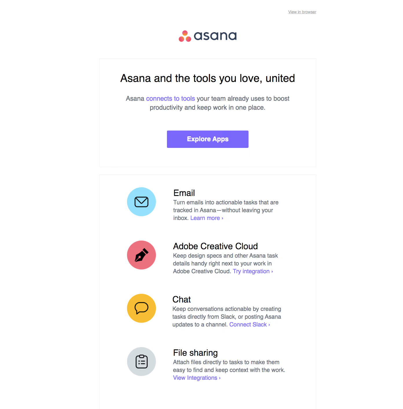
- **Character:** Clean integration-promotion email with a centered hero and four colorful icon-led feature rows.
### Page composition
- **Canvas:** 1393 × 1413 screenshot px.
- **Structure:** Small browser-view link above centered brand logo; thin-bordered hero block; separate bordered list block containing four integration categories.
- **Width:** Estimated screenshot email column approximately 750 px with broad white outer margins.
### Information hierarchy
- **Priority:** Hero headline and purple Explore Apps button lead; inline purple links connect individual category explanations to supporting actions.
### Typography
- **Family:** Familiar Arial-like sans serif, exact font unverified.
- **Scale:** Estimated screenshot heading 36 px, feature titles 30 px, body 20–22 px and CTA 22 px bold; relaxed paragraph leading.
### Colors & surfaces
- **Sampled palette:** White #FFFFFF; purple #7A67FC actions/links; gray #676D76 body; nearly black #0A0A0A headings; yellow #F7BD33, cyan #95E0FC and gray #D5DCE0 icon circles.
- **Treatment:** Fine pale outlines, minimal rounding and no heavy shadows.
### Components
- **Hero:** Centered headline, two-line explanatory paragraph and wide filled purple button.
- **Rows:** Circular colored icon at left, title and explanatory copy at right; black outline symbols represent email, creative tools, chat and file sharing.
- **Geometry:** Estimated screenshot icon diameter 100 px and button approximately 280 × 60 px; main panels use square corners.
### Visual rhythm
- **Spacing:** Approximately 60–80 screenshot px internal hero padding and generous vertical separation between feature rows; aligned text starts create consistency.
### Responsive
- **Observed:** Email screenshot only.
- **Adaptation:** Use a fluid single column, reduce side padding to 20–24 CSS px and retain icon/text alignment when space allows; stack icons if necessary.
### Adaptation guidance
- **Preserve:** One main exploration CTA, consistent feature rows and restrained purple linking.
- **Replace:** Use supplied integration categories and verified functionality; avoid copying unsupported integration claims.
Use this context to reproduce the reference's visual language: layout, typography, colors, spacing, borders, radii, and distinctive elements. The screenshot takes priority if descriptions conflict.
## Direction
{{preferences.fidelityInstructions}}
## Output
{{output.instructions}}
Deliver a polished, cohesive design with precise alignment, hierarchy, and spacing. Produce the requested visual artifact, not just a description. If unsupported, explain the limitation.