
Thank you! Your submission has been received!
Oops! Something went wrong while submitting the form.
Get SaaSFrame Pro
Monthly
$18
Quarterly
$48
Yearly
$180
Upgrade to access this feature
Browse all screens & flows
Filter and search screens & flows
Access Figma files
Access mobile versions
Bookmark screens & flows
Join now
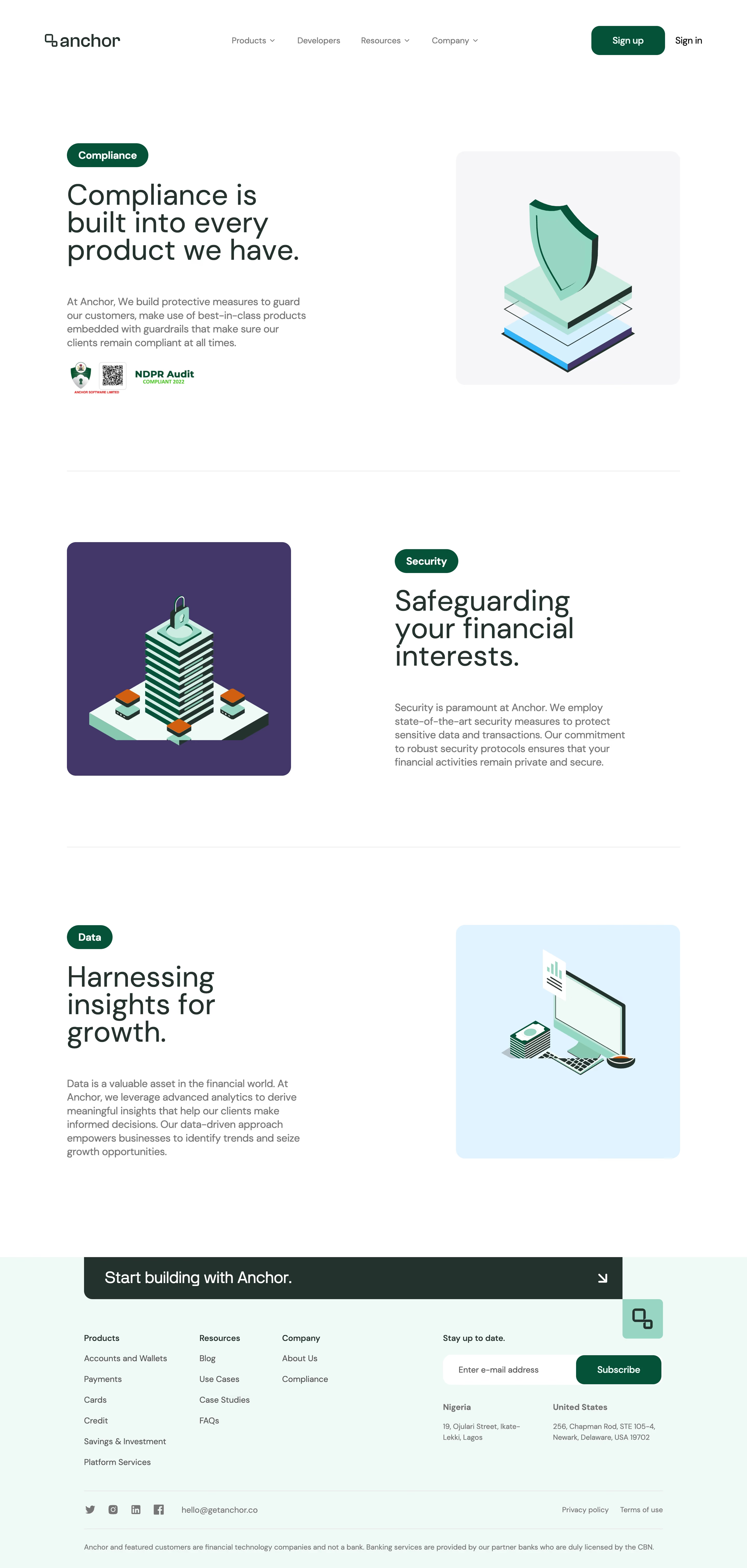

Anchor Security Page

Anchor
Banking-as-a-service platform for Africa
Designed by
No items found.

Bookmark
Bookmark

Design with AI
Thank you! Your submission has been received!
Oops! Something went wrong while submitting the form.
# Design from Reference: Anchor Security Page
Create an original, high-fidelity visual design inspired by the reference. Prioritize composition, typography, colors, spacing, and component styling over technical implementation.
## Reference
- **Product:** Anchor
- **Category:** Security Page
- **Screenshot:** https://cdn.prod.website-files.com/5e9dc792e1210c5325f7ebbc/6acad5295a5fdf4c30310fba_6acad4956cd44b3ad4d6d196_cms-310ed2ac57891731574889cd.webp
Analyze the screenshot first. If inaccessible, request it rather than guessing.
## Content
{{content.instructions}}
{{content.data}}
Preserve essential messaging and factual accuracy. Adapt structure and copy length for visual balance; never invent product claims.
## Visual Design
### Overall aesthetic
- **Character:** A spacious financial-product trust page uses dark forest typography, green pill labels and friendly isometric security illustrations.
- **Treatment:** White dominates the page; softly rounded illustration tiles and a mint footer introduce color without dense card framing.
### Page composition
- **Capture scale:** The source is 2880 × 6042 pixels. A 2× capture is plausible but unverified; dimensions below are estimated CSS values at half source resolution.
- **Header:** A wide brand/navigation row places the wordmark left, four navigation groups centrally and sign-up/sign-in controls right.
- **Three sections:** Compliance opens with text left and a shield illustration right. Security reverses this arrangement with a purple illustration tile left. Data returns text left and a blue illustration tile right.
- **Closing region:** A wide dark invitation banner leads into a pale mint footer containing three link columns, newsletter field, two location blocks, social/contact links and legal fine print.
### Information hierarchy
- **Section labels:** Compact green pills identify Compliance, Security and Data before large multiline headings.
- **Trust detail:** Supporting gray paragraphs remain narrower than the available columns; a small audit badge appears beneath the opening copy.
- **Closing action:** The dark horizontal invitation is the strongest footer-level element, followed by newsletter subscription and grouped navigation.
### Typography
- **Family:** A clean sans serif with rounded forms appears throughout; exact identity is unverified.
- **Headings:** Main section titles are estimated at 56 pixels with about 54–58-pixel leading and regular weight, wrapping into three lines.
- **Body:** Supporting paragraphs are roughly 20 pixels with 26-pixel leading. Navigation and footer links are around 16 pixels.
- **Utility emphasis:** Pills use approximately 20-pixel bold white labels; footer group headings and newsletter label use modest semibold weight.
### Colors & surfaces
- **Measured base:** White #FFFFFF forms the main canvas; deep forest #1F332D appears in the strongest text and closing banner.
- **Measured tiles:** Pale gray #F5F5F7, purple #44386B and pale blue #DBF4FF distinguish the three illustration backgrounds.
- **Measured footer:** Pale mint #EEF9F6 creates a full-width final surface.
- **Accent relationships:** Deep green buttons and pills pair with mint illustration details; small orange and cyan details remain inside the artwork.
### Components
- **Illustration panels:** Approximately 430 × 450 estimated CSS pixels with roughly 18-pixel radii; each holds a centered isometric object rather than a UI screenshot.
- **Category pills:** Compact capsules have fully rounded ends and approximately 20-pixel horizontal padding.
- **Header action:** The green sign-up button is approximately 140 × 56 estimated CSS pixels with a 16-pixel radius.
- **Section dividers:** Thin light-gray rules extend across the main content width between the three major topics.
- **Footer invitation:** A dark horizontal banner uses large white text, a right arrow and a rounded lower-left corner; a mint brand tile hangs below its right edge.
- **Newsletter:** A white rounded email field joins a green rounded subscription button, forming one horizontal control group.
### Visual rhythm
- **Container:** Main content spans approximately 1180 estimated CSS pixels with about 130-pixel outer margins.
- **Section spacing:** Large vertical pauses of roughly 140–180 pixels surround separators and give each illustration/text pair its own stage.
- **Column balance:** Text occupies about 450 pixels while illustrations remain near square; alternating placement creates a deliberate zigzag reading pattern.
### Responsive
- **Observed state:** Only the desktop layout is shown; mobile behavior is unverified.
- **Recommended flow:** Stack each text/illustration pair, preserving a consistent text-first reading order and reducing oversized inter-section gaps.
- **Recommended footer:** Wrap link groups and location blocks, stack newsletter controls when needed and keep the invitation arrow clear of wrapping text.
### Adaptation guidance
- **Preserve identity:** Retain the forest/mint palette, green topic pills and three alternating illustration stages.
- **Use restraint:** Keep trust content on the white canvas and reserve colored panels for illustrations rather than enclosing every paragraph.
- **Implementation estimates:** Begin with a roughly 1180-pixel container, 56-pixel headings and 430-pixel illustration tiles, then compare against the original pixels.
- **Content integrity:** Treat the audit graphic as an image asset; do not infer certification status or interaction behavior from the screenshot.
Use this context to reproduce the reference's visual language: layout, typography, colors, spacing, borders, radii, and distinctive elements. The screenshot takes priority if descriptions conflict.
## Direction
{{preferences.fidelityInstructions}}
## Output
{{output.instructions}}
Deliver a polished, cohesive design with precise alignment, hierarchy, and spacing. Produce the requested visual artifact, not just a description. If unsupported, explain the limitation.


Category
Patterns
No items found.



Added on
February 1, 2024
Similar screens






Upgrade to SaaSFrame Pro now to see similar examples.
Monthly
$18 /month
Billed $18 monthly
Browse all screens & flows
Filter and search screens & flows
Search text in screenshots
Access Figma files
Access mobile versions
Join now
Quarterly
$16 /month
Billed $48 quarterly
Browse all screens & flows
Filter and search screens & flows
Search text in screenshots
Access Figma files
Access mobile versions
Join now
Yearly
$15 /month
Billed $180 yearly
Browse all screens & flows
Filter and search screens & flows
Search text in screenshots
Access Figma files
Access mobile versions
Join now