Overall Style and Aesthetic
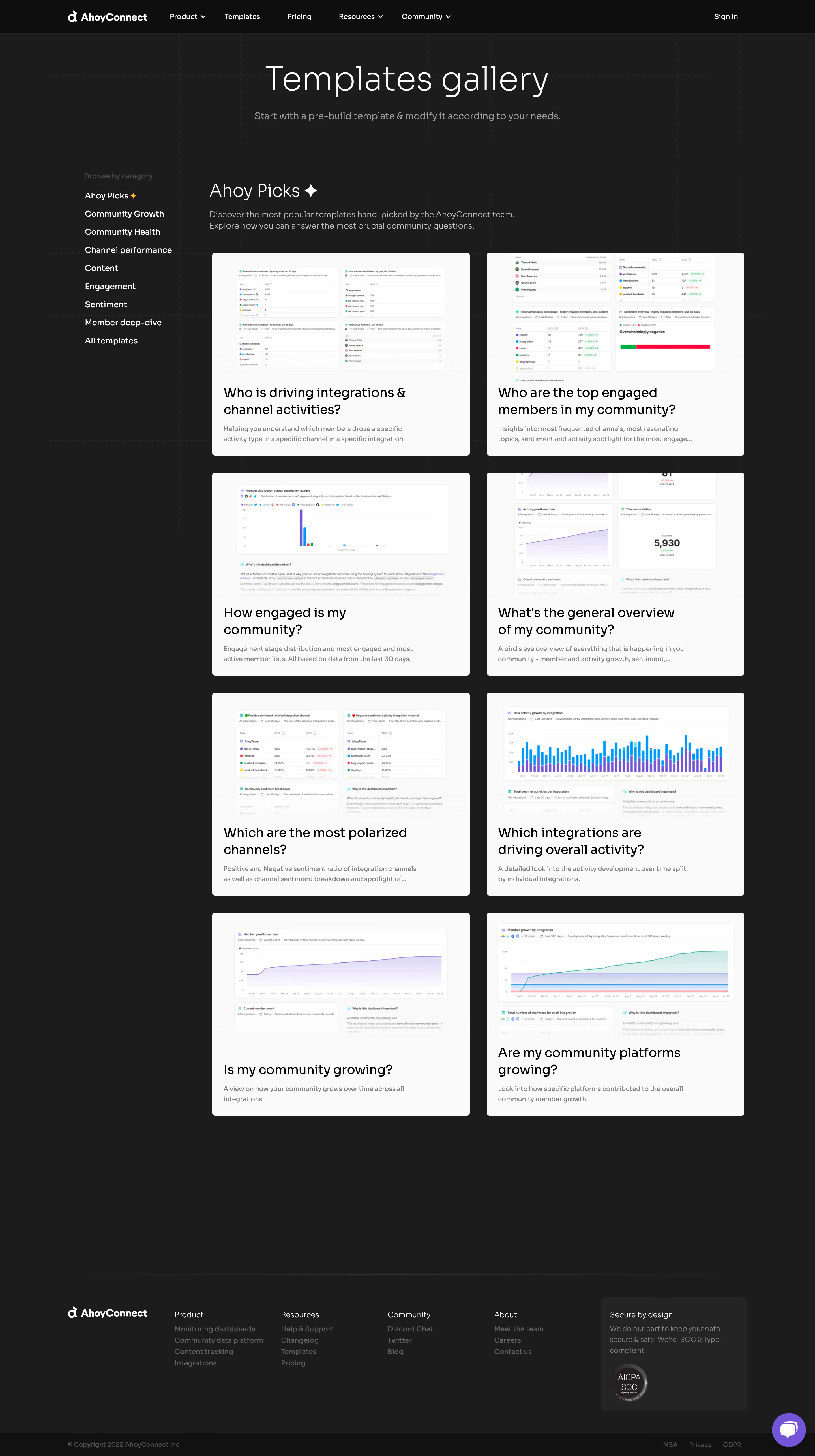
AhoyConnect’s Templates page embraces a sleek, modern aesthetic characterized by clean lines, generous whitespace, and a crisp, professional vibe. The overall design is refreshingly minimalist yet vibrant, striking a balance that feels approachable and confident—ideal for SaaS users seeking clarity and inspiration. Layout and Structure
The page follows a focused, user-centered layout. A concise hero section introduces the value of ready-to-use templates with persuasive copy and a bold primary CTA. The core content is structured as an organized grid of template cards, each featuring informative previews for effortless browsing. Logical segmentation, sticky navigation, and concise labeling guide visitors smoothly through the site, while additional CTAs ensure opportunities for conversion remain visible. Visual Elements
Custom illustrations, light iconography, and subtle hover animations enrich the interface without clutter. Each template card uses simple graphics to preview content, making it effortless for users to compare and select. Animations are understated—present only where they enhance clarity or provide gentle feedback, creating a polished, seamless experience. Color Palette and Typography
A well-coordinated palette anchors the experience: cool blues and purples dominate, contrasted with crisp whites and an accent of teal for actionable elements. Typography leverages a modern sans-serif, offering clear hierarchy—large, friendly headlines, medium-weight subtext, and readable body copy—contributing to strong visual order and accessibility. User Experience Patterns
Navigation is intuitive with a sticky top bar, persistent CTAs, and fast access to templates. Interactive states—such as hover effects and smooth scrolling—provide tactile feedback and increase engagement. Search and filtering tools are thoughtfully integrated, further simplifying the journey for users seeking specific resources. Unique & Notable Design Choices
A standout feature is the real-time preview and filter system for templates, allowing users to experience content before committing. The page’s use of microinteractions amplifies delight while retaining efficiency. Overall, the tone is trustworthy and innovative, exuding the assurance of a tool built for proactive, modern SaaS teams.