Overall Style and Aesthetic
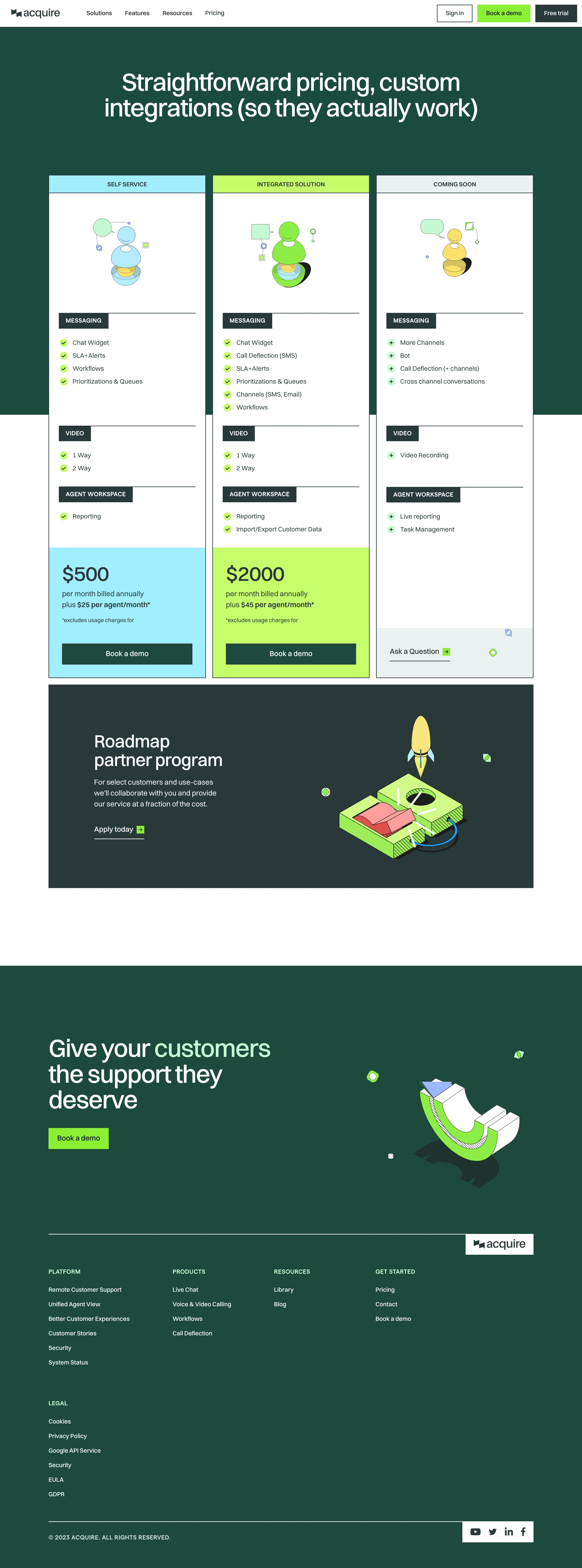
Acquire.io’s pricing page exemplifies a modern, professional SaaS aesthetic with a focus on clarity and simplicity. The site leverages abundant white space for a clean, breathable feel, while subtle pops of brand blue convey reliability and trustworthiness. Every visual decision speaks to users seeking an innovative, enterprise-grade solution. Layout and Structure
The structure is highly intuitive: a concise hero section introduces the value proposition, immediately leading into a well-organized pricing table. Each plan is clearly differentiated, flanked by succinct benefit statements. Supplemental details like FAQs are positioned below to address hesitations without overwhelming initial impressions. The footer provides navigation links to support, company info, and social channels. Visual Elements
Crisp line icons anchor each pricing tier, communicating features at a glance. Soft visual cues and section dividers segment content without clutter. Animation is subtle but purposeful—demo videos and micro-interactions invite deeper engagement without distraction. The absence of stock photos keeps the page sharply focused on clarity. Color Palette and Typography
A palette of white, blue, and muted grays dominates, projecting calm professionalism. The primary blue draws attention to calls to action and important headers. Typography is modern and legible, with distinct font weights guiding the user’s eye from headings to explanatory content, creating a natural reading rhythm. User Experience Patterns
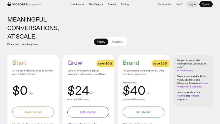
Navigation is frictionless, with sticky headers and clear, prominent CTAs leading users toward conversion. Pricing toggles (such as monthly/annual switchers) offer hands-on interactivity. Forms are kept minimal until a visitor expresses intent, streamlining the path to engagement. Unique or Notable Design Choices
What stands out is the page’s restraint: information density is expertly balanced, and plan highlights adapt fluidly to desktop and mobile. Strategic use of live chat underscores Acquire’s own product strengths, reinforcing credibility while offering instant reassurances to prospective buyers. Tone and Feel
The tone is confident yet inviting, balancing enterprise authority with a user-first sensibility. The result is a design that feels current, scalable, and completely trustworthy—ideal inspiration for SaaS teams seeking to blend transparency with conversion-focused elegance.