Design with AI
Generate a new design based on this screen using your own content.
# Design from Reference: Abyssale Invitation Email
Create an original, high-fidelity visual design inspired by the reference. Prioritize composition, typography, colors, spacing, and component styling over technical implementation.
## Reference
- **Product:** Abyssale
- **Category:** Invitation Emails
- **Screenshot:** https://cdn.prod.website-files.com/5e9dc792e1210c5325f7ebbc/6acbcb6a8313d4c6c0cc7777_6acbc9076a71aae04de08c74_cms-461d015006afd319cd75fede.webp
Analyze the screenshot first. If inaccessible, request it rather than guessing.
## Content
{{content.instructions}}
{{content.data}}
Preserve essential messaging and factual accuracy. Adapt structure and copy length for visual balance; never invent product claims.
## Visual Design
### Overall aesthetic
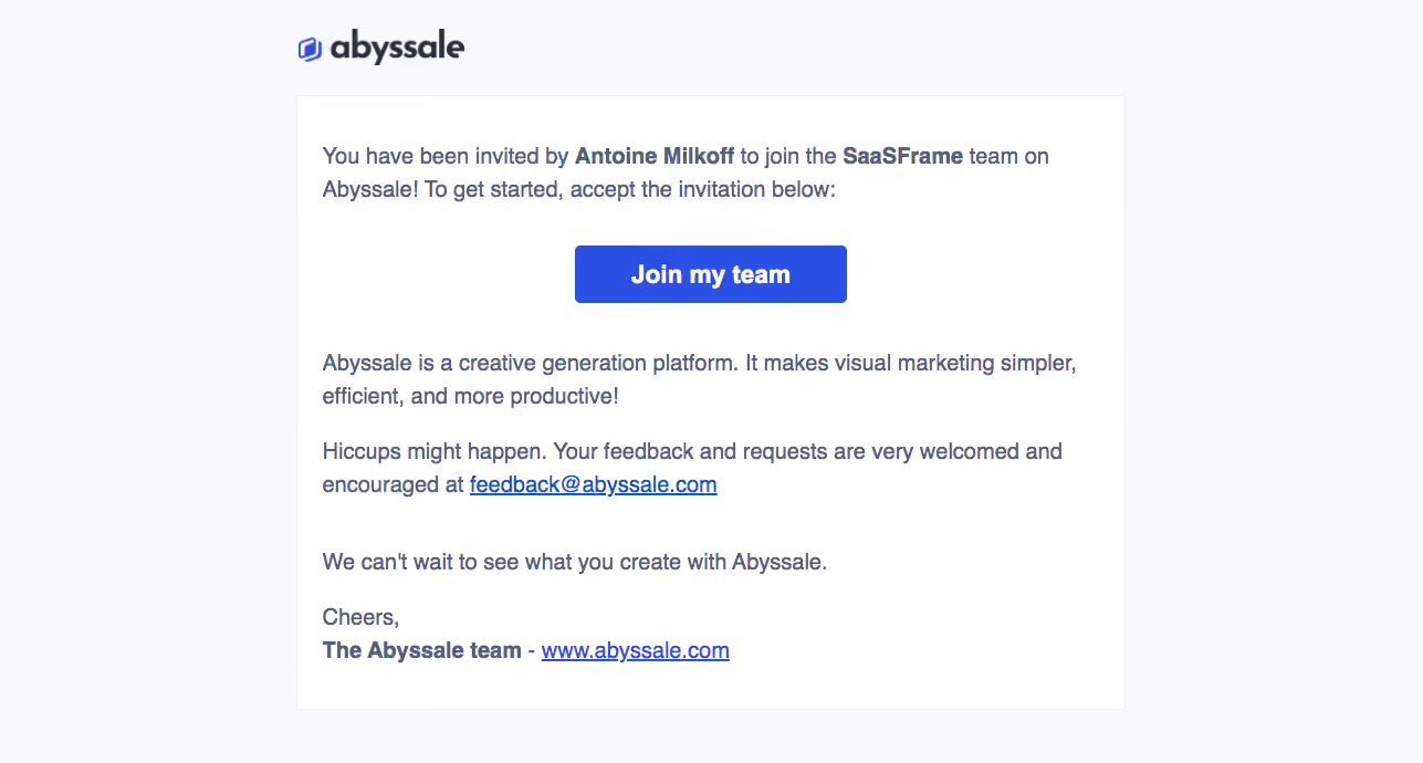
- **Character:** A simple invitation email uses a pale blue-gray canvas, a white message panel, slate text, and one saturated blue team-join action.
- **Evidence:** The screenshot is 1287 × 690 image pixels. Measurements below refer to observed pixels; actual email CSS width and capture ratio are unverified.
- **Tone:** A small brand mark and conversational paragraphs keep the message direct and functional.
### Page composition
- **Container:** A centered region approximately 750 px wide begins near x268.
- **Brand:** The Abyssale wordmark sits above the panel, aligned with its left edge.
- **Message panel:** A thinly outlined white rectangle runs from about y86 to y642, with roughly 23 px side padding.
- **Order:** Invitation paragraph, centered join button, product explanation, feedback paragraph, closing sentence, and team sign-off form one vertical sequence.
- **Close:** The final brand website link shares a line with the bold team signature.
### Information hierarchy
- **Invitation:** The opening paragraph identifies inviter and team using bold inline emphasis.
- **Primary action:** The centered blue Join my team button is the only filled control and the strongest visual element.
- **Secondary content:** Product explanation and feedback copy follow in regular slate text.
- **Links:** Underlined blue email and website links provide secondary destinations without additional button styling.
### Typography
- **Family:** A conventional sans serif is used throughout; exact identity is unverified.
- **Body:** Approximately 20–21 px with 30 px line-height, medium weight, in slate gray-blue.
- **Emphasis:** Inviter, team, and signature use bold weight at the same text size.
- **Button:** Approximately 23–24 px bold white text, centered.
- **Brand:** The wordmark is a separate graphic with heavier dark lettering and a small blue outline symbol.
### Colors & surfaces
- **Measured colors:** Source samples include pale background #F7F9FC, white #FFFFFF, saturated blue #2B50E6, slate #55607D, light gray #F0F0F0, and link blue #1155CC.
- **Semantic use:** Blue marks the primary action and links; slate carries all prose.
- **Panel:** A faint neutral border separates the white message area from the pale canvas.
- **Depth:** No strong shadow or layered card effect is visible.
### Components
- **Invitation button:** Approximately 246 × 52 px, saturated blue with small 4–5 px radii and no visible icon.
- **Message panel:** Approximately 750 × 556 px, square corners, thin border, and modest padding.
- **Inline links:** Blue underlined text distinguishes feedback and website destinations.
- **Brand asset:** A compact logo around 155 px wide sits with clear space above and below.
### Visual rhythm
- **Paragraph spacing:** Broad gaps of roughly 30–40 px separate explanatory groups.
- **CTA spacing:** The button has a generous pause above and below, isolating the acceptance action.
- **Alignment:** Prose and sign-off share one left edge; only the button is centered.
- **Density:** Two-line paragraphs and a short sign-off keep the panel readable despite the compact overall height.
### Responsive
- **Observed limit:** Only one email rendering is available; mobile behavior is unverified.
- **Recommended layout:** Use a fluid max-width panel with 20–24 CSS px mobile gutters and proportional logo sizing.
- **Recommended text:** Preserve live text and readable leading, allowing long names and links to wrap.
- **Recommended CTA:** Maintain comfortable button dimensions without exceeding the available column.
### Adaptation guidance
- **Preserve:** Keep the emphasized invitation context, single filled action, and lightweight explanatory paragraphs.
- **Implement:** Use email-compatible markup and inline styles; include a meaningful logo alternative and descriptive action link.
- **Content:** Substitute appropriate invitation variables without copying personal example names or account details.
- **Validate:** Check narrow-screen wrapping, image-blocked rendering, link contrast, and focus treatment. Acceptance and resulting membership states are not shown.
Use this context to reproduce the reference's visual language: layout, typography, colors, spacing, borders, radii, and distinctive elements. The screenshot takes priority if descriptions conflict.
## Direction
{{preferences.fidelityInstructions}}
## Output
{{output.instructions}}
Deliver a polished, cohesive design with precise alignment, hierarchy, and spacing. Produce the requested visual artifact, not just a description. If unsupported, explain the limitation.