Generate a new design based on this screen using your own content.
Thank you! Your submission has been received!
Oops! Something went wrong while submitting the form.
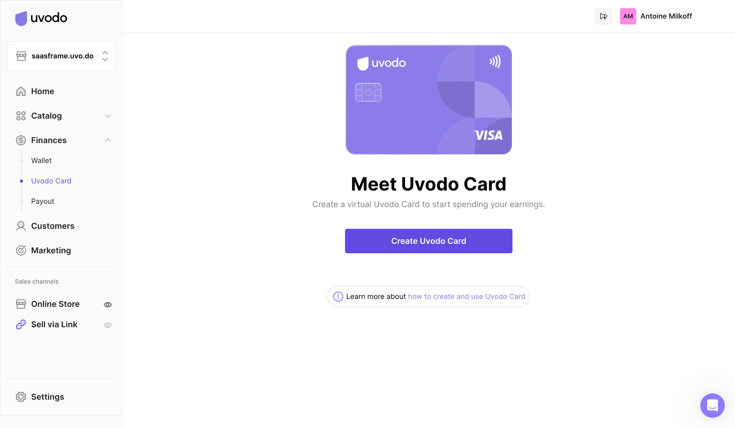
# Design from Reference: Uvodo Uvodo Create Virtual Card
Create an original, high-fidelity visual design inspired by the reference. Prioritize composition, typography, colors, spacing, and component styling over technical implementation.
## Reference
- **Product:** Uvodo
- **Category:** Add & Edit
- **Screenshot:** https://cdn.prod.website-files.com/5e9dc792e1210c5325f7ebbc/6acad66dd63d2caea65c6376_6acad5fb83d98bb981872531_cms-938e3caea0e3f2c22ef036f3.webp
Analyze the screenshot first. If inaccessible, request it rather than guessing.
## Content
{{content.instructions}}
{{content.data}}
Preserve essential messaging and factual accuracy. Adapt structure and copy length for visual balance; never invent product claims.
## Visual Design
Use this context to reproduce the reference's visual language: layout, typography, colors, spacing, borders, radii, and distinctive elements. The screenshot takes priority if descriptions conflict.
## Direction
{{preferences.fidelityInstructions}}
## Output
{{output.instructions}}
Deliver a polished, cohesive design with precise alignment, hierarchy, and spacing. Produce the requested visual artifact, not just a description. If unsupported, explain the limitation.
This SaaS admin page embraces a minimalist, modern aesthetic that immediately conveys professionalism and efficiency. The uncluttered design uses strategically placed whitespace, fostering focus and clarity. A subtle touch of playfulness emerges through clean iconography and micro-interactions, balancing the straightforward interface with approachable energy.
Layout and Structure
The page’s structure is direct and user-centric. At the top, a compact navbar aligns the brand logo and concise utility links, setting the tone for streamlined navigation. The hero area is replaced with a headline and succinct description, immediately orienting users. The primary content focuses on a step-by-step card creation form, visually divided using clear section headings and horizontal rules. This approach prioritizes action and eliminates distractions.
Visual Elements
Visuals are purpose-driven: crisp, line-based icons add visual interest and support comprehension without dominating the view. Subtle hover states and gentle animation cues guide users intuitively through tasks. The absence of stock photography or videos keeps the experience lightweight and focused on interactivity.
Color Palette and Typography
A restrained palette featuring soft whites, gentle grays, and a signature accent color (often a calming green or blue) underscores the interface, highlighting actionable elements and important states. Typography is sharp and highly legible—likely a geometric sans-serif with a clear hierarchy, prioritizing headings and form labels for seamless scanning.
User Experience Patterns & Unique Choices
User flows are intuitive, with prominent call-to-action buttons and concise, well-spaced form fields. Error messages, tooltips, and progress indicators are thoughtfully incorporated, reducing friction. The page’s minimal distraction yet high utility underlines an innovative approach tailored for fast-moving SaaS teams. Overall, the tone feels trustworthy and quietly confident—ideal for SaaS founders seeking “less, but better” design inspiration.