
Thank you! Your submission has been received!
Oops! Something went wrong while submitting the form.
Get SaaSFrame Pro
Monthly
$18
Quarterly
$48
Yearly
$180
Upgrade to access this feature
Browse all screens & flows
Filter and search screens & flows
Access Figma files
Access mobile versions
Bookmark screens & flows
Join now

Sprout Social Activity Report

Sprout Social
Social Media Management Solutions
Designed by
No items found.

Bookmark
Bookmark

Design with AI
Thank you! Your submission has been received!
Oops! Something went wrong while submitting the form.
# Design from Reference: Sprout Social Activity Report
Create an original, high-fidelity visual design inspired by the reference. Prioritize composition, typography, colors, spacing, and component styling over technical implementation.
## Reference
- **Product:** Sprout Social
- **Category:** Activity Summary Email
- **Screenshot:** https://cdn.prod.website-files.com/5e9dc792e1210c5325f7ebbc/62ecad8272e5af210e207e18_1659677307555-5eb9807a18427725b5535dbb_screencapture-mail-google-mail-u-1-2020-05-11-18_37_59.webp
Analyze the screenshot first. If inaccessible, request it rather than guessing.
## Content
{{content.instructions}}
{{content.data}}
Preserve essential messaging and factual accuracy. Adapt structure and copy length for visual balance; never invent product claims.
## Visual Design
### Overall aesthetic
- **Style:** Traditional weekly social-activity email digest with a centered white report column on a light-gray email canvas.
- **Character:** Bright green report banner, blue platform-specific table accents, compact gray typography and rows of square profile photographs.
- **Surface treatment:** Flat rectangular sections, alternating table-row fills and a pale recommended-actions box. Rounded application-style cards are absent.
### Page composition
- **Capture dimensions:** 1304 × 2427 image px. Geometry below refers to screenshot pixels; capture-to-CSS scale is unverified.
- **Outer layout:** A roughly 750 px-wide report column is centered with broad gray side margins. Brand and login link sit above the report.
- **Banner:** Green rectangle spans the report width, with centered uppercase report title, smaller seven-day subtitle and pale decorative bar-chart silhouette along its base.
- **Report identity:** White body begins with a group label/name, associated-account line, divider, date-range line and data-completeness note.
- **Statistics:** A platform heading and icon lead into a three-column striped table for metric, total and comparison. A full-width blue report link closes the table.
- **Profile sections:** Connected profile appears first, followed by five visible new-follower thumbnails with a more-count and four brand-advocate thumbnails.
- **Recommended actions:** A pale-gray box presents a heading and five underlined links arranged in two columns.
- **Email footer:** Outside the white report, a muted brand symbol, social links and address/unsubscribe line sit centered on gray.
### Information hierarchy
- **Report title:** Uppercase white banner text establishes the digest type and time period.
- **Scope:** Group and date information appear before performance data.
- **Metric hierarchy:** Platform heading, column labels and bold totals make the summary scannable; comparison arrows distinguish direction where values exist.
- **Missing comparisons:** Several cells explicitly show Low Data. Do not replace these with invented percentage trends.
- **Action hierarchy:** The blue full-report bar is the strongest action; recommended links provide secondary operational routes.
- **Personal-data handling:** Account identifiers and profile handles are source content and need not be reproduced in an adapted design description.
### Typography
- **Family:** Conventional email-safe sans serif appearance; exact family is unverified.
- **Banner:** Approximately 34–38 image px bold uppercase, with a smaller 20–22 px subtitle and increased tracking.
- **Group name:** Approximately 30–32 image px, green and medium weight.
- **Section headings:** Approximately 22–24 image px for platform statistics; profile-section labels are smaller uppercase gray text.
- **Table/body:** Approximately 16–18 image px with 24–28 px row rhythm. Totals and comparison percentages are bolder.
- **Metadata/footer:** Approximately 13–15 image px, muted gray.
- **CSS guidance:** For a rebuilt email, start around 14–16 CSS px body and 28–32 px banner title, then validate against the desired email width rather than assuming a confirmed device-pixel ratio.
### Colors & surfaces
- **Outer canvas:** Sampled sRGB #EFEFEF supplies the light-gray email background and striped-table reference.
- **Report body:** Sampled #FFFFFF fills the main column.
- **Banner green:** Sampled #7AC142 is the principal bright green accent.
- **Blue table/action:** Sampled #46AAE1 supplies the platform rule and full-report action reference.
- **Secondary box:** Sampled #F2F2F2 supplies the pale recommended-actions surface.
- **Profile placeholders:** Sampled #924B97 supplies the purple background of several generic follower avatars.
- **Decorative bars:** Sampled #A2D57D is a lighter green reference for banner chart bars.
### Components
- **Statistics table:** Three columns, alternating white/gray rows, modest cell padding and no heavy enclosing border.
- **Trend symbols:** Small green upward and gray downward triangles appear beside applicable comparisons.
- **Report action:** Full-width blue rectangular bar with bold uppercase white label and small right chevron.
- **Profile thumbnails:** Square images roughly 110 px across in source geometry, with small centered handles beneath.
- **Follower row:** Five equally sized thumbnails fit one line; the more-count aligns near the section's right edge.
- **Advocate row:** Four thumbnails use the same visual treatment, with a small explanatory subtitle beside the group heading.
- **Recommended box:** Flat pale rectangle with internal padding, heading above two columns of underlined bulleted links.
- **Footer links:** Small platform-colored social symbols/text and a subdued unsubscribe route.
### Visual rhythm
- **Email pacing:** Strong colored banner leads into compact scope data, a dense table, airy profile rows and a final actions box.
- **Alignment:** Report identity, statistics and profile sections share a consistent inset inside the white column.
- **Repetition:** Equal thumbnail sizes and striped table rows provide stable scanning patterns.
- **Whitespace:** Larger gaps separate profile categories, distinguishing them from the tighter metrics region.
### Responsive
- **Evidence limit:** Only the captured email layout is visible; recommendations below are not observed mobile behavior.
- **Width recommendation:** Use a fluid email container with a maximum width and safe side padding.
- **Table recommendation:** Keep metric names readable and prevent comparison columns from becoming too narrow.
- **Profiles recommendation:** Wrap thumbnail rows or reduce the visible count rather than shrinking portraits and labels excessively.
- **Actions recommendation:** Stack recommended links on narrow screens and preserve adequate touch spacing.
- **Email recommendation:** Validate in target mail clients and provide useful alternative text for profile and brand imagery.
### Adaptation guidance
- **Preserve digest structure:** Identify reporting scope and period before presenting metrics, people and next actions.
- **Use real data:** Populate totals, changes, profile identities and date ranges from actual reporting data.
- **Handle uncertainty clearly:** Retain an explicit low-data state when a comparison is unavailable.
- **Keep color meaningful:** Use brand green for the digest identity and a platform/action accent for the statistics section.
- **Accessibility recommendation:** Use semantic table headers, descriptive links and readable contrast; email behavior cannot be verified from the screenshot.
Use this context to reproduce the reference's visual language: layout, typography, colors, spacing, borders, radii, and distinctive elements. The screenshot takes priority if descriptions conflict.
## Direction
{{preferences.fidelityInstructions}}
## Output
{{output.instructions}}
Deliver a polished, cohesive design with precise alignment, hierarchy, and spacing. Produce the requested visual artifact, not just a description. If unsupported, explain the limitation.


Category
Patterns
No items found.
Tech Stack
No items found.
Added on
May 4, 2020
Similar screens
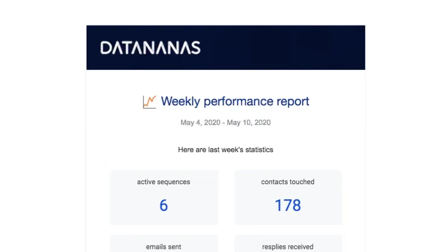


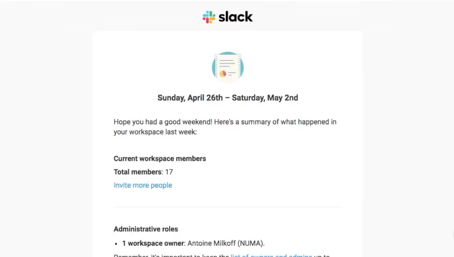

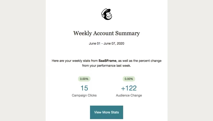

Upgrade to SaaSFrame Pro now to see similar examples.
Monthly
$18 /month
Billed $18 monthly
Browse all screens & flows
Filter and search screens & flows
Search text in screenshots
Access Figma files
Access mobile versions
Join now
Quarterly
$16 /month
Billed $48 quarterly
Browse all screens & flows
Filter and search screens & flows
Search text in screenshots
Access Figma files
Access mobile versions
Join now
Yearly
$15 /month
Billed $180 yearly
Browse all screens & flows
Filter and search screens & flows
Search text in screenshots
Access Figma files
Access mobile versions
Join now