
Thank you! Your submission has been received!
Oops! Something went wrong while submitting the form.
Get SaaSFrame Pro
Monthly
$18
Quarterly
$48
Yearly
$180
Upgrade to access this feature
Browse all screens & flows
Filter and search screens & flows
Access Figma files
Access mobile versions
Bookmark screens & flows
Join now

Spendesk Customer Stories

Spendesk
Spend management
Designed by
No items found.

Bookmark
Bookmark

Design with AI
Thank you! Your submission has been received!
Oops! Something went wrong while submitting the form.
# Design from Reference: Spendesk Customer Stories
Create an original, high-fidelity visual design inspired by the reference. Prioritize composition, typography, colors, spacing, and component styling over technical implementation.
## Reference
- **Product:** Spendesk
- **Category:** Customer Stories
- **Screenshot:** https://cdn.prod.website-files.com/5e9dc792e1210c5325f7ebbc/62f272de33f5458ecf28e5d3_1660055045625-3449c8af-da48-44d0-97ff-52c9d9f815b4-name%3DSpendeskCustomerStories.webp
Analyze the screenshot first. If inaccessible, request it rather than guessing.
## Content
{{content.instructions}}
{{content.data}}
Preserve essential messaging and factual accuracy. Adapt structure and copy length for visual balance; never invent product claims.
## Visual Design
### Overall aesthetic
- **Style:** Long-form customer case study with dark indigo headings, muted slate body copy, lavender proof surfaces, and purple conversion bands.
- **Character:** Text-led editorial presentation with selective bold emphasis, before/after panels, a centered testimonial, and photographic related stories.
- **Capture condition:** Opening hero material is abruptly clipped and article sections repeat across horizontal joins. The footer is cut into a large pale blank tail; missing content is not inferred.
### Page composition
- **Capture and scale:** 1440 × 6485 image px. CSS estimates assume approximately 1× capture; scale is unverified.
- **Header:** Purple brand left, product/company navigation, language selector, login, and purple demo action right.
- **Opening:** Pale-lavender hero fragment with the top of a photo visible, immediately followed by clipped article text.
- **Article column:** Approximately 1024px wide, starting around x=208px, with full-width headings and long paragraphs.
- **Comparison:** Two equal panels sit side by side: pale pink before state and pale lavender after state, each with colored heading and cross/check list.
- **Article themes:** Travel spending, subscription management, time savings, scaling, employee onboarding, and product/company fit.
- **Testimonial band:** Full-width pale lavender section with a centered large quote and small portrait/attribution below.
- **Conversion band:** Full-width purple area, centered heading, short supporting sentence, mint demo action, and outlined contact action.
- **Related stories:** Three photo-led cards in one row, with headings, compact outcome/category metadata, and employee-size chips.
- **Footer fragment:** Brand/socials left and four link groups right; only its upper portion is reliably visible.
### Information hierarchy
- **Narrative headings:** Medium-large dark headings break the customer story into benefit-oriented topics.
- **Paragraph emphasis:** Selected phrases become bold inside otherwise regular slate copy.
- **Before/after proof:** Colored crosses and checks distinguish pains from improvements.
- **Testimonial:** Large centered quotation has greater visual prominence than normal article copy; portrait and role remain subordinate.
- **Conversion:** White heading on purple and mint primary action create the strongest closing emphasis.
- **Related content:** Photography leads, followed by story title, small metric line where present, then compact tags.
- **Capture uncertainty:** Repeated narrative topics and missing hero text are treated as screenshot limitations, not a verified intended sequence.
### Typography
- **Family:** Rounded humanist sans serif; exact identity is unverified.
- **Article headings:** Approximately 36px semibold with 44px line-height.
- **Body:** Approximately 18px regular with 26–28px line-height; bold spans use the same size.
- **Comparison headings:** Approximately 18px semibold; list text around 18px with multiline 27px leading.
- **Testimonial:** Approximately 28–30px medium with 38px line-height, centered over a narrower measure.
- **Conversion:** Approximately 36px heading, 18px support, and 16px button labels.
- **Related cards:** Approximately 18px semibold titles and 14px uppercase metadata.
- **Navigation/footer:** Approximately 14–16px; footer headings are small semibold text.
- **Precision:** CSS dimensions and font roles are visual estimates rather than extracted declarations.
### Colors & surfaces
- **Canvas:** Sampled #FFFFFF.
- **Lavender surfaces:** Sampled #F7F3FE across testimonial/soft brand areas.
- **Primary purple:** Sampled #6140D2 in the conversion band and brand emphasis.
- **Before panel:** Sampled #FCEDF2, paired with pink-red headings and crosses.
- **Secondary neutral:** Sampled #FAFAFA in pale background areas.
- **Mint action:** Sampled #A0EDE5 on the closing demo button.
- **Text roles:** Dark indigo headings and muted slate paragraphs; white text reverses on the purple band.
- **Sampling:** Listed hex values are measured screenshot surfaces; photographs, antialiased text, and shadows contain additional shades.
### Components
- **Header CTA:** Purple rounded rectangle approximately 130 × 44px with white label.
- **Narrative sections:** Unboxed paragraphs and headings with no enclosing card.
- **Before/after panels:** Approximately 496px wide with 8px radius, 32px padding, and roughly 32px gap.
- **Comparison bullets:** Colored cross/check symbols in a narrow gutter, with hanging alignment for wrapped text.
- **Testimonial identity:** Small square portrait with softly rounded corners, purple name, and muted role beside it.
- **Closing actions:** Mint filled button and thin mint-outlined secondary button, around 50px high with 8px radii and about 16px gap.
- **Story images:** Broad landscape crops with rounded corners and customer branding near the lower edge.
- **Story metadata:** Small pale rectangular industry and headcount chips below titles; one card includes a purple uppercase outcome line.
- **Footer socials:** Compact purple icons on very pale rounded tiles.
- **State limits:** Static links/cards only; no expanded menu, video playback, or demo-booking state is shown.
### Visual rhythm
- **Editorial alignment:** Headings, paragraphs, and comparison panels share stable article edges.
- **Paragraph spacing:** Around 24–32px separates body groups, with larger 64–80px breaks around topic headings.
- **Text density:** Long wide paragraphs dominate the middle; comparison cards and full-width bands interrupt the density.
- **Closing progression:** Lavender testimonial, purple CTA, white related stories, and footer create distinct visual chapters.
- **Artifact caution:** Abrupt seams, repeated article material, and blank final space should not be reproduced as deliberate spacing.
### Responsive
- **Observed state:** Desktop only; mobile and interactive behavior are unverified.
- **Article recommendation:** Narrow the reading measure and use 20–24px gutters on small screens.
- **Comparison recommendation:** Stack before and after panels while preserving labels and cross/check meaning beyond color.
- **Related recommendation:** Change the three-card row to a vertical list.
- **CTA recommendation:** Wrap or stack actions; retain contrast between mint fill and outlined secondary action.
- **Navigation recommendation:** Collapse header links and keep demo/login readily available.
### Adaptation guidance
- **Preserve:** Text-led customer narrative, selective bold emphasis, explicit before/after proof, large testimonial, and purple conversion band.
- **Starting geometry:** Approximately 1024px article width, 36px headings, 18px body, 32px panel padding, and 50px actions under the unverified 1× assumption.
- **Capture cleanup:** Use a coherent nonduplicated article sequence from approved source content; do not invent the clipped hero or unseen footer links.
- **Claim fidelity:** Quotes, outcomes, and customer metrics must come from supplied approved material.
- **Photography:** Use relevant customer images with deliberate crops and appropriate alternatives.
- **Implementation recommendation:** Provide accessible links, focus states, and responsive reading widths; static pixels do not prove navigation behavior.
Use this context to reproduce the reference's visual language: layout, typography, colors, spacing, borders, radii, and distinctive elements. The screenshot takes priority if descriptions conflict.
## Direction
{{preferences.fidelityInstructions}}
## Output
{{output.instructions}}
Deliver a polished, cohesive design with precise alignment, hierarchy, and spacing. Produce the requested visual artifact, not just a description. If unsupported, explain the limitation.


Category
Patterns
No items found.




Added on
June 10, 2020
Similar screens
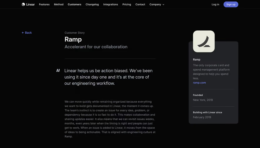


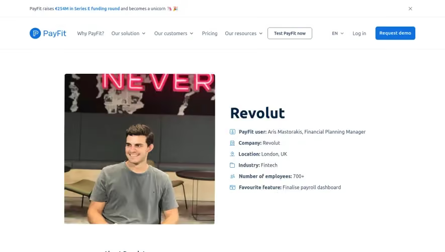



Upgrade to SaaSFrame Pro now to see similar examples.
Monthly
$18 /month
Billed $18 monthly
Browse all screens & flows
Filter and search screens & flows
Search text in screenshots
Access Figma files
Access mobile versions
Join now
Quarterly
$16 /month
Billed $48 quarterly
Browse all screens & flows
Filter and search screens & flows
Search text in screenshots
Access Figma files
Access mobile versions
Join now
Yearly
$15 /month
Billed $180 yearly
Browse all screens & flows
Filter and search screens & flows
Search text in screenshots
Access Figma files
Access mobile versions
Join now