


```html

Thank you! Your submission has been received!
Oops! Something went wrong while submitting the form.
Get SaaSFrame Pro
Monthly
$18
Quarterly
$48
Yearly
$180
Upgrade to access this feature
Browse all screens & flows
Filter and search screens & flows
Access Figma files
Access mobile versions
Bookmark screens & flows
Join now
Slack Blog

Slack
Corporate communication
Designed by
No items found.

Bookmark
Bookmark
Design with AI
Thank you! Your submission has been received!
Oops! Something went wrong while submitting the form.
# Design from Reference: Slack Blog
Create an original, high-fidelity visual design inspired by the reference. Prioritize composition, typography, colors, spacing, and component styling over technical implementation.
## Reference
- **Product:** Slack
- **Category:** Blog Feed
- **Screenshot:** https://cdn.prod.website-files.com/5e9dc792e1210c5325f7ebbc/62eca42517fa6381208117b5_1659674415958-62ec9c8beb86d37cda840c3d_screenshot-device-585a2f42d7aef01acda51bec7a04fbfa-1659606059834.webp
Analyze the screenshot first. If inaccessible, request it rather than guessing.
## Content
{{content.instructions}}
{{content.data}}
Preserve essential messaging and factual accuracy. Adapt structure and copy length for visual balance; never invent product claims.
## Visual Design
### Overall aesthetic
- **Character:** An editorial magazine-style blog using a white canvas, assertive black typography, thin horizontal rules and bright illustrated article imagery. Plum brand surfaces punctuate the otherwise airy layout.
- **Image basis:** The 1440 × 5531 screenshot was inspected through its full length at approximately 1400 px wide. Dimensions below are approximate inspection pixels; CSS scale and pixel ratio remain unverified.
### Page composition
- **Global header:** A compact horizontal navigation bar places the logo and menus left, search and sign-in toward the right, followed by outlined and filled sales/signup actions.
- **Editorial masthead:** Three compact most-read summaries precede a large centered “Several People Are Typing” masthead. Date and descriptive text share a lower line; blue category links sit between thin rules.
- **Featured region:** A roughly 683 px square green illustration occupies the left half. The right half contains a blue category, large multiline headline and excerpt, followed by two smaller side-by-side story tiles.
- **Collections:** A large section heading and compact count/circle-arrow controls introduce a horizontal strip. Approximately three 352 px wide, 591 px tall collection cards and part of a fourth are visible.
- **Latest and footer:** A four-column, two-row recent-content grid includes article cards and two promotional slots. Pagination precedes a cream newsletter section, a plum closing CTA with a curved lower edge, and a multi-column white footer.
### Information hierarchy
- **Editorial priority:** The masthead establishes publication identity; the featured headline and its oversized illustration then command attention.
- **Article roles:** Blue category labels introduce bold titles, followed by regular excerpts. Rules close each content unit without enclosing every article in a card.
- **Collections:** Numbered labels, colored backgrounds, large titles, descriptive copy and bottom illustrations distinguish thematic browsing from individual article browsing.
- **Conversion layers:** Promotional slots appear within the recent grid, followed by newsletter signup and a dedicated full-width CTA near the bottom.
### Typography
- **Display:** Masthead and major section headings are approximately 64 px, bold, with tight tracking and compact line-height. The sans-serif family is unverified.
- **Feature:** The main article title is approximately 48 px, bold, across several lines; supporting text is approximately 18 px with 26 px line-height.
- **Cards:** Recent and secondary story titles are approximately 24 px bold. Collection titles and compact promotional headings are closer to 32 px.
- **Utility:** Category links and labels are approximately 14–16 px. Footer group headings are small uppercase text; navigation and legal links use compact regular sans-serif text.
### Colors & surfaces
- **Measured base:** White #FFFFFF is the dominant page surface. Cream samples #F5EDE5 and #F4ECE3 appear in pale editorial or newsletter treatments.
- **Measured brand:** Plum #4B154B anchors the lower CTA and dark promotional treatment.
- **Measured artwork:** Green #185F33, blue #308AB7 and pinks #F5BBC1 and #F79FA6 occur in illustrated content. They are image-specific colors, not verified global UI tokens.
- **Separators:** Thin gray rules provide structure. Strong black text and blue editorial links make most hierarchy independent of surface color.
### Components
- **Navigation actions:** Compact rectangular buttons use a plum outline for the secondary sales action and a solid plum fill for signup, with modest corner rounding.
- **Featured story:** The large image is square and sharply cropped. Its companion content uses open white space and a bottom rule, with no heavy border or shadow.
- **Collection cards:** Tall, sharp-cornered colored panels contain top-aligned type, a small text-arrow action and large bottom artwork. The visible neighboring card communicates horizontal continuation.
- **Article grid:** Approximately 297 px wide article units use square imagery, category labels, bold titles, excerpts and bottom rules. Promotional slots share the grid's dimensions but have a distinct text-led surface.
- **Newsletter form:** A broad email field ends in a plum arrow control. Small consent text sits beneath; a large pink mailbox illustration balances the left-aligned heading and form.
- **Footer and pagination:** The current page number is blue and underlined; further numbers and an arrow extend the sequence. Footer links are grouped into five columns beside a separate brand mark. Interaction states beyond the selected page are unobserved.
### Visual rhythm
- **Editorial grid:** Repeated column edges, square imagery and thin rules create a disciplined newspaper-like rhythm.
- **Scale contrast:** Approximately 64 px headings alternate with compact labels and 18 px excerpts. Large vertical gaps distinguish collection, recent-content and newsletter regions.
- **Density:** The feature uses asymmetrical image/text weight; the recent grid becomes more regular and dense. Bright collection panels create a deliberate interruption.
- **Closing shape:** The large curved plum boundary softens an otherwise rectilinear page and separates conversion messaging from the footer.
### Responsive
- **Evidence limit:** The screenshot shows desktop only; responsive behavior is not observed.
- **Recommended grids:** Stack the feature, reduce recent stories from four columns to two and then one, and retain square image proportions.
- **Recommended collections:** Preserve horizontal browsing with accessible controls and a clear partial next card, or stack complete cards when horizontal scrolling is unsuitable.
- **Recommended forms:** Place newsletter artwork below the text on narrow screens; keep the email input and submit action usable without reducing text size.
- **Recommended navigation:** Collapse global navigation and footer groups while retaining search, publication categories and clear signup access.
### Adaptation guidance
- **Preserve:** Use oversized editorial headings, thin rules, blue category links and colorful illustration rather than adding heavy shadows to every story.
- **Model content:** Build distinct featured-story, article, collection and promotional components so each browsing purpose retains its hierarchy.
- **Maintain consistency:** Standardize image aspect ratios and title/excerpt spacing while allowing collection artwork and colors to vary.
- **Validate:** Confirm font identity, actual CSS spacing, link contrast, keyboard carousel controls and form labels during implementation. Static pixels do not verify those behaviors.
Use this context to reproduce the reference's visual language: layout, typography, colors, spacing, borders, radii, and distinctive elements. The screenshot takes priority if descriptions conflict.
## Direction
{{preferences.fidelityInstructions}}
## Output
{{output.instructions}}
Deliver a polished, cohesive design with precise alignment, hierarchy, and spacing. Produce the requested visual artifact, not just a description. If unsupported, explain the limitation.
Category
Patterns
No items found.
Tech Stack
No items found.
Added on
April 25, 2020
Similar screens
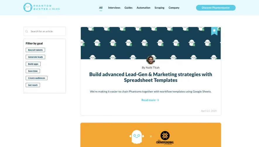


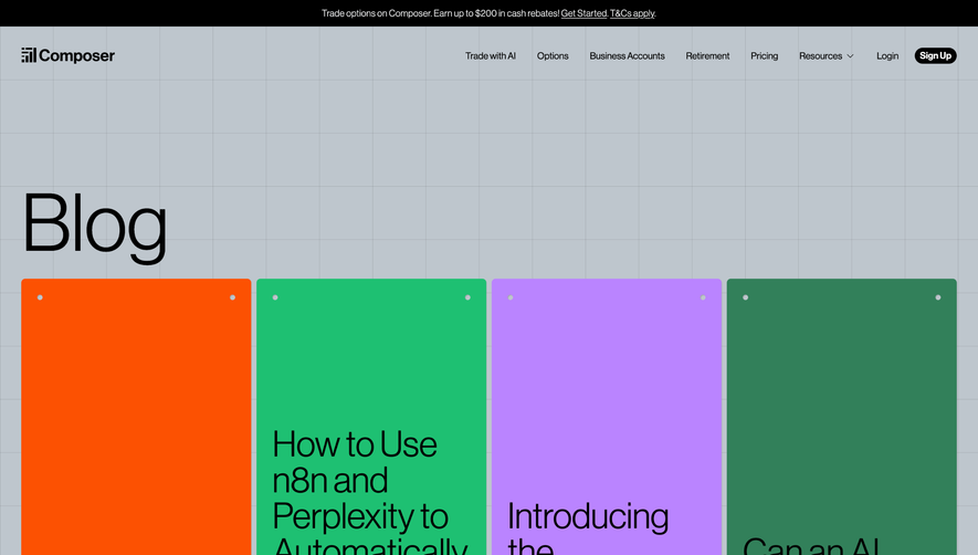

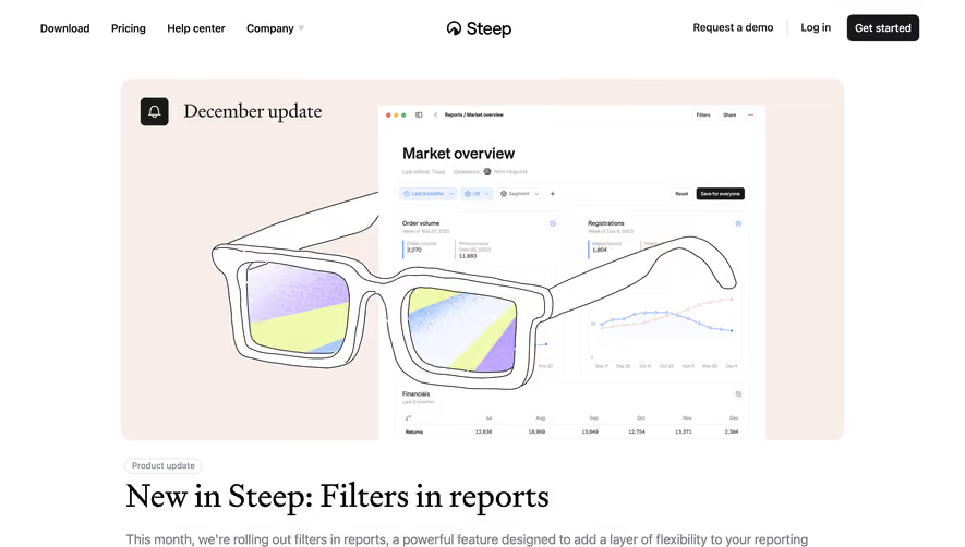

Upgrade to SaaSFrame Pro now to see similar examples.
Monthly
$18 /month
Billed $18 monthly
Browse all screens & flows
Filter and search screens & flows
Search text in screenshots
Access Figma files
Access mobile versions
Join now
Quarterly
$16 /month
Billed $48 quarterly
Browse all screens & flows
Filter and search screens & flows
Search text in screenshots
Access Figma files
Access mobile versions
Join now
Yearly
$15 /month
Billed $180 yearly
Browse all screens & flows
Filter and search screens & flows
Search text in screenshots
Access Figma files
Access mobile versions
Join now