
Thank you! Your submission has been received!
Oops! Something went wrong while submitting the form.
Get SaaSFrame Pro
Monthly
$18
Quarterly
$48
Yearly
$180
Upgrade to access this feature
Browse all screens & flows
Filter and search screens & flows
Access Figma files
Access mobile versions
Bookmark screens & flows
Join now
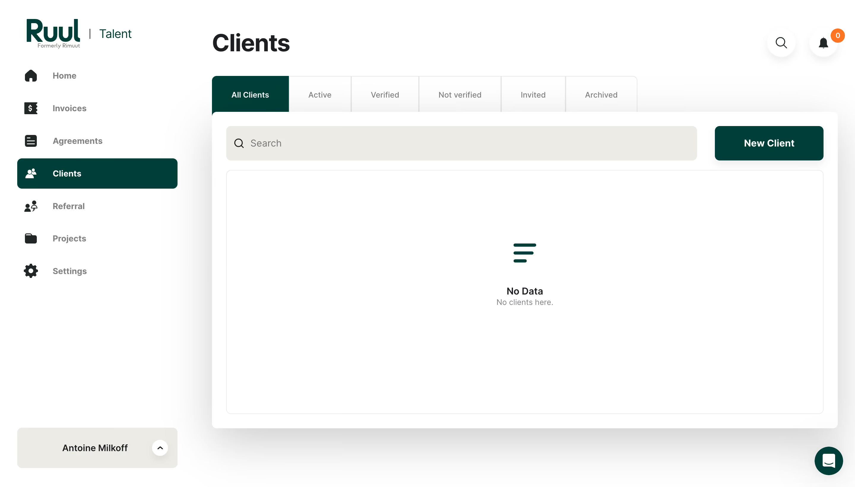
Ruul Add New Client

Ruul
Worktech Solutions for Modern and Global Work
Designed by
No items found.

Bookmark
Bookmark

Design with AI
Thank you! Your submission has been received!
Oops! Something went wrong while submitting the form.
# Design from Reference: Ruul Add New Client
Create an original, high-fidelity visual design inspired by the reference. Prioritize composition, typography, colors, spacing, and component styling over technical implementation.
## Reference
- **Product:** Ruul
- **Category:** Add & Edit
- **Screenshot:** https://cdn.prod.website-files.com/5e9dc792e1210c5325f7ebbc/6acb6c0f5391d62536b67162_6acb6ab45e515b69c796b771_cms-f4ba759f7cf809974656a09b.webp
Analyze the screenshot first. If inaccessible, request it rather than guessing.
## Content
{{content.instructions}}
{{content.data}}
Preserve essential messaging and factual accuracy. Adapt structure and copy length for visual balance; never invent product claims.
## Visual Design
### Overall aesthetic
- **Style:** Bright financial/work-management dashboard with deep-green navigation emphasis and a large empty client-list surface.
- **Character:** White canvas, bold page title, warm-gray search fill, substantial rounded controls, and a soft shadow beneath the main panel.
- **Observed state:** Client list is empty; no new-client form or dialog is open despite the record title.
### Page composition
- **Capture and scale:** 2880 × 1642 image px. CSS estimates assume a 2× capture, approximately 1440 × 821 CSS px; scale is unverified.
- **Sidebar:** About 320px wide, with brand/talent lockup top, seven icon-led navigation items, and a warm-gray account switcher anchored near the bottom.
- **Main area:** Begins near x=357 CSS px, with large Clients title above a six-tab status strip.
- **Header utilities:** Circular search and bell controls at upper right, with a small orange zero badge on the bell.
- **List panel:** Broad white rounded surface, approximately 1054px wide, containing search and New Client in one toolbar.
- **Empty list:** Large outlined inner rectangle fills most of the panel, with a small green empty-state symbol and centered two-line message.
### Information hierarchy
- **Page title:** Clients is the largest text element.
- **Selection:** Deep-green Clients navigation item and All Clients tab establish the current location and filter.
- **Primary action:** New Client is a solid deep-green rectangle at the toolbar’s right.
- **Empty state:** No Data label and muted explanatory sentence occupy the center of the blank list.
- **Secondary navigation:** Other status tabs and sidebar items remain gray, with compact labels.
### Typography
- **Family:** Neutral proportional sans serif; exact family is unverified.
- **Page title:** Approximately 40px bold with 48px line-height.
- **Navigation:** Approximately 14px bold labels; status tabs approximately 14px regular.
- **Toolbar:** Search text around 16px and New Client around 16px semibold.
- **Empty state:** Approximately 16px semibold title and 14px gray explanation.
- **Precision:** CSS sizes, weights, and line-heights are visual estimates under the unverified 2× assumption.
### Colors & surfaces
- **Canvas / panel:** Sampled #FFFFFF.
- **Primary green:** Sampled #003F39 on selected navigation, active tab, main action, and empty-state symbol.
- **Warm neutral:** Sampled #ECECE5 in search/account surfaces.
- **Text hierarchy:** Near-black heading and icons, medium-gray inactive labels, lighter explanatory copy.
- **Borders:** Very pale gray outlines define tabs and the inner list area.
- **Utility accent:** Small orange notification-count badge is isolated from the main green palette.
- **Depth:** Broad gray shadow separates the panel from the white page; near-white sampled shades reflect antialiasing and soft effects.
### Components
- **Sidebar destinations:** Icon plus label rows around 55px pitch. Selected Clients row is approximately 270 × 51px with 7px radius and reversed white content.
- **Status tabs:** Six adjoining bordered tabs, about 60px tall; active first tab has dark-green fill and white label.
- **Main panel:** Approximately 8px outer radius and 24px padding, with a pronounced broad shadow.
- **Search field:** About 794 × 58px, warm-gray fill, rounded 8px corners, leading magnifier, and no heavy outline.
- **New Client action:** Approximately 184 × 58px, deep green with white label, 8px radius, and subtle shadow.
- **Inner empty area:** Approximately 1006 × 410px with thin pale outline and 7px radius.
- **Empty symbol:** Three descending green horizontal strokes above the message.
- **Utility buttons:** White circular search and bell controls with soft shadows; orange badge overlaps the bell.
- **Account switcher:** Broad warm-gray rounded rectangle with user label and small white upward-chevron circle.
- **Support:** Deep-green circular chat launcher at the lower-right corner.
- **State limits:** No client rows, active typing, filter results, or creation form are shown.
### Visual rhythm
- **Alignment:** Page title, tab strip, and panel share the same left edge.
- **Toolbar:** Search takes most horizontal space; a roughly 30px gap separates it from New Client.
- **Empty-state spacing:** Large blank interior keeps the centered symbol and message isolated and calm.
- **Sidebar rhythm:** Consistent icon/label positions and repeated row spacing support fast scanning.
### Responsive
- **Observed state:** Desktop only; smaller layouts and interactive states are unverified.
- **Sidebar recommendation:** Collapse to a drawer when space is limited.
- **Tabs recommendation:** Allow horizontal scrolling or use a filter selector instead of compressing all six labels.
- **Toolbar recommendation:** Stack search and creation action at narrow widths.
- **Empty-state recommendation:** Keep message centered with a sensible minimum height, while preventing support controls from covering it.
### Adaptation guidance
- **Preserve:** Deep-green selection/action system, clear status filters, broad search toolbar, and a restrained empty list.
- **Starting dimensions:** About 320px sidebar, 40px title, 58px toolbar controls, 24px panel padding, and 8px radii under the unverified 2× assumption.
- **State fidelity:** Reconstruct the empty client-list screen; do not add a new-client form without a separate supplied state.
- **Content privacy:** Replace personal account labels with supplied example content.
- **Interaction recommendation:** Provide accessible tab/filter semantics, labeled utility buttons, clear focus, and an actual empty-state creation path consistent with the product.
Use this context to reproduce the reference's visual language: layout, typography, colors, spacing, borders, radii, and distinctive elements. The screenshot takes priority if descriptions conflict.
## Direction
{{preferences.fidelityInstructions}}
## Output
{{output.instructions}}
Deliver a polished, cohesive design with precise alignment, hierarchy, and spacing. Produce the requested visual artifact, not just a description. If unsupported, explain the limitation.


Category
Patterns



Added on
May 3, 2023
Found in 1 flow


Similar screens
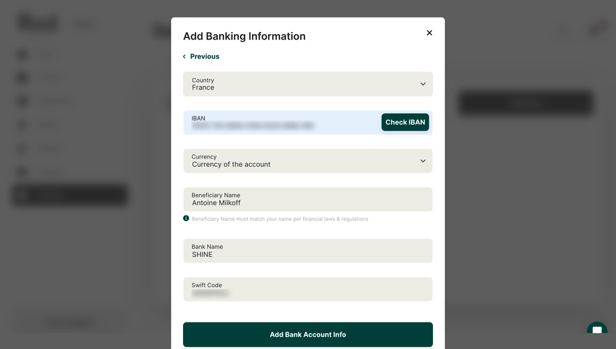

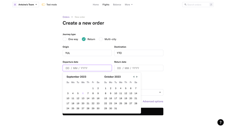

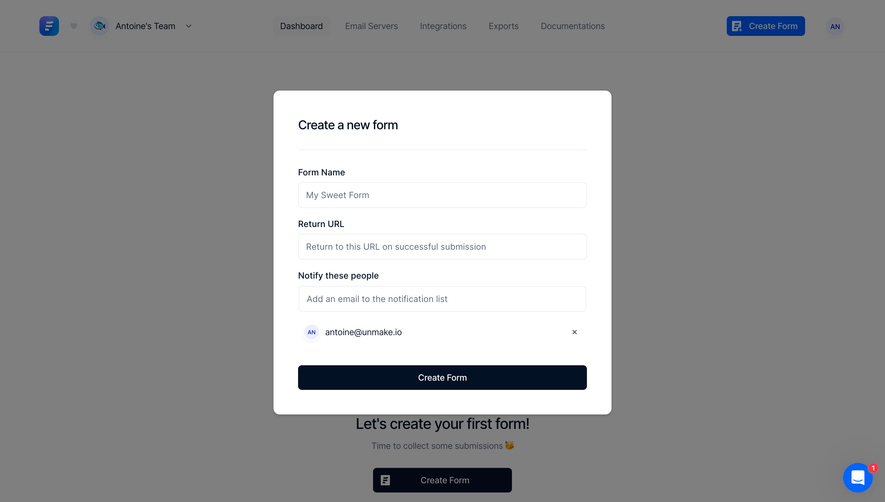

Upgrade to SaaSFrame Pro now to see similar examples.
Monthly
$18 /month
Billed $18 monthly
Browse all screens & flows
Filter and search screens & flows
Search text in screenshots
Access Figma files
Access mobile versions
Join now
Quarterly
$16 /month
Billed $48 quarterly
Browse all screens & flows
Filter and search screens & flows
Search text in screenshots
Access Figma files
Access mobile versions
Join now
Yearly
$15 /month
Billed $180 yearly
Browse all screens & flows
Filter and search screens & flows
Search text in screenshots
Access Figma files
Access mobile versions
Join now