Design with AI
Generate a new design based on this screen using your own content.
# Design from Reference: Remote Time Off Requests Table
Create an original, high-fidelity visual design inspired by the reference. Prioritize composition, typography, colors, spacing, and component styling over technical implementation.
## Reference
- **Product:** Remote
- **Category:** Table
- **Screenshot:** https://cdn.prod.website-files.com/5e9dc792e1210c5325f7ebbc/6acad676d63d2caea65c6531_6acad60b5a5fdf4c3031431b_cms-1532c97322c4d71a9d3550f3.webp
Analyze the screenshot first. If inaccessible, request it rather than guessing.
## Content
{{content.instructions}}
{{content.data}}
Preserve essential messaging and factual accuracy. Adapt structure and copy length for visual balance; never invent product claims.
## Visual Design
### Overall aesthetic
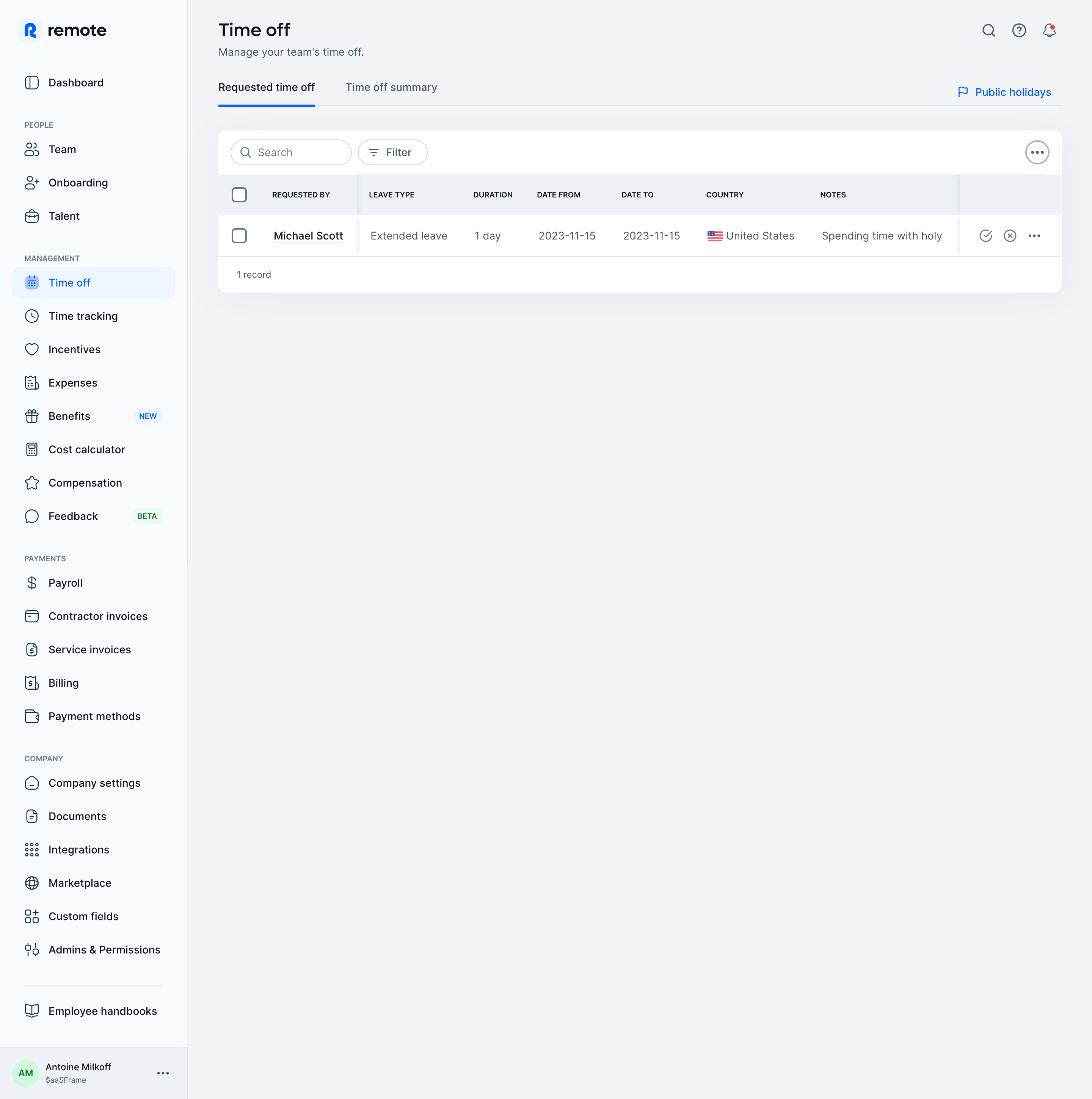
- **Character:** A light HR management screen uses a pale blue-gray workspace, white table card, dark navy text, and blue navigation/selection accents.
- **Evidence:** Original dimensions are 2880 × 2900 px, inspected across two crops at 1400 px width. Dimensions below estimate a 1440 px CSS layout at 2× capture; ratio is unverified.
### Page composition
- **Sidebar:** A roughly 248 CSS px rail contains brand, grouped people/management/payments/company links, and a bottom account block.
- **Main header:** Time off title and helper copy sit above two tabs; public-holiday access aligns right.
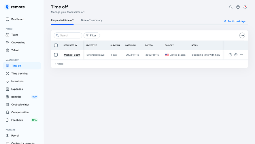
- **Table card:** A broad rounded white panel holds search/filter tools, column headers, one request row, and record count.
- **Whitespace:** The single-row table occupies the upper workspace, leaving a large empty region below.
### Information hierarchy
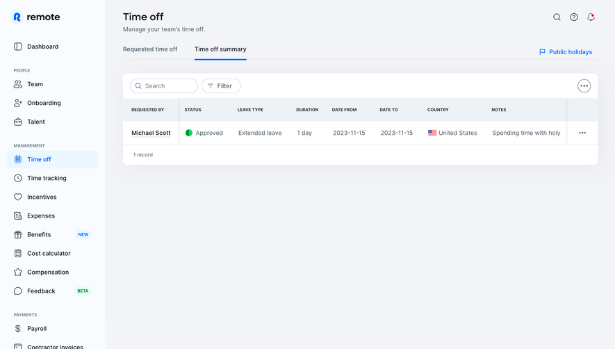
- **Location:** Selected Time off navigation and active requested-time-off tab identify the current view.
- **Table:** Uppercase column labels distinguish requester, leave type, duration, dates, country, and notes.
- **Request:** An underlined requester name and readable row values identify the single record.
- **Actions:** Approval/rejection symbols and overflow sit at the row end; a separate overflow control appears in the card toolbar.
### Typography
- **Family:** A rounded interface sans serif is used; exact identity is unverified.
- **Title:** Approximately 25 px semibold.
- **Navigation/body:** Around 14–15 px with 20 px leading.
- **Table headers:** Approximately 10–11 px uppercase semibold.
- **Section captions:** Small uppercase slate labels organize the sidebar.
### Colors & surfaces
- **Measured palette:** Samples include #F3F4F8, pale blue #F8FCFF, white #FFFFFF, #EDF2F6, #F2F3F7, and #F1F2F6.
- **Semantic accents:** Blue identifies active navigation, tab underline, and public-holiday link.
- **Text:** Navy primary labels contrast with muted slate row/helper text.
- **Structure:** Pale header fill and fine blue-gray rules define the table without heavy grid borders.
### Components
- **Sidebar selection:** Pale-blue rounded row with blue icon/text.
- **Search/filter:** Small outlined pill controls with leading icons.
- **Table card:** About 1110 CSS px wide with 12 px radii and soft shadow.
- **Table rows:** Header approximately 54 px high and data row about 55 px, with checkbox gutter and trailing actions.
- **Country cell:** Small flag precedes country text.
- **Badges:** Small blue New and green Beta pills appear beside some sidebar items.
### Visual rhythm
- **Gutters:** Main content starts roughly 40 CSS px beyond the sidebar.
- **Header spacing:** Title, helper, tabs, and table form distinct stacked groups.
- **Row alignment:** Stable columns and compact icon actions support scanning.
- **Sidebar cadence:** Even icon/text rows are separated by larger category gaps.
### Responsive
- **Observed limit:** Only desktop is visible; narrow-screen behavior is unverified.
- **Recommended navigation:** Collapse the long sidebar into an accessible drawer.
- **Recommended table:** Preserve readable columns through contained scrolling or labeled request cards.
- **Recommended actions:** Provide clear accessible names and comfortable targets for approval/rejection icons.
### Adaptation guidance
- **Preserve:** Keep clear request/summary navigation, readable request metadata, and compact search/filter tools.
- **Implement:** Use semantic table headers, labeled checkboxes, keyboard focus, and explicit action feedback.
- **Privacy:** Use suitable example employee/leave data rather than copying personal notes.
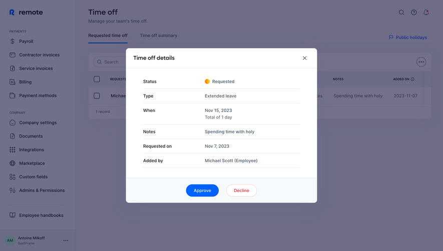
- **Validate:** Confirm fonts, CSS scale, column overflow, empty/multiple-row states, and action confirmations. No request decision is shown.
Use this context to reproduce the reference's visual language: layout, typography, colors, spacing, borders, radii, and distinctive elements. The screenshot takes priority if descriptions conflict.
## Direction
{{preferences.fidelityInstructions}}
## Output
{{output.instructions}}
Deliver a polished, cohesive design with precise alignment, hierarchy, and spacing. Produce the requested visual artifact, not just a description. If unsupported, explain the limitation.