Design with AI
Generate a new design based on this screen using your own content.
# Design from Reference: Qatalog Blog Feed
Create an original, high-fidelity visual design inspired by the reference. Prioritize composition, typography, colors, spacing, and component styling over technical implementation.
## Reference
- **Product:** Qatalog
- **Category:** Blog Feed
- **Screenshot:** https://cdn.prod.website-files.com/5e9dc792e1210c5325f7ebbc/6acb6ea22837b9f3168fb5c0_6acb6c78bf2e69a0c03bf082_cms-37f6faa5dcf54121d15108d5.webp
Analyze the screenshot first. If inaccessible, request it rather than guessing.
## Content
{{content.instructions}}
{{content.data}}
Preserve essential messaging and factual accuracy. Adapt structure and copy length for visual balance; never invent product claims.
## Visual Design
### Overall aesthetic
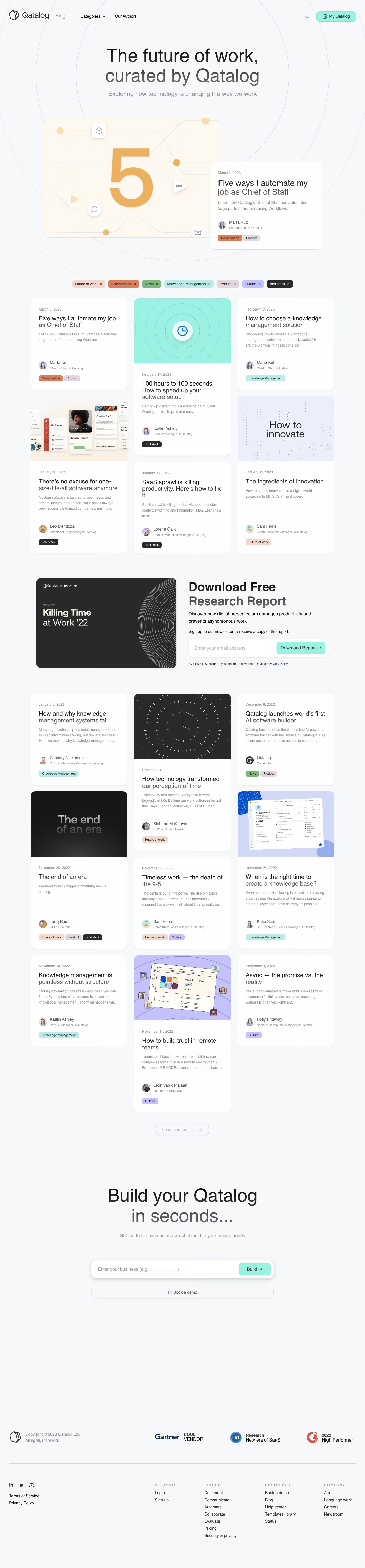
- **Character:** Soft editorial blog with light blue-gray canvas, concentric line motifs and pastel topic chips.
### Page composition
- **Capture:** 1440 × 6186 screenshot pixels; estimated CSS scale approximately 1×.
- **Structure:** Blog navigation, centered hero, featured illustration with overlapping story card, category chips, three-column masonry feed, research signup interruption, load more, product CTA and footer.
### Information hierarchy
- **Priority:** Featured story leads; dates, titles, excerpts, authors and tags repeat within cards. Research download and product-build actions interrupt the feed.
### Typography
- **Family:** Regular sans serif with restrained weight changes; exact family unverified.
- **Estimated CSS sizes:** Hero 68px, feature title 32px, card titles 24px, body 14–16px and metadata 12–14px.
### Colors & surfaces
- **Measured palette:** Canvas #F6F8FA, card #FDFEFE, dark #292929, warm illustration #FDF9F0, white #FFFFFF and lavender #ECEFFB.
- **Accents:** Mint buttons and topic-specific peach, orange, green, lavender and charcoal chips.
### Components
- **Elements:** Rounded masonry cards, optional cover images, author avatars, removable category chips, email/download field and large build-input CTA.
- **Estimated geometry:** Content 1200px wide, 24px gaps, card radii 20–24px, 32px padding and 64px CTA fields.
### Visual rhythm
- **Spacing:** Variable-height cards create an editorial rhythm; full-width research band and large CTA provide strong breaks.
### Responsive
- **Suggested adaptation:** Reduce masonry columns, remove feature overlap on narrow screens and wrap topic chips. Mobile behavior is unverified.
### Adaptation guidance
- **Transfer:** Preserve mixed image/text cards and consistent metadata order. Keep category colors coherent across filters and articles.
Use this context to reproduce the reference's visual language: layout, typography, colors, spacing, borders, radii, and distinctive elements. The screenshot takes priority if descriptions conflict.
## Direction
{{preferences.fidelityInstructions}}
## Output
{{output.instructions}}
Deliver a polished, cohesive design with precise alignment, hierarchy, and spacing. Produce the requested visual artifact, not just a description. If unsupported, explain the limitation.