Generate a new design based on this screen using your own content.
Thank you! Your submission has been received!
Oops! Something went wrong while submitting the form.
# Design from Reference: PlayPlay Upgrading
Create an original, high-fidelity visual design inspired by the reference. Prioritize composition, typography, colors, spacing, and component styling over technical implementation.
## Reference
- **Product:** PlayPlay
- **Category:** Plans
- **Screenshot:** https://cdn.prod.website-files.com/5e9dc792e1210c5325f7ebbc/6acbcd8033302e716eaa4565_6acbcb2be13ab9df8f04f140_cms-edc6e31972c98f505eda7e85.webp
Analyze the screenshot first. If inaccessible, request it rather than guessing.
## Content
{{content.instructions}}
{{content.data}}
Preserve essential messaging and factual accuracy. Adapt structure and copy length for visual balance; never invent product claims.
## Visual Design
Use this context to reproduce the reference's visual language: layout, typography, colors, spacing, borders, radii, and distinctive elements. The screenshot takes priority if descriptions conflict.
## Direction
{{preferences.fidelityInstructions}}
## Output
{{output.instructions}}
Deliver a polished, cohesive design with precise alignment, hierarchy, and spacing. Produce the requested visual artifact, not just a description. If unsupported, explain the limitation.
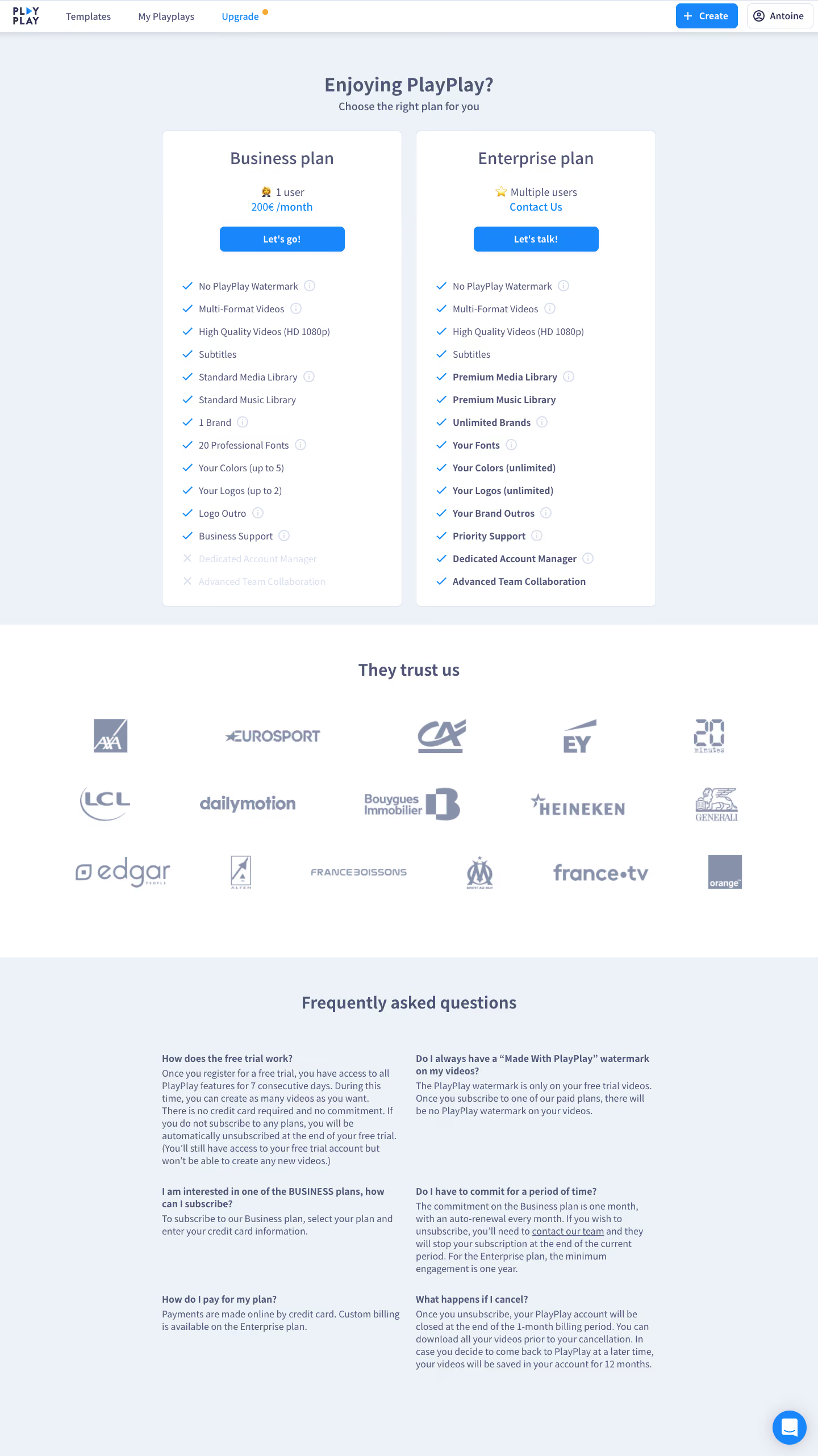
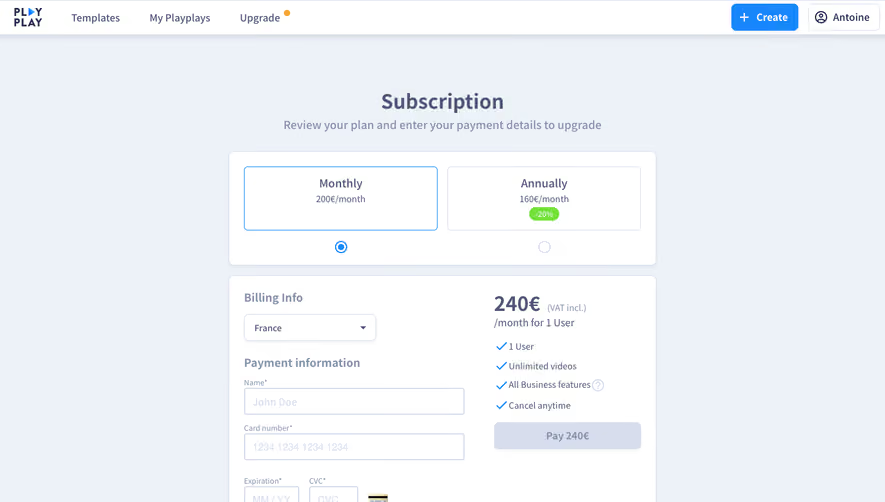
PlayPlay’s upgrade page is a masterclass in modern SaaS design: effortlessly clean, spacious, and vibrant. The overall vibe is both professional and playful, striking a balance that appeals to business users and creative teams alike.
Layout and Structure
The page flows in a logical, user-friendly structure. A prominent hero section introduces the upgrade proposition, followed by clear feature highlights, persuasive testimonial logos, and a focused call-to-action area. There’s minimal clutter, with each section breathing thanks to generous spacing and a distinct hierarchy.
Visual Elements
Dynamic, friendly illustrations and crisp vector icons create a visually engaging experience while reinforcing key features. Soft, rounded shapes and subtle animations inject energy and guide the eye down the page. Occasional product screenshots and UI previews add authenticity and context, helping users envision the product in action.
Color Palette and Typography
The color palette combines bold primaries—blue and yellow—with ample white space, giving the interface a bright, lively tone. Contrasts are leveraged for emphasis, especially in CTAs. Typography pairs a clean, humanist sans-serif for headings and supporting text, maintaining both legibility and approachability. Typography hierarchy guides users smoothly from headlines to details.
User Experience Patterns and Notable Choices
Navigation is efficient, with a sticky header ensuring easy access to other pages. Multiple, well-placed CTAs drive action while reducing friction. Subtle hover effects and micro-interactions provide tactile feedback, and clear pricing cards simplify decision-making. The decision to emphasize both benefits and trust signals (client logos) builds credibility. Overall, the tone feels innovative and inviting—ideal inspiration for an aspirational SaaS upgrade experience.