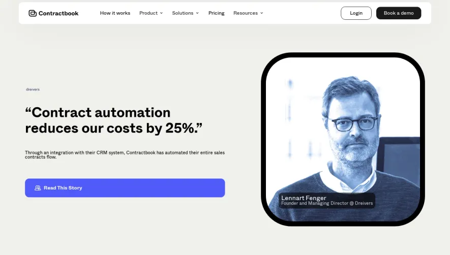
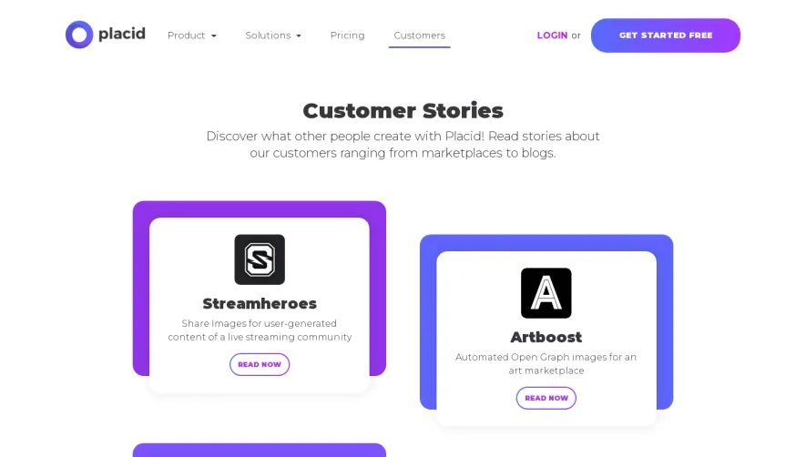
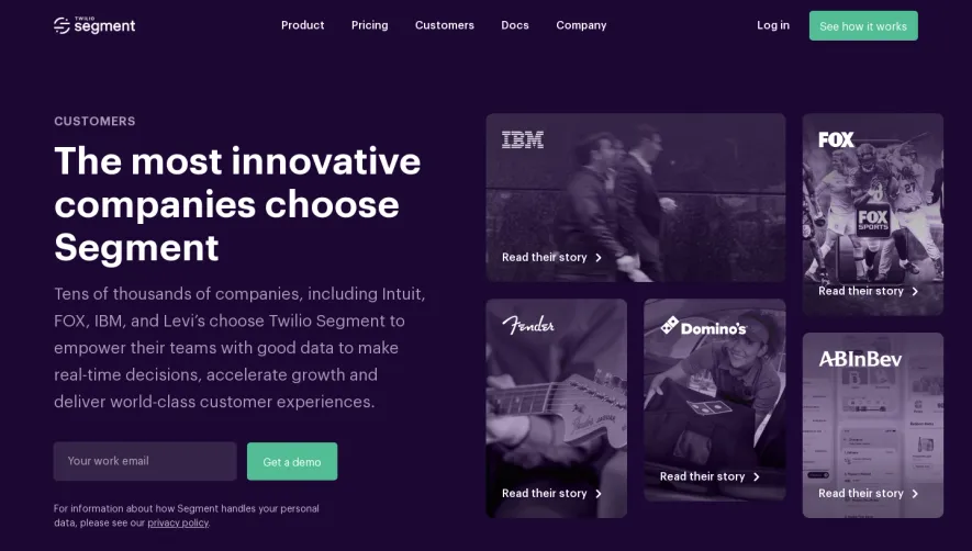
Generate a new design based on this screen using your own content.
Thank you! Your submission has been received!
Oops! Something went wrong while submitting the form.
# Design from Reference: PlanetScale Customers Page
Create an original, high-fidelity visual design inspired by the reference. Prioritize composition, typography, colors, spacing, and component styling over technical implementation.
## Reference
- **Product:** PlanetScale
- **Category:** Customers Page
- **Screenshot:** https://cdn.prod.website-files.com/5e9dc792e1210c5325f7ebbc/62ecbb57c8eb8333028ec376_1659680764779-screenshot-device-9b3138ac61dd692cdd0d2e2db2f1e66d-1659680290691.webp
Analyze the screenshot first. If inaccessible, request it rather than guessing.
## Content
{{content.instructions}}
{{content.data}}
Preserve essential messaging and factual accuracy. Adapt structure and copy length for visual balance; never invent product claims.
## Visual Design
Use this context to reproduce the reference's visual language: layout, typography, colors, spacing, borders, radii, and distinctive elements. The screenshot takes priority if descriptions conflict.
## Direction
{{preferences.fidelityInstructions}}
## Output
{{output.instructions}}
Deliver a polished, cohesive design with precise alignment, hierarchy, and spacing. Produce the requested visual artifact, not just a description. If unsupported, explain the limitation.
Planetscale’s Customers page exemplifies a sophisticated, modern SaaS aesthetic that balances professionalism with approachability. The design embraces minimalism, leveraging generous white space and subtle UI elements to create a sense of clarity and focus. It feels trustworthy and cutting-edge, positioning the product as enterprise-ready while remaining accessible.
Layout and Structure
The page opens with a visually striking hero section anchored by customer logos, immediately establishing credibility. Content is organized in a modular, grid-based structure—each case study presented as a high-impact card with a headline, logo, and concise summary. This card layout creates visual rhythm, making dense content easy to scan and inviting exploration.
Visual Elements
Vibrant product imagery, logo arrays, and candid team photography add authenticity and visual interest. The use of subtle motion—such as smooth fade-ins on scroll—injects a feeling of vitality without overwhelming the user. Consistent iconography highlights key features and takeaways.
Color Palette and Typography
A crisp blue and white palette dominates, accented by splashes of bold color from partner brands and UI elements. Typography is highly readable, with geometric sans-serif fonts, strong hierarchy in headings, and generous spacing. Text blocks are short and to the point.
User Experience Patterns and Notable Choices
Navigation is frictionless, with sticky headers and prominent CTAs (“Read more”) for deeper dives. Scroll interactions reveal content organically, while uniform cards simplify comparison. Notably, customer stories are prioritized over generic testimonials, grounding the brand in real results and use cases.
Tone and Feel
The design radiates innovation and authority, yet feels approachable and human-centric—a perfect reference point for SaaS teams seeking inspiration for clean, conversion-focused storytelling.