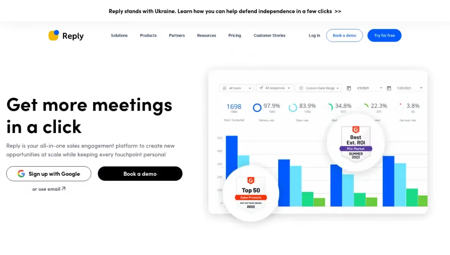
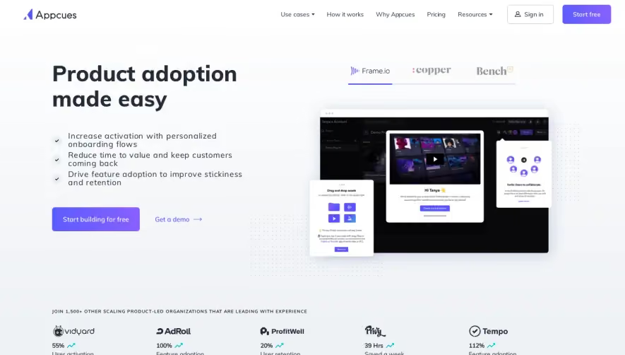
Overall Style and Aesthetic
Narrative BI’s website embodies a crisp, modern, and minimalist style, striking a balance between tech-savvy sophistication and approachability. Clean lines, ample white space, and disciplined use of color create a refined, professional presence that never feels cold. The design highlights clarity and usability, giving the platform immediate credibility while exuding a quiet confidence. Layout and Structure
The page structure flows intuitively: a compelling hero section with a focused headline and concise call-to-action, followed by a dynamic features carousel, social proof with recognizable logos, customer quotes, and an at-a-glance “how it works” breakdown. The main navigation is sticky and minimal, while the footer condenses essential links and contact opportunities, making the browsing experience smooth and logical. Visual Elements
Sleek, animated product mockups and subtle micro-interactions draw attention to core features without being distracting. Custom icons augment content blocks, reinforcing clarity. Human-centric illustrations and curated logos add personality, while restrained animation sequences gently coax attention deeper into the page. Color Palette and Typography
A limited palette prioritizes pristine white, balanced with blue and gentle gradients as accent tones, imparting energy without overwhelming the eye. A geometric sans-serif font family ensures modernity and readability; smart font scaling and bolding maintain clear hierarchy, guiding users effortlessly from headlines to details. User Experience Patterns & Unique Design Choices
Prominent CTAs are strategically placed in the hero and throughout feature blocks, encouraging demo signups with minimal friction. Captivating “social proof” sections and interactive feature demos foster trust and exploration. Overall, the site feels innovative yet inviting, establishing authority while encouraging user engagement with seamless navigation and subtle, delightful design details.