Design with AI
Generate a new design based on this screen using your own content.
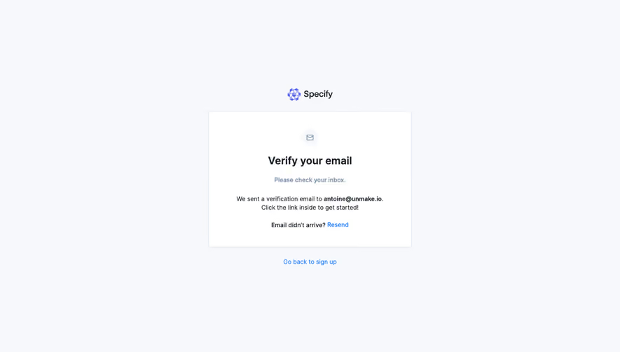
# Design from Reference: Mangools Email Verification
Create an original, high-fidelity visual design inspired by the reference. Prioritize composition, typography, colors, spacing, and component styling over technical implementation.
## Reference
- **Product:** Mangools
- **Category:** Verification
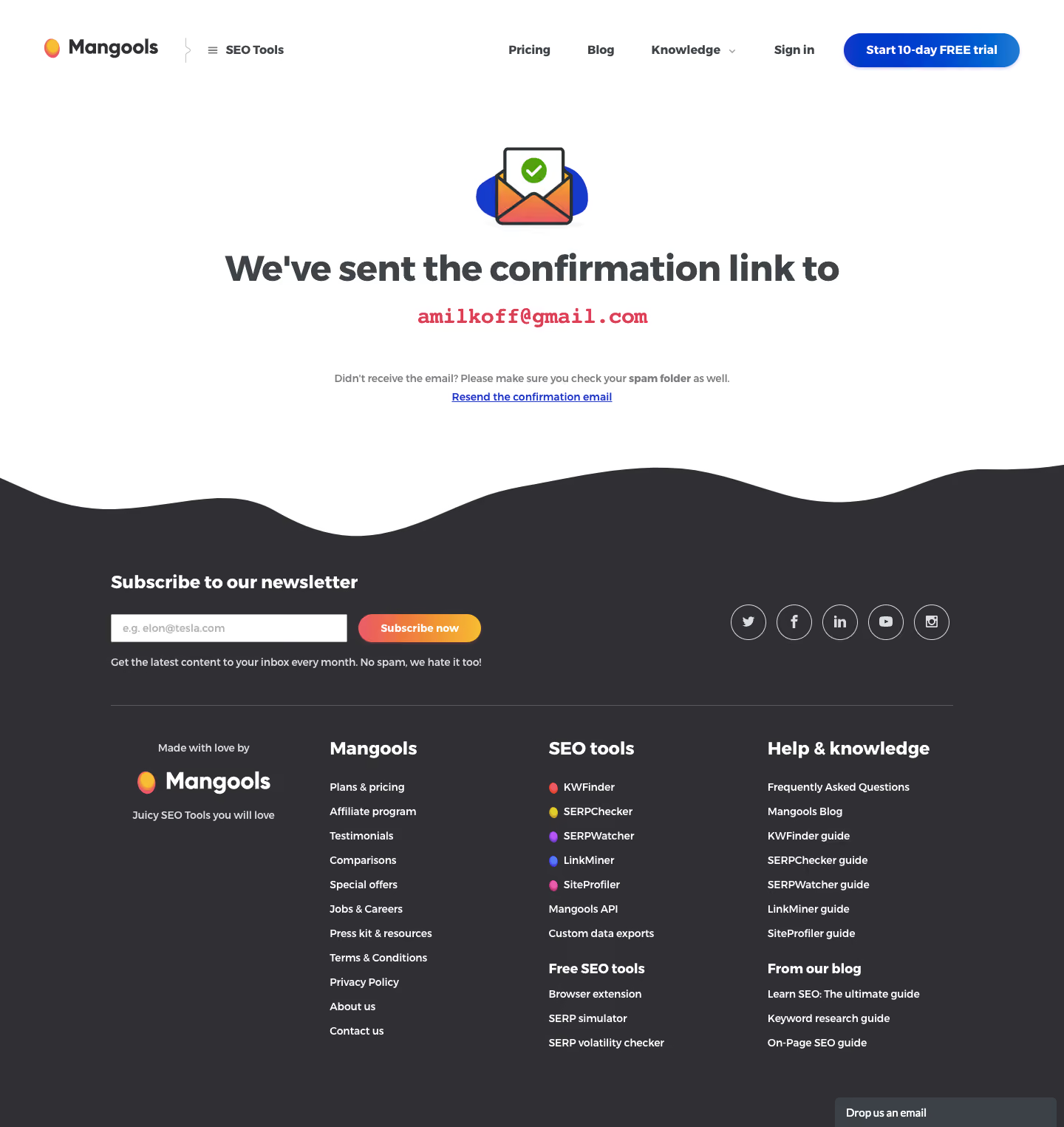
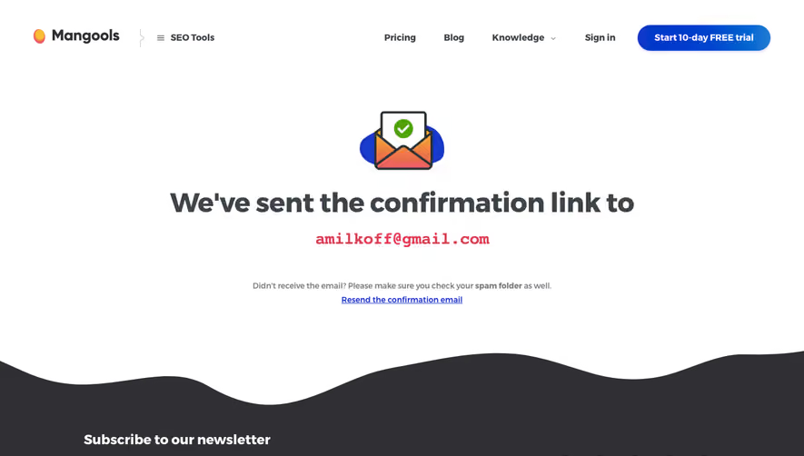
- **Screenshot:** https://cdn.prod.website-files.com/5e9dc792e1210c5325f7ebbc/6acbc94f1790037d3e059409_6acbc667ceb0f22248305d67_cms-8b75ab21c9c16ee648a8b46e.webp
Analyze the screenshot first. If inaccessible, request it rather than guessing.
## Content
{{content.instructions}}
{{content.data}}
Preserve essential messaging and factual accuracy. Adapt structure and copy length for visual balance; never invent product claims.
## Visual Design
### Overall aesthetic
- **Style:** Friendly email-verification confirmation page with a spacious white main area and dark, wavy-edged footer.
- **Character:** Heavy rounded headings, colorful envelope illustration, blue and coral accents, and rich footer navigation.
### Page composition
- **Canvas:** 1440 × 1525 screenshot px; measurements refer to image coordinates.
- **Header:** Logo and tools switcher left; product navigation and blue trial pill right.
- **Confirmation:** Centered envelope/check illustration, large statement, emphasized email line, and resend guidance.
- **Footer transition:** Broad irregular wave separates white from charcoal.
- **Footer:** Newsletter form and social circles above four navigation groups and chat tab.
### Information hierarchy
- **Primary:** Large confirmation statement.
- **Recipient:** Separate coral-red monospace email line creates emphasis.
- **Recovery:** Smaller spam-folder instruction and underlined resend link.
- **Footer:** Newsletter prompt dominates before navigation groups.
### Typography
- **Family:** Rounded geometric sans serif for headings and body; exact identity unverified.
- **Confirmation heading:** Approximately 48 screenshot px, bold.
- **Email line:** Approximately 28px, bold monospace.
- **Guidance:** Approximately 14px, medium.
- **Footer section headings:** Approximately 24px, bold.
- **Footer links:** Approximately 14px with 32px row spacing.
- **Precision:** Font sizes are image-based estimates.
### Colors & surfaces
- **Canvas:** #FFFFFF.
- **Footer:** #302F33.
- **Dark heading tones:** #3E4348 and #3B4146.
- **Blue action/link:** Approximately #163ACC.
- **Recipient accent:** Approximately #DF3E55.
- **Muted borders:** #D9DCE0.
- **Newsletter button:** Coral-to-yellow gradient.
- **Precision:** WebP compression creates adjacent shades; gradient values vary.
### Components
- **Confirmation illustration:** Envelope with green check, blue backdrop, and warm-colored envelope.
- **Trial CTA:** Blue gradient pill with white bold label.
- **Resend:** Small underlined blue text link.
- **Newsletter:** Rectangular white email field beside gradient pill button.
- **Social links:** Circular white outlines with platform glyphs.
- **Footer groups:** Section headings, colored tool dots, and stacked links.
- **Chat:** Small dark tab at lower right.
### Visual rhythm
- **Whitespace:** Large vertical gaps around the central confirmation.
- **Alignment:** Main content centered; footer content uses a wide aligned container.
- **Density shift:** Sparse confirmation transitions to a dense link footer.
- **Wave:** Adds a soft organic break between sections.
### Responsive
- **Observed:** Desktop only.
- **Recommendation:** Wrap confirmation text and recipient safely, stack newsletter controls, and reduce footer columns.
- **Privacy:** Avoid exposing recipient data beyond the required confirmation context.
- **Actions:** Keep resend visible without making it compete with the headline.
### Adaptation guidance
- **Preserve:** Clear sent-email status, recipient emphasis, recovery instruction, and simple resend link.
- **Content:** Replace recipient and product copy with supplied values.
- **Footer:** Include only relevant navigation and newsletter controls.
- **Behavior:** Delivery, resend timing, and verification result are not demonstrated.
Use this context to reproduce the reference's visual language: layout, typography, colors, spacing, borders, radii, and distinctive elements. The screenshot takes priority if descriptions conflict.
## Direction
{{preferences.fidelityInstructions}}
## Output
{{output.instructions}}
Deliver a polished, cohesive design with precise alignment, hierarchy, and spacing. Produce the requested visual artifact, not just a description. If unsupported, explain the limitation.