
Thank you! Your submission has been received!
Oops! Something went wrong while submitting the form.
Get SaaSFrame Pro
Monthly
$18
Quarterly
$48
Yearly
$180
Upgrade to access this feature
Browse all screens & flows
Filter and search screens & flows
Access Figma files
Access mobile versions
Bookmark screens & flows
Join now
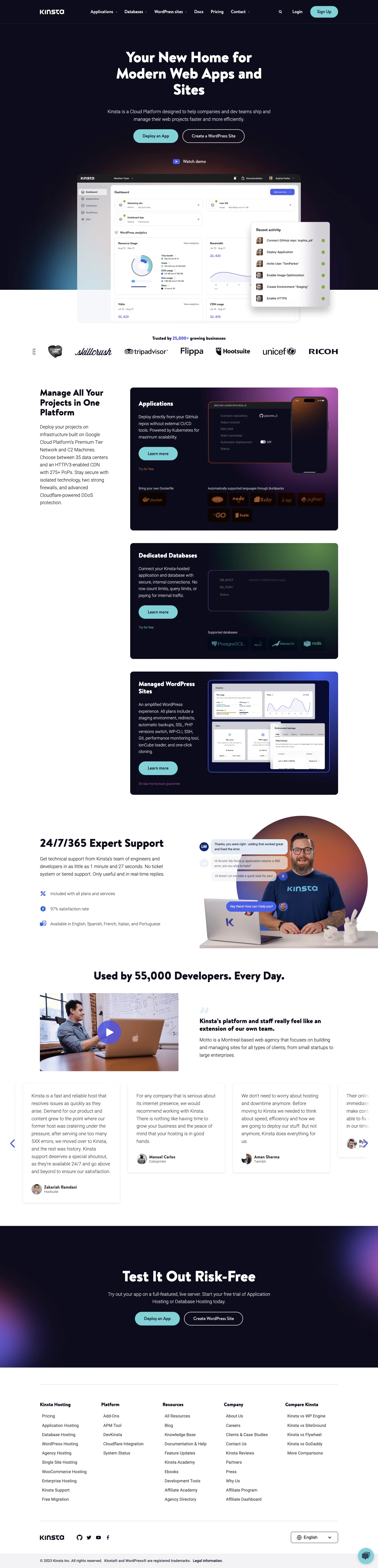

Kinsta Landing Page

Kinsta
WordPress Hosting Tool
Designed by
No items found.

Bookmark
Bookmark

Design with AI
Thank you! Your submission has been received!
Oops! Something went wrong while submitting the form.
# Design from Reference: Kinsta Landing Page
Create an original, high-fidelity visual design inspired by the reference. Prioritize composition, typography, colors, spacing, and component styling over technical implementation.
## Reference
- **Product:** Kinsta
- **Category:** Landing Page
- **Screenshot:** https://cdn.prod.website-files.com/5e9dc792e1210c5325f7ebbc/6acb726db10d21a746c47c88_6acb6f1218ad202d01d934a3_cms-a0e0e4dd877af96a1759e0d9.webp
Analyze the screenshot first. If inaccessible, request it rather than guessing.
## Content
{{content.instructions}}
{{content.data}}
Preserve essential messaging and factual accuracy. Adapt structure and copy length for visual balance; never invent product claims.
## Visual Design
### Overall aesthetic
- **Character:** A hosting marketing page combining a near-black, softly glowing hero with expansive white product and proof sections. Rounded, heavy headlines and cyan pill buttons make the technical content approachable.
- **Image basis:** Observed on a 1440 × 5968 screenshot, inspected at approximately 1400 px wide throughout. Geometry below is approximate inspection-pixel scale; CSS scale and device pixel ratio are unverified.
### Page composition
- **Header and hero:** A dark horizontal header places the logo left, product navigation across the middle, and search, login and a cyan signup action right. The centered hero uses a three-line headline, two-line supporting copy, paired actions and a small demo link.
- **Product reveal:** An approximately 829 px wide dashboard image overlaps the dark-to-white boundary. A smaller activity panel floats over its right edge; colored glows and shadows supply depth.
- **Product offering:** Below a customer-logo row, a narrow introductory column sits beside three stacked dark product panels for applications, databases and WordPress. Each panel combines left-aligned copy and a cyan action with a distinct product illustration on the right.
- **Proof and closing:** A support section pairs text and three benefit rows with a cutout person and chat illustrations. Video and quotation content precede a horizontal testimonial strip. A dark centered closing CTA leads into a five-column white footer and a lower legal strip.
### Information hierarchy
- **Primary attention:** The oversized hero statement dominates the first screen; the cyan deployment action is its strongest interactive accent. An outlined secondary action stays adjacent.
- **Product scanning:** Each dark product panel has its own bold heading, short description, primary action and smaller supporting link. Screenshots remain secondary evidence rather than replacing explanatory text.
- **Trust sequence:** Customer logos, support benefits, a video story and testimonial cards progressively substantiate the product claims.
- **Footer navigation:** Small grouped headings and dense links support secondary browsing; social icons, language selection and legal information occupy separate lower rows.
### Typography
- **Display roles:** Heavy, rounded sans-serif headlines are approximately 56 px in the hero and closing CTA, with tight tracking and roughly 1.1 line-height. The family identity is unverified.
- **Section roles:** Major white-section headings appear around 40 px; the product introduction is closer to 32 px. Dark-panel titles are clearly bold and subordinate to the main hero.
- **Reading roles:** Supporting text is approximately 18 px with 26–28 px line-height. The prominent quotation is around 24 px and heavier than its explanatory paragraph.
- **Utility roles:** Navigation, button labels, supporting links and footer text use smaller sans-serif sizes, approximately 13–16 px, with restrained weight variation.
### Colors & surfaces
- **Measured foundations:** Sampled screenshot colors include white #FFFFFF and near-black navy #0D0C1B, with nearby dark variants #0C0C1C and #0C0B1B. Light neutral regions include #F3F3F6.
- **Measured accent:** Cyan #82D1D6 is a principal action and brand accent. It contrasts strongly against the dark hero and product panels.
- **Illustrative color:** Magenta, green and blue glows differentiate the three product illustrations; purple corner glows enrich the closing section. These are artwork treatments rather than measured interface-state tokens.
- **Depth:** Floating interface images and testimonial cards use soft shadows, while most white content remains flat and open.
### Components
- **Hero actions:** The filled cyan pill measures approximately 167 × 51 px; the outlined WordPress action is approximately 230 × 51 px. Both have fully rounded ends and centered labels.
- **Product panels:** Broad dark cards use roughly 12 px corner radii, generous internal padding and two-column compositions. Product-specific screenshots, badges and small links provide distinct content inside a shared frame.
- **Support rows:** Small blue icons anchor three vertically spaced benefits. The adjacent portrait, gradient circle and chat bubbles form one illustrative cluster.
- **Proof cards:** Testimonial cards have white surfaces, subdued shadows, text above avatar/name attribution and blue directional controls nearby. The strip exposes partial neighboring cards.
- **Footer utilities:** A language selector and social icon row sit below the link columns. A small cyan circular chat launcher appears at the lower right. Hover and focus states are not shown.
### Visual rhythm
- **Macro spacing:** Large white gaps separate logos, products, support and proof. The dark hero and closing CTA bracket the page with strongly contrasting visual weight.
- **Alignment:** Centered promotional messaging alternates with left-aligned editorial blocks. Repeated product panels align along one right-hand column beside a persistent introductory region.
- **Internal rhythm:** Approximately 18 px body text and broad 40–60 px panel padding create comfortable density; small utility links sit distinctly below primary actions.
- **Layering:** The overlapping dashboard and floating activity panel create the main depth event, while later sections rely primarily on whitespace and artwork.
### Responsive
- **Evidence limit:** Only a desktop composition is visible; mobile layouts and breakpoints are unobserved.
- **Recommended stacking:** Stack the introductory column above the product panels, then place each panel's illustration below its text. Convert support and video/quote pairs into single-column sequences.
- **Recommended hero:** Scale the large headline with a fluid maximum and wrap the paired actions on narrow screens. Contain the dashboard overlap so floating elements do not create horizontal overflow.
- **Recommended navigation:** Collapse the dense header and footer groups appropriately, preserve touch-sized actions, and allow the testimonial strip to scroll with accessible controls.
### Adaptation guidance
- **Preserve:** Carry forward the dark navy/cyan action language, rounded display typography, layered product demonstration and substantial white-space intervals.
- **Build systematically:** Use reusable product-panel, benefit-row, testimonial and footer-group components. Separate decorative glows from content layers.
- **Tune to content:** Give each product a distinct illustration and supporting link while keeping the same title/body/action hierarchy. Avoid shrinking the product UI to accommodate excessive copy.
- **Validate:** Confirm font metrics, CSS dimensions, contrast, focus visibility and small-screen overlap behavior in implementation; none can be established solely from this static screenshot.
Use this context to reproduce the reference's visual language: layout, typography, colors, spacing, borders, radii, and distinctive elements. The screenshot takes priority if descriptions conflict.
## Direction
{{preferences.fidelityInstructions}}
## Output
{{output.instructions}}
Deliver a polished, cohesive design with precise alignment, hierarchy, and spacing. Produce the requested visual artifact, not just a description. If unsupported, explain the limitation.


Category
Patterns
No items found.
Tech Stack

Added on
March 10, 2023
Similar screens






Upgrade to SaaSFrame Pro now to see similar examples.
Monthly
$18 /month
Billed $18 monthly
Browse all screens & flows
Filter and search screens & flows
Search text in screenshots
Access Figma files
Access mobile versions
Join now
Quarterly
$16 /month
Billed $48 quarterly
Browse all screens & flows
Filter and search screens & flows
Search text in screenshots
Access Figma files
Access mobile versions
Join now
Yearly
$15 /month
Billed $180 yearly
Browse all screens & flows
Filter and search screens & flows
Search text in screenshots
Access Figma files
Access mobile versions
Join now