
Thank you! Your submission has been received!
Oops! Something went wrong while submitting the form.
Get SaaSFrame Pro
Monthly
$18
Quarterly
$48
Yearly
$180
Upgrade to access this feature
Browse all screens & flows
Filter and search screens & flows
Access Figma files
Access mobile versions
Bookmark screens & flows
Join now
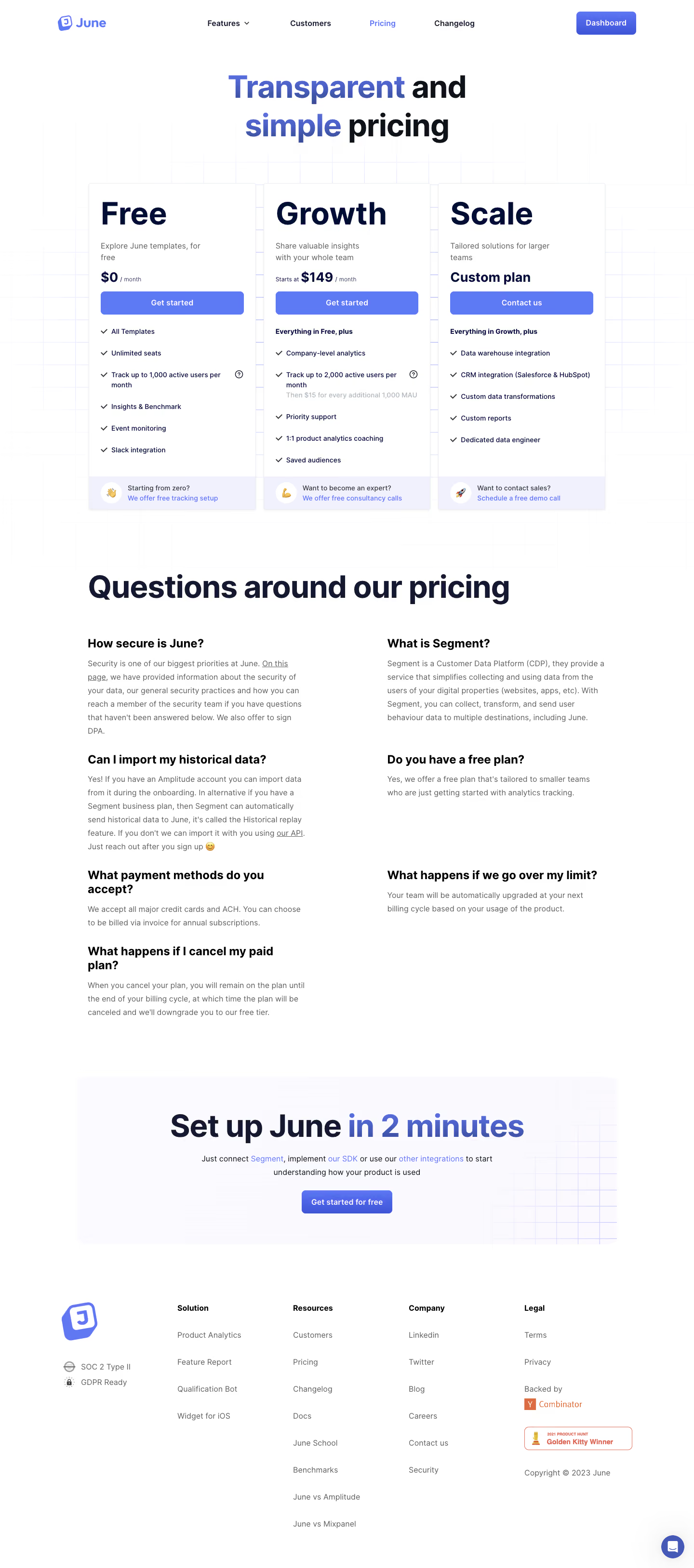

June Pricing Page

June
Actionable product insights, out of the box.
Designed by
No items found.

Bookmark
Bookmark

Design with AI
Thank you! Your submission has been received!
Oops! Something went wrong while submitting the form.
# Design from Reference: June Pricing Page
Create an original, high-fidelity visual design inspired by the reference. Prioritize composition, typography, colors, spacing, and component styling over technical implementation.
## Reference
- **Product:** June
- **Category:** Pricing Page
- **Screenshot:** https://cdn.prod.website-files.com/5e9dc792e1210c5325f7ebbc/6acb726ab10d21a746c47bf3_6acb6f103c1d196a9384fbf8_cms-2028f0f2479d5d847552addd.webp
Analyze the screenshot first. If inaccessible, request it rather than guessing.
## Content
{{content.instructions}}
{{content.data}}
Preserve essential messaging and factual accuracy. Adapt structure and copy length for visual balance; never invent product claims.
## Visual Design
### Overall aesthetic
- **Style:** Bright three-tier SaaS pricing page with bold navy typography, blue-violet actions, and a faint grid background.
- **Character:** Open white space, large plan names, checked feature lists, pale support strips, and a soft gradient closing panel.
- **Decoration:** Fine blue grid lines fade into the background; selected headline words use a blue-violet gradient.
### Page composition
- **Capture and scale:** 1440 × 3255 image px. CSS estimates assume approximately 1× capture; scale is unverified.
- **Header:** Brand left, feature/customer/pricing/changelog navigation center, and dashboard action right.
- **Hero:** Centered large two-line pricing headline above three equal cards.
- **Plan grid:** Approximately 1070px wide, three cards around 346px wide with narrow gaps; Free, Growth, and Scale align at the top and bottom.
- **Cards:** Plan name, description, price/custom-plan line, full-width action, feature checklist, and pale bottom assistance strip.
- **FAQ:** Large left-aligned section heading above two columns of visible question/answer groups.
- **Closing panel:** Broad rounded pale-gradient rectangle with grid detail at right, centered setup headline, short supporting sentence with links, and blue action.
- **Footer:** Brand/compliance block left and four link groups; legal/backing/award/copyright information appears at right. Chat launcher floats at the lower-right.
### Information hierarchy
- **Hero:** Gradient-highlighted words and dark remaining words create the first emphasis.
- **Plan names:** Very large navy names dominate the card headers.
- **Pricing:** Smaller bold price/custom-plan line sits directly above each action.
- **Feature structure:** Checks and bold inherited-plan labels distinguish inclusions; some limits have small question-mark affordances.
- **Assistance:** Bottom card strips pair circular emoji badges with short support prompts and blue links.
- **FAQ:** Bold questions precede gray visible answers; no collapsed accordion is shown.
- **Closing conversion:** Large setup promise and blue action repeat the primary route.
### Typography
- **Family:** Neutral proportional sans serif; exact family is unverified.
- **Hero / major headings:** Approximately 64px bold with 76–80px line-height and tight tracking.
- **Plan names:** Approximately 64px bold.
- **Descriptions:** Approximately 16px regular with 24px line-height.
- **Price:** Approximately 28px bold, with smaller monthly/cadence qualifiers.
- **Features:** Approximately 14px medium with 20px line-height.
- **FAQ:** Approximately 24px bold questions and 16px gray answers with 28px line-height.
- **Footer:** Approximately 16px, with bold group labels and lighter links.
- **Precision:** Sizes, weights, line-heights, and tracking are visual estimates rather than extracted CSS.
### Colors & surfaces
- **Canvas / cards:** Sampled #FFFFFF.
- **Navy text:** Sampled #141830.
- **Blue-violet action:** Sampled #5E79F4.
- **Pale support strips:** Sampled #F0F1FD.
- **Closing/background tones:** Sampled #FAF9FE, #FAFAFF, #FAFAFE, and #FBFBFF.
- **Secondary copy:** Medium gray for descriptions/answers; lighter gray for overage details.
- **Boundaries:** Very pale blue-gray card outlines and grid lines; soft subtle shadows below cards.
- **Gradient treatment:** Headline accents and dashboard/closing actions contain neighboring blue-violet shades rather than one flat color.
### Components
- **Plan cards:** Approximately 346 × 678px, thin pale border, small 4px radius, around 24px padding, and subtle shadow.
- **Primary actions:** Approximately 296 × 48px, blue-violet fill, white bold label, and 8px radius.
- **Feature rows:** Dark checkmarks in a fixed gutter, hanging text alignment, and roughly 44px pitch for simple rows.
- **Limit details:** Small outlined question-mark circles near selected usage limits; muted overage line under the Growth allowance.
- **Support strips:** Pale-violet footer band around 70px tall with white circular emoji tile and two-line prompt/link.
- **FAQ groups:** Unboxed text columns with generous vertical gaps; inline underlined reference links.
- **Closing CTA:** About 1120px wide, 16px radius, soft pale fill, grid at right, and centered blue action.
- **Footer badges:** Compliance labels, accelerator mark, and outlined award badge provide small proof details.
- **Chat launcher:** Small blue-violet circle with white chat symbol and soft shadow.
- **State limits:** No tooltip, checkout, hover, or chat state is open.
### Visual rhythm
- **Grid consistency:** Three equal cards align their action rows and bottom support strips.
- **Card density:** Large names contrast with compact feature lists and small support text.
- **Section spacing:** Broad gaps separate pricing, FAQ, closing panel, and footer.
- **FAQ rhythm:** Unequal answer lengths fit an open two-column layout without enclosing cards.
- **Closing continuity:** The faint grid motif links the hero/pricing area to the final panel.
### Responsive
- **Observed state:** Desktop only; mobile and interactive states are unverified.
- **Cards recommendation:** Stack tiers with consistent ordering and preserve full-width actions.
- **Typography recommendation:** Reduce major headings toward 36–40px while keeping plan names prominent.
- **FAQ recommendation:** Change to one column and retain question/answer grouping.
- **Footer recommendation:** Wrap navigation groups and keep award/legal details readable.
- **Chat recommendation:** Avoid covering bottom links on narrow screens.
### Adaptation guidance
- **Preserve:** Three clear tiers, large navy plan names, blue-violet actions, checked lists, and pale assistance strips.
- **Starting geometry:** Approximately 1070px card grid, 346px cards, 24px padding, 48px actions, and 14px feature text under the unverified 1× assumption.
- **Commercial fidelity:** Supply actual plan limits, prices, overages, and free-plan conditions; screenshot figures are historical reference content.
- **Support adaptation:** Keep optional setup/consultation links distinct from the main signup action.
- **Implementation recommendation:** Provide accessible feature help, meaningful links, clear focus, and responsive stacking; static pixels do not establish these behaviors.
Use this context to reproduce the reference's visual language: layout, typography, colors, spacing, borders, radii, and distinctive elements. The screenshot takes priority if descriptions conflict.
## Direction
{{preferences.fidelityInstructions}}
## Output
{{output.instructions}}
Deliver a polished, cohesive design with precise alignment, hierarchy, and spacing. Produce the requested visual artifact, not just a description. If unsupported, explain the limitation.


Category
Patterns
No items found.
Tech Stack

Added on
March 10, 2023
Similar screens
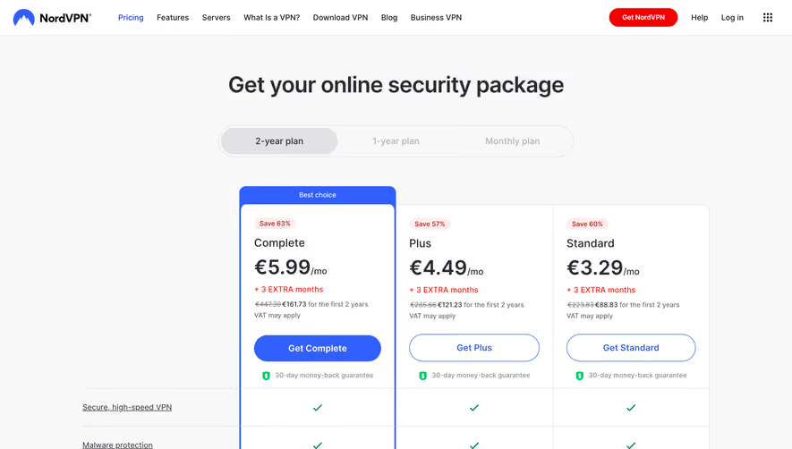


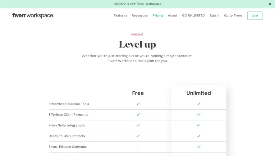

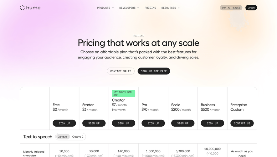

Upgrade to SaaSFrame Pro now to see similar examples.
Monthly
$18 /month
Billed $18 monthly
Browse all screens & flows
Filter and search screens & flows
Search text in screenshots
Access Figma files
Access mobile versions
Join now
Quarterly
$16 /month
Billed $48 quarterly
Browse all screens & flows
Filter and search screens & flows
Search text in screenshots
Access Figma files
Access mobile versions
Join now
Yearly
$15 /month
Billed $180 yearly
Browse all screens & flows
Filter and search screens & flows
Search text in screenshots
Access Figma files
Access mobile versions
Join now