
Thank you! Your submission has been received!
Oops! Something went wrong while submitting the form.
Get SaaSFrame Pro
Monthly
$18
Quarterly
$48
Yearly
$180
Upgrade to access this feature
Browse all screens & flows
Filter and search screens & flows
Access Figma files
Access mobile versions
Bookmark screens & flows
Join now
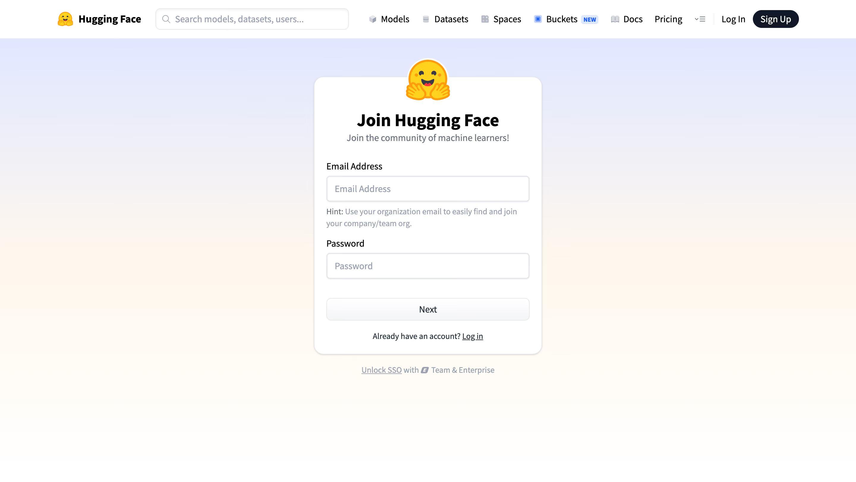
Hugging Face Join Hugging Face

Hugging Face
The AI community building the future
Designed by
No items found.

Bookmark
Bookmark

Design with AI
Thank you! Your submission has been received!
Oops! Something went wrong while submitting the form.
# Design from Reference: Hugging Face Join Hugging Face
Create an original, high-fidelity visual design inspired by the reference. Prioritize composition, typography, colors, spacing, and component styling over technical implementation.
## Reference
- **Product:** Hugging Face
- **Category:** Signup
- **Screenshot:** https://cdn.prod.website-files.com/5e9dc792e1210c5325f7ebbc/6acad09551f927271bf81e5b_6acad02d610f0f51f4ed2f47_cms-d392dfc2c99e30faa6077f7f.webp
Analyze the screenshot first. If inaccessible, request it rather than guessing.
## Content
{{content.instructions}}
{{content.data}}
Preserve essential messaging and factual accuracy. Adapt structure and copy length for visual balance; never invent product claims.
## Visual Design
### Overall aesthetic
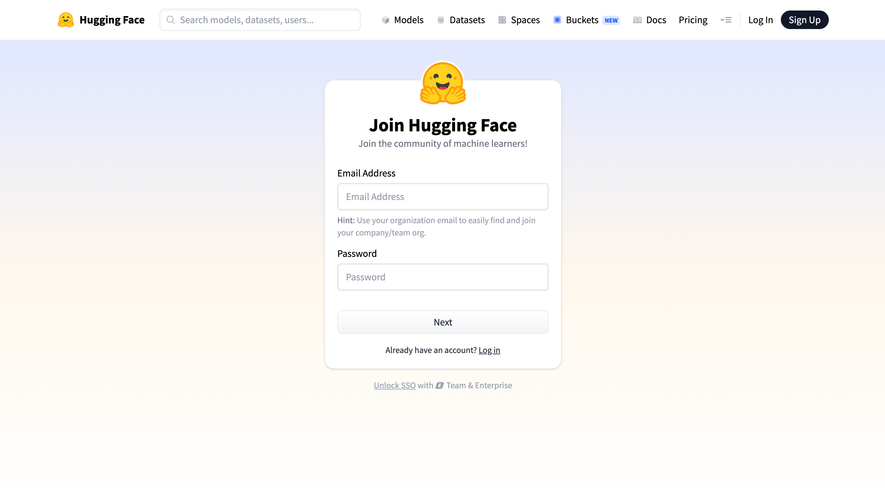
- **Style:** Friendly account signup page with a compact white form card over a soft lavender-to-cream background.
- **Character:** A large hugging-face mark overlaps the card's top edge, giving a welcoming identity to an otherwise conventional form.
- **Capture:** The image measures 2880 × 1624 pixels. CSS estimates assume a 2× capture, equivalent to approximately 1440 × 812 CSS pixels; actual scale and font identity are unverified.
### Page composition
- **Global header:** A 64-CSS-pixel white navigation bar includes brand, search, product/documentation links and account actions.
- **Background:** A pale periwinkle upper field fades through warm cream into white toward the bottom.
- **Signup card:** A centered card approximately 384 × 468 pixels begins near x528, y130 CSS pixels.
- **Card sequence:** Overlapping brand mark, bold centered title, short subtitle, email label/input/helper, password label/input, full-width Next action and login prompt.
- **Secondary route:** An SSO/enterprise link sits centered outside the card below it.
### Information hierarchy
- **Page identity:** The bold signup title and large brand mark establish the purpose immediately.
- **Form priority:** Email and password are the only visible entry fields; the email hint explains the value of an organization address.
- **Progression:** Next is a full-width control beneath the fields, suggesting a subsequent step without showing it.
- **Returning users:** An underlined login link appears beneath the primary action; global login is also available in the header.
- **Enterprise option:** SSO access is visually subordinate outside the card.
- **Header scope:** The broad product navigation remains available, but the centered card dominates the page content.
### Typography
- **Family:** A compact sans-serif is visible; exact font identity is unverified.
- **Card title:** Approximately 30-pixel CSS size, bold, with around 36-pixel line height.
- **Subtitle:** Approximately 16 pixels, regular weight, in muted slate.
- **Labels and inputs:** Approximately 16 pixels; labels are darker than placeholder text.
- **Helper and secondary text:** Approximately 14 pixels with 20-pixel line height.
- **Header:** Brand text is around 18 pixels and bold; navigation and search text around 16 pixels.
### Colors & surfaces
- **Measured base:** White #FFFFFF fills the header and card.
- **Measured warm gradient samples:** #FFFDF9, #FFFEFC and #FFF8EE occur in the lower background, with related cream tones across the transition.
- **Upper background:** A pale lavender/periwinkle wash is visibly distinct from the warm lower field; it is a gradient rather than a single flat token.
- **Text:** Black headings contrast with slate-gray subtitle/helper text and lighter placeholders.
- **Brand accent:** Yellow and orange are concentrated in the hugging-face artwork; the header signup action uses near-black.
- **Boundaries:** Light-gray outlines and a subtle shadow separate the card and input controls from their surroundings.
### Components
- **Header search:** A long rounded field, approximately 326 × 36 CSS pixels, includes a magnifier and muted search prompt.
- **Account action:** A small dark Sign Up pill sits at the header's far right.
- **Form card:** Approximately 16-pixel corners, thin gray border, low shadow and 20-pixel horizontal padding.
- **Overlapping mark:** A roughly 72-pixel illustration is centered across the card's upper boundary.
- **Inputs:** Approximately 342 × 44 pixels with small 6-pixel corners, light borders and subtle inset/elevated edge treatment.
- **Email hint:** Two muted lines sit directly beneath the first input, before the password label.
- **Next button:** Approximately 342 × 38 pixels with a very light neutral fill/gradient, fine outline and centered dark label.
- **Login and SSO:** The login prompt is centered inside the card; the separate SSO line includes a small enterprise-style symbol.
- **State scope:** Inputs are empty; no validation, password rules or subsequent signup step is visible.
### Visual rhythm
- **Centering:** The card aligns to the viewport center beneath the global header.
- **Field spacing:** The email hint increases the space between email and password while keeping the hint attached to its field.
- **Action spacing:** Roughly 32 pixels separate the password input from Next; a smaller gap precedes the login prompt.
- **Whitespace:** Broad empty margins and a largely blank lower half keep the form isolated.
- **Header density:** Compact navigation contrasts with the sparse form region.
### Responsive
- **Recommendation — header:** Collapse secondary navigation and reduce the search footprint on narrow screens.
- **Recommendation — card:** Use a fluid width with 16–24-pixel side gutters while retaining the overlapping mark.
- **Recommendation — inputs:** Preserve full-width controls and readable helper wrapping.
- **Recommendation — height:** Allow normal page scrolling on short screens so Next, login and SSO remain reachable.
- **Recommendation — navigation:** Maintain accessible account alternatives without crowding the form. No mobile state is evidenced.
### Adaptation guidance
- **Keep signup focused:** Preserve the two-field first step and concise organizational-email guidance.
- **Reuse the warm identity:** Combine a neutral white card with soft background color and a single expressive brand mark.
- **Maintain clear alternatives:** Keep login inside the card and enterprise SSO as a separate lower-priority route.
- **Standardize form tokens:** Reuse input heights, label spacing, border tones and corner radii across later steps.
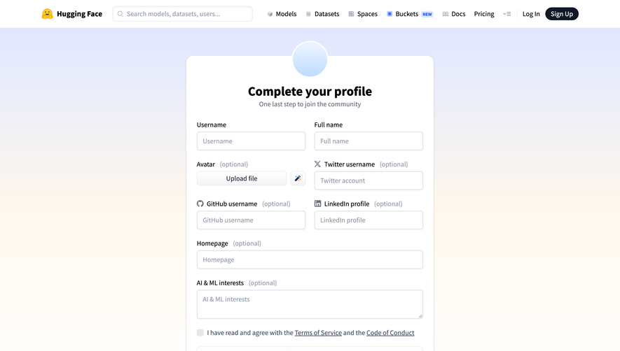
- **Define unseen states:** Implement validation, password handling and step progression separately; the capture only shows the initial empty form.
- **Preserve semantics:** Associate labels and helper text with inputs and expose keyboard focus clearly.
Use this context to reproduce the reference's visual language: layout, typography, colors, spacing, borders, radii, and distinctive elements. The screenshot takes priority if descriptions conflict.
## Direction
{{preferences.fidelityInstructions}}
## Output
{{output.instructions}}
Deliver a polished, cohesive design with precise alignment, hierarchy, and spacing. Produce the requested visual artifact, not just a description. If unsupported, explain the limitation.


Category
Tech Stack

Added on
September 21, 2026

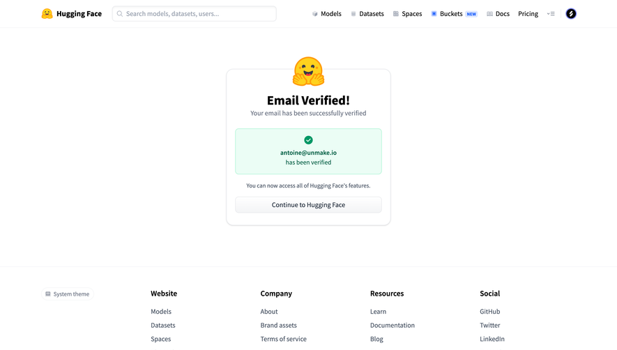
Similar screens
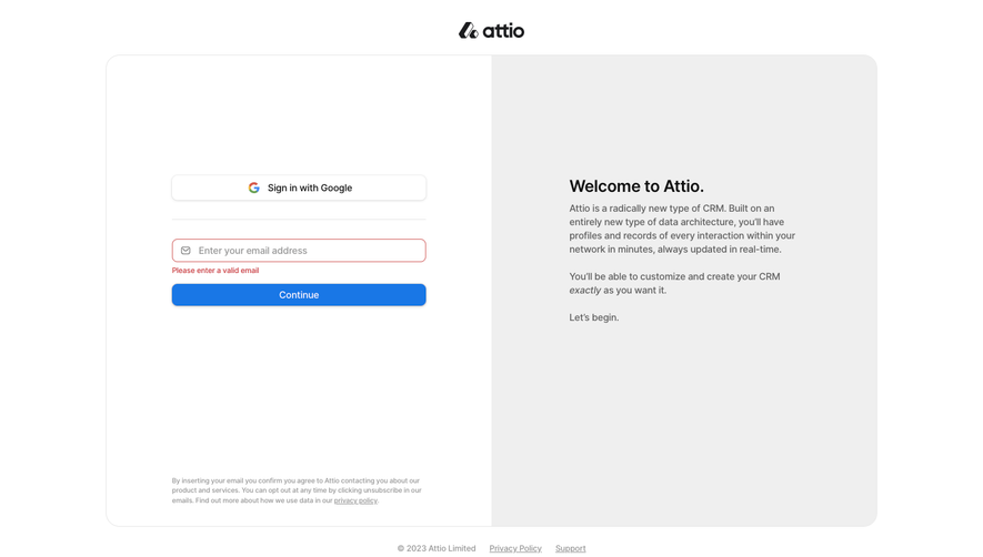


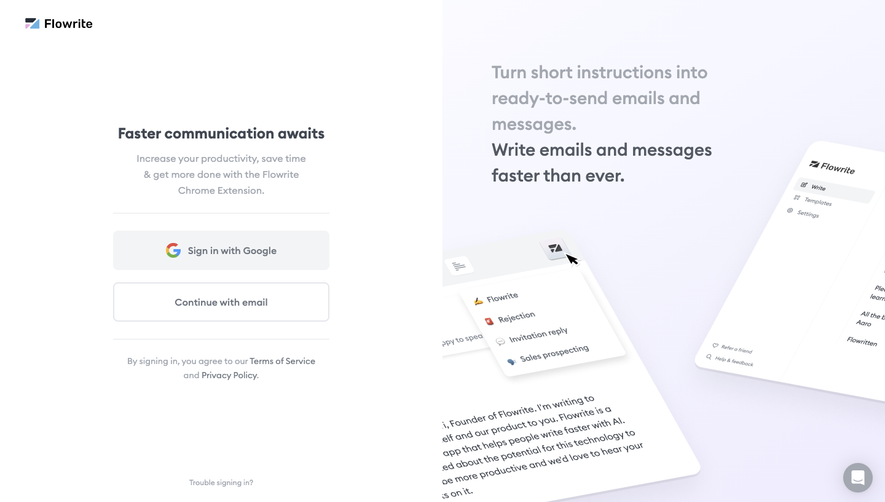

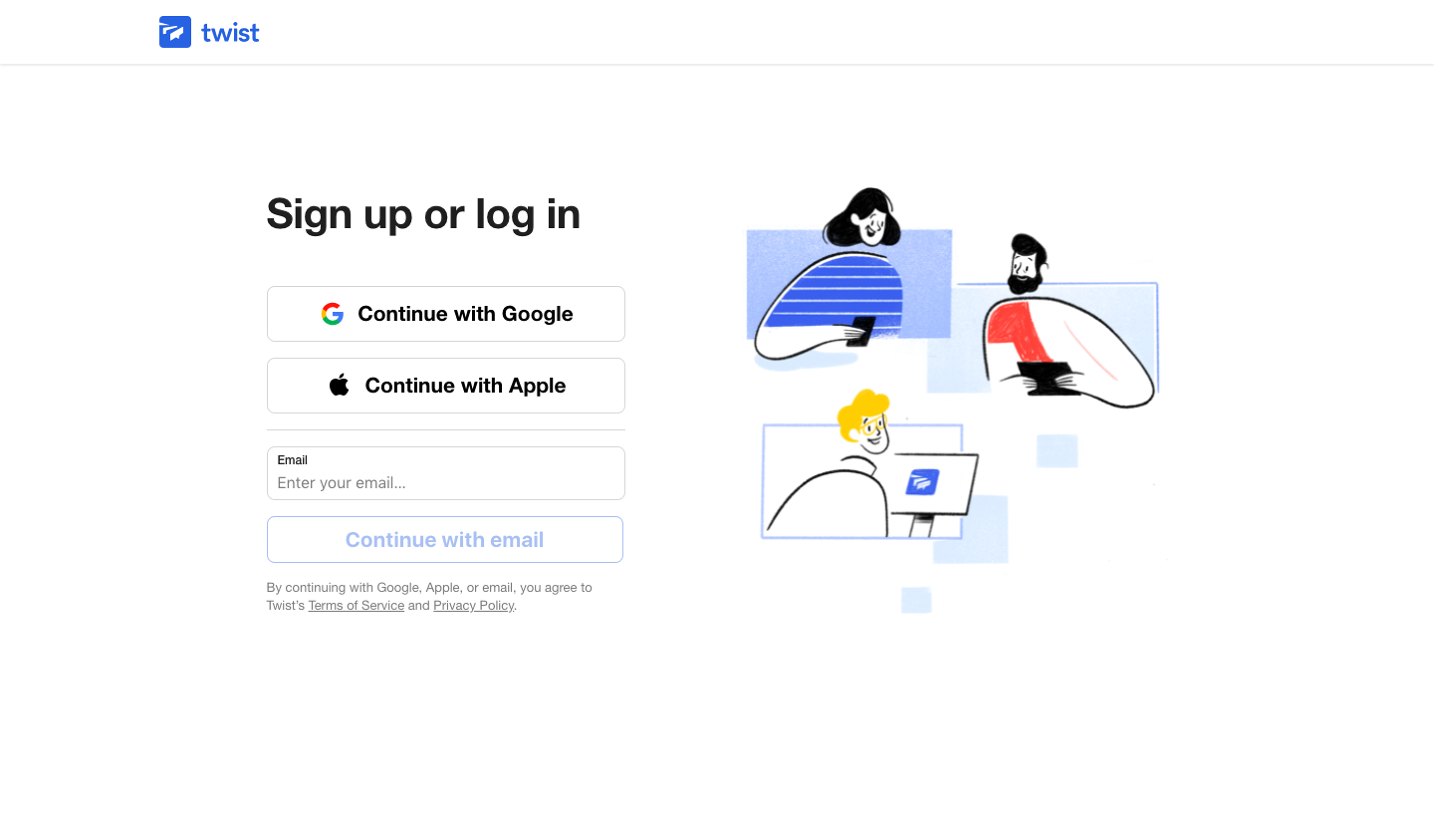

Upgrade to SaaSFrame Pro now to see similar examples.
Monthly
$18 /month
Billed $18 monthly
Browse all screens & flows
Filter and search screens & flows
Search text in screenshots
Access Figma files
Access mobile versions
Join now
Quarterly
$16 /month
Billed $48 quarterly
Browse all screens & flows
Filter and search screens & flows
Search text in screenshots
Access Figma files
Access mobile versions
Join now
Yearly
$15 /month
Billed $180 yearly
Browse all screens & flows
Filter and search screens & flows
Search text in screenshots
Access Figma files
Access mobile versions
Join now