
Thank you! Your submission has been received!
Oops! Something went wrong while submitting the form.
Get SaaSFrame Pro
Monthly
$18
Quarterly
$48
Yearly
$180
Upgrade to access this feature
Browse all screens & flows
Filter and search screens & flows
Access Figma files
Access mobile versions
Bookmark screens & flows
Join now
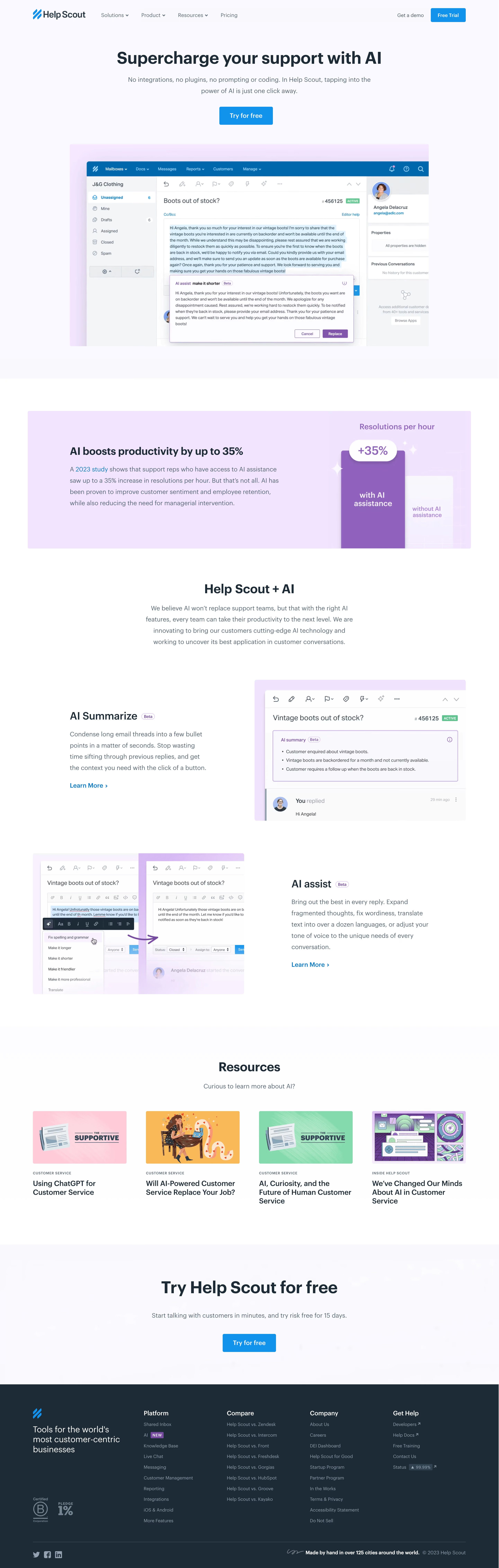

Help Scout AI Page

Help Scout
Customer Service Software
Designed by
No items found.

Bookmark
Bookmark

Design with AI
Thank you! Your submission has been received!
Oops! Something went wrong while submitting the form.
# Design from Reference: Help Scout AI Page
Create an original, high-fidelity visual design inspired by the reference. Prioritize composition, typography, colors, spacing, and component styling over technical implementation.
## Reference
- **Product:** Help Scout
- **Category:** AI Page
- **Screenshot:** https://cdn.prod.website-files.com/5e9dc792e1210c5325f7ebbc/6acadb65494a081980ea068a_6acad87fbf4db4ed6805afd8_cms-3b0d7a6ecfdfd48949742cb1.webp
Analyze the screenshot first. If inaccessible, request it rather than guessing.
## Content
{{content.instructions}}
{{content.data}}
Preserve essential messaging and factual accuracy. Adapt structure and copy length for visual balance; never invent product claims.
## Visual Design
### Overall aesthetic
- **Character:** An approachable AI feature page with navy typography, blue actions, pale lavender surfaces and large support-interface examples.
- **Tone:** Product-led and reassuring, balancing feature demonstrations with resources and a final trial invitation.
### Page composition
- **Capture scale:** The source measures 2882 × 9050 pixels. A roughly 1441 × 4525 CSS-pixel page at 2× scale is plausible but unverified; all four readable portions were inspected.
- **Opening:** A horizontal brand/navigation header precedes centered heading, short description, blue trial CTA and a wide product screenshot on lavender.
- **Evidence:** A pale purple productivity banner pairs explanatory copy with a simple two-bar graphic.
- **Features:** A centered Help Scout + AI introduction leads into two alternating text/image rows for summarization and writing assistance.
- **Resources:** Four image-led article cards form one row.
- **Closing:** A large pale trial band precedes a dark navy footer with brand statement and four link groups.
### Information hierarchy
- **Hero:** The largest heading introduces AI support, with concise supporting text and a clear free-trial action.
- **Evidence banner:** A bold productivity claim leads into a smaller study reference and comparison graphic; this is captured marketing content, not independently verified evidence.
- **Feature rows:** AI Summarize and AI assist titles include small Beta badges, explanatory paragraphs and blue Learn More links.
- **Resources:** Category eyebrows and bold titles sit beneath colorful thumbnails.
- **Final action:** A repeated trial heading and CTA close the main content before dense footer navigation.
### Typography
- **Family:** A clean sans serif is visible; exact identity is unverified.
- **Major headings:** Approximately 48–50 estimated CSS pixels, bold, with tight 58-pixel line height.
- **Section headings:** Around 36 pixels; feature titles are about 30 pixels.
- **Body:** Approximately 18 pixels with 32-pixel line height and muted blue-gray color.
- **Cards/footer:** Resource titles are around 21 pixels, semibold; category eyebrows are small uppercase tracked text, and footer links are around 13–14 pixels.
### Colors & surfaces
- **Measured palette:** ICC-aware sRGB sampling yields white #FFFFFF, pale lavender #F9F9FF/#FAFAFF, stronger lavender #F2E4FF and dark navy #1D2B36.
- **Action system:** Bright blue identifies trial buttons and learning links; purple highlights AI UI examples and the productivity graphic.
- **Surface detail:** Product screenshots sit inside pale lavender frames with modest corners; most editorial regions remain flat and borderless.
- **Footer:** White/gray text and a blue brand symbol contrast against the dark navy background.
### Components
- **Hero demonstration:** A large support-inbox screenshot shows selected reply text and a purple AI-assist result panel with Cancel/Replace controls.
- **Productivity banner:** A wide lavender block pairs a text explanation with taller purple versus shorter pale bars and a percentage callout.
- **Summarize example:** A support conversation includes a purple outlined summary panel with bullet points.
- **Assist example:** Before/after editor images, a contextual command menu and curved purple arrow demonstrate rewriting.
- **Resource cards:** Four equal columns use colorful landscape images, small category labels and multiline titles without enclosing card borders.
- **Trial actions:** Blue rounded rectangles use white semibold labels and comfortable padding.
- **Footer:** Brand positioning, certification-style marks, link columns, social icons and a lower attribution line form the closing region.
### Visual rhythm
- **Alternation:** Centered hero/evidence sections transition into alternating feature rows and then a regular resource grid.
- **Spacing:** Broad 80–120-pixel estimated CSS intervals separate major sections.
- **Image weight:** Large interface captures carry the feature explanation, while text uses constrained widths for readability.
- **Color pacing:** Pale lavender recurs behind product/CTA regions before the strong dark footer.
### Responsive
- **Recommendation:** Stack feature copy and images, reduce resources to two/one columns and keep interface examples linked to larger views.
- **Recommendation:** Reduce oversized headings and collapse navigation/footer groups without shrinking body text.
- **Recommendation:** Preserve live-text descriptions so tiny embedded interface labels are not essential on phones. No mobile state is shown.
### Adaptation guidance
- **Preserve:** Retain product-led demonstrations, consistent blue actions and restrained lavender AI accents.
- **Build:** Use reusable feature-row, evidence-banner and resource-card components.
- **Content integrity:** Treat productivity figures, beta labels and trial durations as historical screenshot content rather than current validated claims.
- **Accessibility:** Provide image descriptions and meaningful learning links, and keep essential explanations outside screenshots.
Use this context to reproduce the reference's visual language: layout, typography, colors, spacing, borders, radii, and distinctive elements. The screenshot takes priority if descriptions conflict.
## Direction
{{preferences.fidelityInstructions}}
## Output
{{output.instructions}}
Deliver a polished, cohesive design with precise alignment, hierarchy, and spacing. Produce the requested visual artifact, not just a description. If unsupported, explain the limitation.


Category
Patterns
No items found.
Tech Stack

Added on
October 16, 2023
Similar screens
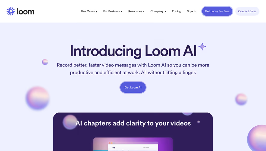


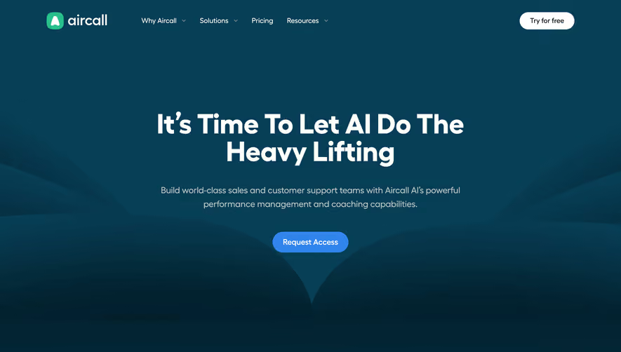



Upgrade to SaaSFrame Pro now to see similar examples.
Monthly
$18 /month
Billed $18 monthly
Browse all screens & flows
Filter and search screens & flows
Search text in screenshots
Access Figma files
Access mobile versions
Join now
Quarterly
$16 /month
Billed $48 quarterly
Browse all screens & flows
Filter and search screens & flows
Search text in screenshots
Access Figma files
Access mobile versions
Join now
Yearly
$15 /month
Billed $180 yearly
Browse all screens & flows
Filter and search screens & flows
Search text in screenshots
Access Figma files
Access mobile versions
Join now