Prompt 1,262 words Copy
# Design from Reference: Aircall AI Page

Create an original, high-fidelity visual design inspired by the reference. Prioritize composition, typography, colors, spacing, and component styling over technical implementation.

## Reference

- **Product:** Aircall
- **Category:** AI Page
- **Screenshot:** attached to this message (also available at https://media.saasframe.io/v/8495625205d12570a809-1600.webp)
- **Source:** https://aircall.io/products/ai/

Analyze the attached screenshot first. If no image is attached, open the screenshot link; if neither is accessible, ask for it rather than guessing.

## Visual Design Context

### Overall aesthetic
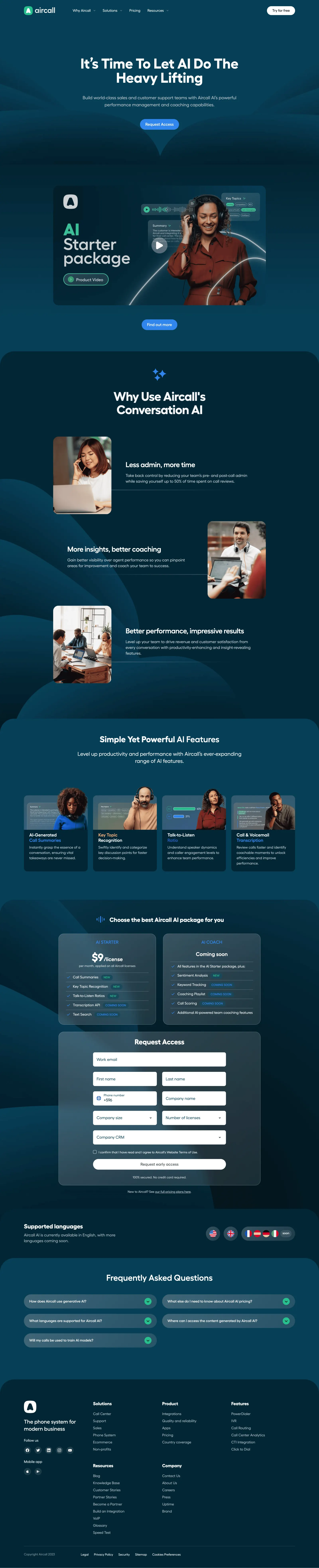
- **Character:** Immersive dark-teal AI product landing page with white rounded typography, blue actions and photographic/product compositions.
- **Visual language:** Large curved layered backgrounds, rounded section tops and translucent blue-gray cards create a continuous cinematic scroll.
- **Scale:** The image measures 2880 × 14158 px. Dimensions below estimate a 1440 × 7079 CSS layout at 2× scale; device ratio and zoom are unverified. Five readable portions were inspected.

### Page composition
- **Header/hero:** Wordmark and four menu groups align left/center, with white trial pill right. A centered two-line headline, supporting paragraph and blue access action sit above large symmetrical dark curves.
- **Video:** A wide rounded product-video poster features a headset-wearing person, floating transcript/topic UI and large package lettering, followed by a small blue information action.
- **Benefits:** A darker rounded-top region introduces three alternating photo/text rows for reduced administration, coaching insight and performance.
- **Features:** A lighter teal section contains four equal cards with portrait/UI images above titles and descriptions.
- **Packages/form:** Two translucent pricing/package cards sit above a wider matching access-request form.
- **Lower content:** A language-support strip precedes five collapsed FAQ pills in two columns, then a large dark footer with brand/social/app links and multiple navigation groups.

### Information hierarchy
- **Hero:** Large white outcome statement leads; muted supporting text explains the AI performance/coaching proposition.
- **Benefits:** Bold short headings and compact paragraphs pair with tall rounded photos.
- **Features:** Four cards describe summaries, topic recognition, talk/listen ratio and transcription, using blue/orange emphasis within titles.
- **Package status:** The first card shows a price and feature list; the second says Coming soon. Small badges distinguish new and forthcoming items.
- **Access:** A centered Request Access heading leads the form; a white early-access action follows consent and fields.
- **Evidence caution:** Price, availability and feature claims are captured content, not verified current product facts.

### Typography
- **Family:** Rounded geometric sans-serif; exact identity is unverified.
- **Hero:** Approximately 60–64 CSS px, heavy weight, around 64 px leading and tight tracking.
- **Section headings:** Roughly 42–54 px bold, often centered and multiline.
- **Benefit headings:** About 30–32 px bold; body roughly 18 px with 26 px leading.
- **Cards/form:** Feature titles are approximately 20 px bold; descriptions around 16 px. Form placeholders are near 16 px.
- **Small roles:** Package badges, reassurance and footer links use compact 12–16 px text.

### Colors & surfaces
- **Measured dominant tones:** ICC-aware sRGB sampling yields #022635 and #063F56 across major dark-teal sections.
- **Measured curved layers:** #032230, #032433, #042938, #042B3C and #052E3E occur in layered backgrounds.
- **Measured light:** #FFFFFF supplies primary text/form fields.
- **Accents:** Bright blue marks primary actions and selected title phrases; green/mint marks brand and new-status details.
- **Depth:** Translucent-looking blue-gray package/form surfaces have thin light borders and soft gradients; photographs and posters use rounded corners.

### Components
- **Hero action:** A blue fully rounded button with white bold caption sits under centered copy.
- **Video poster:** A large landscape rounded rectangle includes a central translucent play control and layered speech/topic fragments. No playback is demonstrated.
- **Benefit photos:** Three tall rounded portraits/team photos alternate sides, with fine horizontal rules extending beneath text.
- **Feature cards:** Four equal dark-teal cards have image tops and padded text bodies, with roughly 16 px corners.
- **Package cards:** Two bordered translucent rectangles show titles, price/status and checkmarked rows separated by fine rules; small rounded badges identify new/coming-soon states.
- **Form:** White rounded fields include full-width email, paired name/contact/company rows, company-size/license selectors and full-width CRM selector. Consent and a wide white pill action finish the panel.
- **Language strip:** Flag circles and a small soon badge align right of a short explanatory block.
- **FAQ:** Five long rounded blue-gray controls have green circular down chevrons; all are collapsed.
- **Footer:** Brand statement/social/store icons occupy the first column, with grouped links and a lower legal row.

### Visual rhythm
- **Section shaping:** Broad rounded upper corners and layered curves distinguish sections without abrupt white breaks.
- **Alignment:** Most content uses a centered roughly 1220 CSS px container; video/packages/form use narrower measures.
- **Alternation:** Photo/text benefits reverse sides; feature cards and package cards introduce regular grids.
- **Spacing:** Generous roughly 80–120 px section intervals contrast with compact feature rows and footer links.
- **Color continuity:** Dark teal persists throughout, while subtle shade changes and blue actions mark progression.

### Responsive
- **Evidence limit:** Only desktop is shown; recommendations follow.
- **Hero:** Collapse navigation and scale display text fluidly.
- **Benefits/cards:** Stack alternating rows and reduce four feature columns to two then one.
- **Packages/form:** Stack packages and paired fields, keeping labels/consent readable.
- **FAQ/footer:** Use one-column FAQ and fewer footer groups per row; maintain clear keyboard/touch controls.
- **Imagery:** Preserve poster proportions and simplify decorative curves rather than shrinking embedded UI beyond readability.

### Adaptation guidance
- **Reusable structure:** Lead with an AI outcome, demonstrate visually, explain benefits/features and connect packages to a clear access request.
- **Visual system:** Use a controlled dark-teal palette, rounded white type and restrained blue/mint accents.
- **State truth:** Keep new/coming-soon distinctions explicit and do not infer form submission or video playback.
- **Accessibility:** Provide readable dark-theme contrast, real field labels, video alternatives and semantic FAQ expanded states.
- **Content discipline:** Validate current commercial claims separately before reuse; use screenshot-derived layout as the design reference.

## Content

**Instructions:**

Generate realistic example content that fits the selected design reference.

Create appropriate headlines, descriptions, labels, buttons, and supporting copy based on the type of interface being designed.

If a product or business description is provided, use it to guide the content.

Otherwise, invent a plausible fictional SaaS product appropriate for the reference.

Keep the content concise, coherent, and visually balanced.

Do not present fictional statistics, customer names, or testimonials as verified facts.

## Design Direction

**Instructions:**

Use the reference screenshot as the main source of visual inspiration rather than a strict layout template.

Preserve its most distinctive design characteristics, such as typography, visual rhythm, color relationships, component treatments, and overall aesthetic.

Feel free to modify section arrangements, proportions, spacing, and individual components to better suit my content.

Introduce original design decisions where they improve usability, composition, or brand consistency.

The result should clearly reflect the reference's visual language without looking like a direct reproduction.

Follow the visual identity of the reference design.

Use its typography, color palette, component styling, and overall aesthetic as the primary design direction.

Do not introduce an unrelated visual identity.

## Output

**Instructions:**

Generate a high-fidelity visual mockup of the requested interface.

Present the design as a polished, realistic website or product UI screenshot.

Prioritize visual composition, typography, spacing, colors, alignment, and component details.

Use the available image-generation or visual-design capabilities.

Do not replace the mockup with source code, a written design specification, or a textual description.

If direct visual generation is unavailable, clearly explain the limitation.

## Constraints

- Use the actual screenshot as the primary visual reference.
- Preserve essential messaging and factual accuracy.
- Prioritize visual quality and consistency.
- Do not invent unsupported product claims.
- Adapt structure and copy length for visual balance.
Reference image Attach it to your message: assistants can’t open image links. Open in ChatGPT ↗ Open in Claude ↗
Build it in Lovable ↗ v0 ↗ Figma Make ↗
Opening a tool copies the screenshot so you can paste it with your prompt.
 SaaSFrame