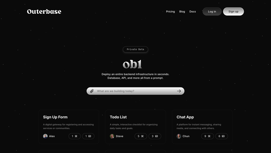
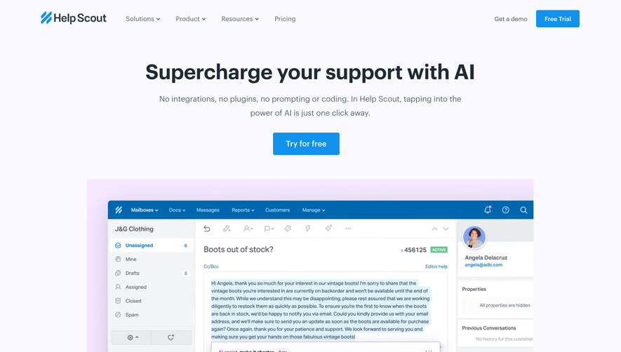
Overall Style and Aesthetic
CommandBar Copilot’s website radiates modern minimalism with a tech-forward, approachable edge. The design exudes clarity and confidence, balancing ample white space with lively visual details for a streamlined, sophisticated feel that remains inviting—not sterile. Layout and Structure
The single-scroll layout is intuitively segmented: Hero section immediately captivates with a clear headline and concise value prop. Interactive product demos take center stage, quickly followed by a features grid showcasing key functions. Supporting sections highlight social proof, integration partners, and end with a strong call-to-action above a compact, efficient footer. Visual Elements
Dynamic, branded illustrations—featuring bold, abstract shapes and playful micro-animations—bring the interface concepts to life. Motion draws attention without distracting, while sprinkled icons add clarity to feature lists. There’s minimal use of traditional photography, keeping the visual language cohesive and product-centric. Color Palette and Typography
A crisp palette of bright cyan, deep navy, and vivid “command” yellow energizes the page, creating striking contrast and guiding the eye. Clean, geometric fonts (headings and body) reinforce a SaaS-modern vibe, with clear hierarchy placing emphasis on CTAs and value statements. User Experience Patterns
Sticky navigation ensures seamless movement, while prominent buttons—animated on hover—guide visitors to start exploring or booking a demo. Thoughtful microinteractions and progressive “show-don’t-tell” explainers help users understand Copilot’s unique value instantly. Unique or Notable Design Choices
The standout is a no-friction, interactive product walk-through embedded in the hero area—allowing instant, hands-on exploration without sign-up. Subtle, looping UI animations exemplify the product’s intelligence, pushing innovative design that feels both aspirational and immediately accessible. Tone and Feel
The tone lands at the intersection of trustworthy SaaS and futuristic innovation—energetic, confident, and genuinely helpful—making visitors feel both impressed and empowered.